| Image |
Comment |
| 02/19/2004 10:43:12 AM |
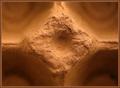
textures of an egg cartonby ScantyNebulaComment: Good. Great sense of plasticity, great sense of tone. the regular composition works very well too: strong graphic element to hold the eye, and a sense of depth to give some relief (in both emotional and topographic meanings). Not perhps something I'd want to buy, but ought to place highly, and technically assured work. |
 Photographer found comment helpful. Photographer found comment helpful. |
| 02/19/2004 10:40:46 AM |
|
| 02/19/2004 10:39:15 AM |
Leather and dog hair.by anmurrellComment: You seem out fo control of the lighting, and the placing of the subject is poor - is that a shoe in the background? Don't find the graphical structure of this very intersting at all, seems rather confused as to where the lines want ot be in the image. |
| 02/19/2004 10:37:52 AM |
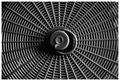
Web in my kitchenby gatchamanComment: Intriguing pattern - and shows good understanding of the ideas behind regular and rhythmic compositions such as this - even allowing the handle to break that pattern is effective. Touch of brightness lower left is amazingly distracting for such a small area, thugh it's a function of the regularity of the patterning. Get some feeling of plastic from the image, but mutedly so. Nice work. |
| 02/19/2004 10:35:41 AM |
Soft-white Swanby qnjtComment: Very good. I think you've just allowed some areas of feathers to get away from you in terms of exposure, though tricky when it's still got its young feathers on its neck. great sense of the furry neck feathers, a touch less successful with the pure white back feathers.Composition is a bit odd - cropped so close to the curve of the neck, and that loop of the neck only bringing the eye to centre of the frame. |
| Photographer found comment helpful. |
| 02/19/2004 10:33:16 AM |
Tactile Defenseby fisheyeComment: aha - a spiky green thing photograph that isn't as ugly as sin for once. Good capture of the little leaves, as well as of the rough surface beneath. Kind of gives more feeling of reflection than illumination, which I think makes the surface llok harder than perhaps it is, and the very finest level of detail is not quite present - that sense of subtlety that really good lighting brings. |
| Photographer found comment helpful. |
| 02/19/2004 10:30:54 AM |
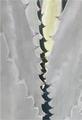
Agaveby carlacrypticComment: Weird - is that desaturation, or is it really grey? Good on the patterning, and the spines of the leaves, but lacking a sense of surface texture. |
| Photographer found comment helpful. |
| 02/19/2004 10:28:23 AM |
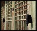
Checkered Wallby librodoComment: Quite contrasty (a good thing), and good on the colour tones. Detailing seems somewhat squashed - as though this were a near 1:1 magnification off the sensor, which loses some sense of feel in the textures. |
| Photographer found comment helpful. |
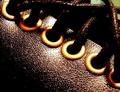
| 02/19/2004 10:25:16 AM |
Leather Braceletby Apollo2077Comment: Nice high-contrast work, and a great sense of plasticity in the capture of the reflections on the leather. The brass grommets on the holes are well exhibited too. Certainly meets the challenge, and should score well, I hope. |
| Photographer found comment helpful. |
| 02/19/2004 10:23:03 AM |
The Operationby israfelComment: Oh - very peculiar. Good contrast of the metal of the screw and the softness of the bread, both of which textures you've really brought out here. The rest of teh pastry seems superfluous to the image, and just serves to crowd that moment with the screw, and a shame you couldn't have edited that background to black and got rid of some of those crumbs - certainly in dpc terms, but also they serve to make the composition look huried, and suggest that not enough care has been taken woth the presentation. |
| Photographer found comment helpful. |
Home -
Challenges -
Community -
League -
Photos -
Cameras -
Lenses -
Learn -
Help -
Terms of Use -
Privacy -
Top ^
DPChallenge, and website content and design, Copyright © 2001-2025 Challenging Technologies, LLC.
All digital photo copyrights belong to the photographers and may not be used without permission.
Current Server Time: 06/23/2025 03:46:48 PM EDT.