| Image |
Comment |
| 02/20/2004 02:38:59 PM |
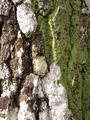
layers of timeby lizbeth010Comment: very dark, and with very low contrast - by dark I mean tha your brightest pointin this image is really very very grey. Some small sense of skin texture, but that very moderate lighting has not helped display that. But that lack of anything approaching white is doing it more harm than anything. |
 Photographer found comment helpful. Photographer found comment helpful. |
| 02/20/2004 02:37:41 PM |
The Texture of Memoryby Brooklyn513Comment: Somehow the high-contrast look of this stone has lost the real feel of the surface of the momument - the text appears almost like print, rather than carving. Not a big fan of the composition either - unbalanced toward the bottom half of frame, I think. |
| Photographer found comment helpful. |
| 02/20/2004 02:35:44 PM |
Interwovenby BBBastetComment: I perhaps see your point, but the fringes of these ares of colour are messy and disorganised I find it difficult to like. The lighting isn't helping any either, being pretty flat, and the exposure could have made a brighter image - it's all very muddy looking here. |
| 02/20/2004 02:34:19 PM |
lines in my houseby bergandComment: Lacks a sense of texture to the most extreme extent - really difficult to say whether thisis shadowing or colouring here: the almost perfectly fklat lighting might be useful in another context, but in this I fear it has rather undermined your submission. |
| 02/20/2004 02:32:57 PM |
cataclysmic tamingby xburnerxComment: Good muted photo - a sense of the ominous from it - really good definition on the cotton. well framed, well composed, and beautiful lighting. I must say that I don't understand your title however. |
| Photographer found comment helpful. |
| 02/20/2004 02:30:32 PM |
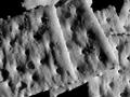
CrystalStoneby MigffComment: I get the stange sense from thsi that these two objects lie either side of the focal plane. Don't know what makes me think that. Thre's an over-processed, or poorly-processed look to the whole thing that is really not good, and loses all the fine detail of the image for you. |
| 02/20/2004 02:28:01 PM |
Nature's Canvasby brett2004Comment: Great colours here, and good sense of feel. Despite the interest of those colours, I find this lacks a real sense of subject, of something to catch and hold my attention. |
| Photographer found comment helpful. |
| 02/20/2004 02:24:45 PM |
Coaster Artby Adrian TungComment: I find this a confising composition - the geometry of these forms is displayed in a slightly too busy manner, with the weight of the composition perhaps too heavily pushed toward the right of frame. Good tonally, and the focus is fine, but whether it's the lighting or the fine detail something has removed a sense of real texture from this to my eye. |
| Photographer found comment helpful. |
| 02/20/2004 02:22:08 PM |
Saltinesby gpiersonComment: Pure texture almost, and really very little else maybe. but as that was the challenge theme ... I find the composition a touch trying, with little to ease the eye through the frame and the subjects. Good effort though. |
| Photographer found comment helpful. |
| 02/20/2004 02:19:30 PM |
Tomorrow: Generally sunny. Very cold. High 18F. Winds NW at 10 to 20 mph.by basia03Comment: Good work this - and like the title. I think it such a simple composition you mgith need to really centre the eyes both in the gap of the woollen, and more evenly in frame - that left eye is perahps too far out of things. Good sense of the prickly warmth of the wool, and good rendition of the colours - just a touch over-exposed on the white parts of the pattern though. |
| Photographer found comment helpful. |
Home -
Challenges -
Community -
League -
Photos -
Cameras -
Lenses -
Learn -
Help -
Terms of Use -
Privacy -
Top ^
DPChallenge, and website content and design, Copyright © 2001-2025 Challenging Technologies, LLC.
All digital photo copyrights belong to the photographers and may not be used without permission.
Current Server Time: 09/04/2025 02:08:15 AM EDT.