| Image |
Comment |
| 04/05/2004 05:34:32 PM |
Delicious Mint in Delightful Marchby mirdonamyComment: Pure on-board flash removes any element of depth, and much of texture from this. processing is poor too - if you're going to over-expose most of the plate, then why not all of it? Food photography has come on loads in the past few years - take alook at Jonathan Lovekin's work, amongst others, and compare ... |
 Photographer found comment helpful. Photographer found comment helpful. |
| 04/05/2004 05:31:49 PM |
Enshroudedby ChaszmyrComment: Oh man this could have been such an enormous image with the contrast pushed and converted to black and white. It would accentuate the graphic element, and the colour element here is really serving no great purpose. Good shooting though. Love the breaks of light through the clouds. |
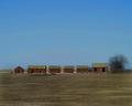
| 04/05/2004 05:27:58 PM |
Prarie Lineby leafComment: The first note is that I see some banding in the sky - and i've checked and don't see it on similarly graded tonal images, so i think it must be in your picture.
Like the idea though - there's a bleakness, an isolation and desolation about it. Not completely convinced about the execution though - and i think that is down to the moment of light you've chosen - or perhaps even the point of view. Did you try getting right down to the ground, so that the barns formed more of a horizon, or at least less horizon was visible beyond them? They somehow don't seem to impose themselves enough on this image, and I think that might have helped. |
| Photographer found comment helpful. |
| 04/05/2004 05:22:53 PM |
Foot Bridgeby OlyuziComment: The muted tones are lovely - very well done. There seems to be an absence of sharpness, somewhere, or perhaps rather of detail. I'm not convinced by the composition, i think: my eye drifts away from the bridge, but not particularly toward anything. |
| Photographer found comment helpful. |
| 04/05/2004 05:20:12 PM |
A Monarch Butterflyby trainComment: great detail, good pop in the colours, intersting composition with those diagonal lines. A hint, perhaps of over-sharpening? The edges of things seem a touch blocky, like the real smoothness of the detail is lost - though it could be the bright light, or even a camera thing (not a Fuji 7000 shot is it? They're supposed to do that.) I like it though - like the camouflage/obvious thing to it. |
| Photographer found comment helpful. |
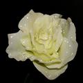
| 04/05/2004 05:17:31 PM |
Artificial Beautyby ChiquiComment: Enjoy the scattering of water, and the capturing of that effect - you've really made them sparkle, a la Man Ray. The lighting on the flower itself could have been a bit more careful though - some areas of it appear quite flat, and there is a sense of softness of focus (as opposed to soft focus), that doesn't help for me. |
| Photographer found comment helpful. |
| 04/05/2004 05:14:32 PM |
Aging Ironby chasmoComment: Your processing ... my first thought on seeing this shot is 'oh no, it looks like there was a great sense of age and subtlety of tone here, and it's been ruined...'. It looks like a good composition - quite difficult to spot in these metal studies, and you seem to have pulled it off. I really can't see any benefit gained from that processing though - perhaps something of an aging effect - but did it really need it? |
| 04/05/2004 05:11:17 PM |
Bloom, In Greenby ScottKComment: Interesting shapes and textures. I think a tighter crop might have added to the impact of the near-abstract quality here - those small areas of just visible background seem to 'place' the subject too much, and the image to me doesn't seem to need that context. I wonder if shooting directly into the centre of the plant might have given a more pleasing composition - a centre for the eye to be drawn to, perhaps? That might also have entailed waiting for a different light, too ... |
| Photographer found comment helpful. |
| 04/05/2004 05:08:23 PM |
KFCby Beerme425Comment: great close-up, and a real senses of character in the thing too. Colour is excellent, croppingworks well as it draws the eye toward the head and the eye. It may only be the reflectted light, but there's a sense of over-sharpening around the red areas, and perhaps a little detail lost - hand-held shooting, or a moving target and a not-quite-fast-enough shutter? |
| Photographer found comment helpful. |
| 04/05/2004 01:06:37 PM |
|
| Photographer found comment helpful. |
Home -
Challenges -
Community -
League -
Photos -
Cameras -
Lenses -
Learn -
Help -
Terms of Use -
Privacy -
Top ^
DPChallenge, and website content and design, Copyright © 2001-2025 Challenging Technologies, LLC.
All digital photo copyrights belong to the photographers and may not be used without permission.
Current Server Time: 08/30/2025 04:18:12 PM EDT.