|
|
|
Showing 2141 - 2150 of ~3604 |
| Image |
Comment |
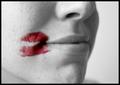
| 06/21/2004 01:41:26 PM | A Kiss in the Corner of Her Mouthby JesuispeureComment: Overtones of lesbianism here? Somehow I'm not sure - it's such a placid shot, such a gentle tonal range and gentle focus, I would perhaps have expected something more heavily worked. But I like that dichotomy, anyway. Good work. 7 |  Photographer found comment helpful. Photographer found comment helpful. |
| 06/21/2004 01:37:26 PM | The Color of Summerby nbortonComment: Fun action shot - but I don't think the de-sat actually works for this subject: to my eye, the fun of the shot is in the guy's expression, and the spray of the water. The colour in the inflatable puts the subject there, and this creates a conflict which to me doesn't help the shot. 5 | | Photographer found comment helpful. |
| 06/21/2004 01:33:02 PM | Stomp Boxby Thousands_FallComment: Don't see anything much here, I'm afraid. The focus seems a bit arbitrary, as does the composition, and the de-sat adds little to the impact. 2 |
| 06/20/2004 06:50:04 PM | Flightby zeus68Comment: The obvious, brief-glance comment would be to moan about he centred composition ... but of course this is not centred. The cleanliness of the aircraft, and the dissipation of the contrail into a murky brown that speaks of pollution, especially against the deepest blue suffusion of the sky brings the political to this image; some suggestion of the battle of the giant airlines against the perception of their trade as damaging to our world - everything must be shiny bright, but leaves a trail of waste and poisons. The bluntness of the placing of the plane in frame adds to this effect beautifully, disrupting that almost complete darkness. 9 |
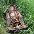
| 06/20/2004 06:06:18 PM | There was a time when it was lovedby scottwilsonComment: My immediate feeling on seeing this, is that somewhere around this subject there's a wonderful shot waiting to get out, but that this looks like the kind of thing taken to remind one of the situation, in order to go back later. The contrast of life and death, rust and green, is tempting, but this for me is too obvious, too straightforward. Get personal with it - get low daown and try and create weird landscapes across the rusted car, with the greenery forming an horizon, or a foreground, or concentrate on the strange angles around that exposed subframe ... there must be magical images here :-)
The composition is what mostly makes this look like a reminder shot: positioning of the car in frame seems arbitrary, from centre bottom to mid centre top - it doesn't lead me anywhere, doesn't point up the contrast of metal and plants. 5 | | Photographer found comment helpful. |
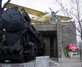
| 06/20/2004 06:00:15 PM | Plane and Train, Budapestby stuartComment: Confused composition - trees, odd positioning in frame of the two primary subjects, overlapping of subjects, profusion of geometry with the square architecture, and the more organic train, the blocky currves of the plane, the more modern curves of the other train, and then the trees - all makes it difficult to get into this image. Looks like not a good day for light, either: very very general, very blank illumination on everything, nothing to bring the eye to a primary focus anywhere. 4 |
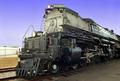
| 06/20/2004 05:56:11 PM | Engine # 3985by jab119Comment: Ah, proper grown-up light - I like this. Brings out the almost scuptural engineering of the beast. Wonderfully well done technically. Cropping bother a touch - why not simply glory in the definition of the metal, and plonk the old thing full frame? The angle of view you've chosen, and the complementary angles of the front of the train and the top would place the front of the engine right on the happy thirds line, and also might rid the shot of the slight feeling that you've cropped to hide something at the back of it. That visible background frame left, for me, adds nothing here - let it impose itself on us! But great work - great detail, great tonality, and great subject - real feeling of power. 8 | | Photographer found comment helpful. |
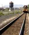
| 06/20/2004 05:49:53 PM | Coming Through Townby drgsoellComment: Focus is really bizarre in this - have you softened it? Like the leading lines effect, though the solidity of the water tower pulls the eye quite strongly too - in fact might form an intersting balance t the primary compositional elements of the rails and the engine. Burnt out sky, and those poles and posts seem cluttered rather than evocative. 4 | | Photographer found comment helpful. |
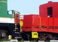
| 06/20/2004 05:47:01 PM | The Colors of Trainsby wetlandComment: Nie and bright, but the composition doesn't work for me: I don't find this particular conjunction of trains terribly interesting - in fact I want to focus on the yellow against the red of the further wagon, and the geometry of those hand rails. The bits of background visible beneath, and the weeds in front also confuse the focus of attention, I think. Rendering of the red and yellow is very strong though. 5 | | Photographer found comment helpful. |
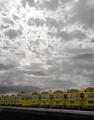
| 06/20/2004 05:44:12 PM | Yellowby RoosterComment: De-sat is effective, and hasn't harmed the effect of light in the sky too much, though perhaps some work to darken the (formerly) blue areas might have paid off? Like the composition very much, but would wish for a little more impact from the yellow of the buses - they all seem a touch muted to me. 6 | | Photographer found comment helpful. |
|
Showing 2141 - 2150 of ~3604 |
Home -
Challenges -
Community -
League -
Photos -
Cameras -
Lenses -
Learn -
Help -
Terms of Use -
Privacy -
Top ^
DPChallenge, and website content and design, Copyright © 2001-2025 Challenging Technologies, LLC.
All digital photo copyrights belong to the photographers and may not be used without permission.
Current Server Time: 08/29/2025 06:04:17 AM EDT.
|