| Image |
Comment |
| 06/29/2004 02:50:58 AM |
I can hear musicby RUEDISCHMUTZComment: Background issue here - looks like someone's living-room. Good light, good pose and capture - apart from that background couldn't criticise at all. 6 |
 Photographer found comment helpful. Photographer found comment helpful. |
| 06/29/2004 02:49:29 AM |
Dreamerby NazgulComment: The uplighting is a touch strong for me - gives a slightly sinister quality, especially in the way it accentuates the eyebrow ridge. A good attempt though - quite enjoy the different poitioning within frame. A touch of shininess too - but minor. 6 |
| Photographer found comment helpful. |
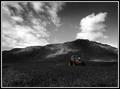
| 06/24/2004 07:10:18 PM |
A Days Workby arnitComment: Fine work indeed. The real touch that I like here is the inclusion of the entirety of the tractor and whatever the hell it's towing. great light on the hills, good sky - perhaps a slight loss of impact in the foreground - would like to have seen the contrast taken a touch further there, or perhaps simply more of the crop included but that's a minor thing I think, and no doubt subject to compositional constraints. 8 |
| 06/23/2004 01:20:32 PM |
"Julia"by grigrigirlComment: Very fine portrait indeed, depite the contrived-looking pose. great definition, good use of de-sat, and wonderful tonality. Just pushed a touch too far in the self-consciousness stakes for me to put it in my faves, but it's close. |
| Photographer found comment helpful. |
| 06/23/2004 01:17:15 PM |
Blue skyby MotoCycleBoiComment: Good capture - shows patience, I suspect, and perseverance. Good tones in both the black and white and colour areas, and a great moment of light on the flag. Whilst I suppose it follows the thirds rule, I think it does so too slavishly: the out of focus area of the pole has become too dominant in the image for my liking, and the placement of the flag seems low in the frame: that space towards top and left seems unuseful. 6 |
| Photographer found comment helpful. |
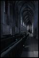
| 06/23/2004 01:07:15 PM |
Street Bistroby RUEDISCHMUTZComment: Goood work. There are strong leading lines in this shot which don't quite work with your choice of desaturation subject - rather against: they pull my eye toward that brighter area behind the guy at the table ... I wonder if that bloke himself might have made a stronger subject than the sunshade? The black and whie element is strong, and the colour is good also - I just have those small reservations. |
| Photographer found comment helpful. |
| 06/23/2004 06:38:10 AM |
Admire or Prayby jonpinkComment: Originally posted by wasifs:
how 'bout getting the lighting right and sticking to the contest subject |
Oh dear ... still, I guess we've got to take the rough with the smooth. Like this shot Jon (and glad you're still submitting - thought you'd deserted us) - has a Beguinicity (to coin a word) about it. Like the sombreness, the tonality, though personally I might have worked to bring in a touch more contrast and brightness - it just begins to put most of its interest into the darker half of the available shades to my eye. Subtleties though, rather than glaring points.
And of course, it scored so low because folks won't bring their own ideas to shots, they want it all from you (and who am I to say that's wrong?) |
| 06/23/2004 06:07:11 AM |
Yellowby cbellerComment: For me, your yellow key line in the frame here is a mistake - it amkes the frame part of the picture, rather than something to isolate the picture from its surroundings, precisely because you've used that colour as your choice in the image. The remaining colour in the eyes looks so unreal too - I really do think you should have desaturated those areas also. There's also a pull introduced by your cropping between the face and the flower and the negative space image right - but I don't see a purpose of that negative space here, other than to place the flower on the cntre of image, which I think is weak, compositionally. I like the softness of the image, has a suitability for what feels quite old-time, but I also think you could have found some more definition with your lighting - more depth. All of which sounds hyper-critical, but actually to my eye you're not far off something rather nice here. 6 |
| Photographer found comment helpful. |
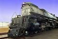
| 06/21/2004 01:51:29 PM |
Engine # 3985by jab119Comment: 6.2something isn't bad I guess, nor is 23rd ... but I still think this is under-rated. Good work James |
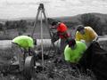
| 06/21/2004 01:45:25 PM |
Men At Workby GalimagesComment: Reminds me of Kiwi's composite shots - I think it's the de-sat that's doing that, and the fact that all the guys seem to be the same build. Also have the slightly bizarre impression that the cable being fed in by one set of blokes is what the other two are looking for. |
Home -
Challenges -
Community -
League -
Photos -
Cameras -
Lenses -
Learn -
Help -
Terms of Use -
Privacy -
Top ^
DPChallenge, and website content and design, Copyright © 2001-2025 Challenging Technologies, LLC.
All digital photo copyrights belong to the photographers and may not be used without permission.
Current Server Time: 08/29/2025 07:18:39 AM EDT.