| Image |
Comment |
| 08/09/2004 01:46:38 PM |
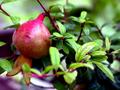
Pomogarnadeby mamcgComment: Don't really get this, I'm afraid, in the context of the challenge. Difficult to be sure what your intention was, and the challenge idea was itself so nebulous ...
There's some good stuff here though - the depth of green on the leaves, and some of the detail, but I don't find anything that really grabs my attention here. |
| 08/09/2004 01:37:38 PM |
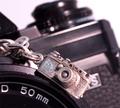
the nitsby supermaxComment: Strange composition - there's something intriguing here though. It seems obvious that these must be miniature cars, but exactly what it is that communicates that is different to pin down as one looks - especially given details like the mud-spatters (it seems) on the nearer one. Depth of field is strange - don't really feel like there's a point to grab the attention here. The deception is good (though of course, a closer look allows the shut-lines, the warp of the cloth they're on, the radiator panels etc. to give things away). I'm not going to penalise you for it, as i think it was poorly worded, but I think you've gone diametrically against the challenge, by the way. 6 |
| 08/09/2004 12:46:31 PM |
Catch upby k4ffyComment: Something very odd happening with colour balance here - that fade to very stronf yellow in the background, and the 'oranging' of the big tomato. I don't like this composition - don't see the point or use of the large area of dead space at top. |
 Photographer found comment helpful. Photographer found comment helpful. |
| 08/09/2004 12:43:56 PM |
Pick A Card...by bizess357Comment: Tricky with lighting - I actually like the area of daylight (?) top right, but I guess you'll get a few comments against it. The noise in the areas around the main light area is annoying, a touch: the fade through red, rather than the fact of it's fading, looks kind of messy, especially given the blue surrounding areas. Perhaps just a WB thing, but I don't see that it helps any. |
| 08/09/2004 12:40:03 PM |
Addictionby digistouneComment: A touch more care would have had you remove those dust specks from the lens. Neat composition. Like the mix of warm and cold light - always effective in communicating shape and yet letting us see everything. |
| Photographer found comment helpful. |
| 08/09/2004 12:37:31 PM |
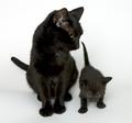
I shall call him... MiniMeby dan_pendletonComment: Pretty good stuff - to my eye, you could have pushed the high-key background thing a touch more, and the mid-tone point is on the dark side: but you get the benefit of the doubt with folks' variations in monitors. Detail is good, poses good (luck or patience?). |
| Photographer found comment helpful. |
| 07/26/2004 05:38:33 PM |
Diseased Purple Cowsby DefyTimeComment: I have no intention of voting on this challenge, it's just too weird, but this has made me laugh so hard it shouldn't be legal. Absolutely fantastic work, just magic. I'll put a ten here so the comment registers, but expect it to disappear :-) |
| Photographer found comment helpful. |
| 07/21/2004 07:34:48 PM |
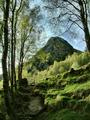
Ben A`anby geewhyComment: I think this may be a better photo, Gordon. I much prefer the subtlety, and the distribution of light, not to mention the distribution of your attention to processing here than in the ribbon winner. To see the roots and mud around them adds enormously to the impact - both in terms of settling the image, and in giving us a range of distance in the shot. It's more complicated than the other, or course - and equally of course, the more fascinating for it. |
| Photographer found comment helpful. |
| 07/19/2004 06:19:18 PM |
|
| Photographer found comment helpful. |
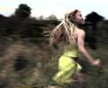
| 07/19/2004 06:16:20 PM |
Like the Windby ImagineerComment: Focus Focus! I'm sure you don't need telling to ignore those cries, but another vote of confidence won't hurt, I'm sure. I never had the time to round to voting on everything, let alone adjusting those votes to their final standings, but this would i think have been high up that list, if not at the top. Sure some folks just don't go for the stylised thing, but some fine judges have approved wholeheartedly too.
I get the impression that you achieved exactly what you were after - truly competent work. One thing only would I change: that slightly weird heart-shaped patch of darkness image left (or eye shaped) - once seen it can't be escaped, and IMO of course, doesn't add anything.
And the first shot I've added to favourites in a while. Message edited by author 2004-07-19 18:16:53. |
| Photographer found comment helpful. |
Home -
Challenges -
Community -
League -
Photos -
Cameras -
Lenses -
Learn -
Help -
Terms of Use -
Privacy -
Top ^
DPChallenge, and website content and design, Copyright © 2001-2025 Challenging Technologies, LLC.
All digital photo copyrights belong to the photographers and may not be used without permission.
Current Server Time: 08/28/2025 11:14:01 PM EDT.