|
|
|
Showing 2021 - 2030 of ~3604 |
| Image |
Comment |
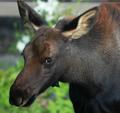
| 09/07/2004 07:51:40 PM | "Wildlife Can Seem Omnipresent In Yellowstone Country"by GallatinComment: One of the few 'rules' around photography that I can't think of any exceptions for is the one that says when shooting wildlife always have the eyes in focus - the rest can be effect, just have the eyes. This seems more about the things' neck, I'm afraid. |
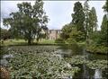
| 09/07/2004 07:49:32 PM | Wakehurst Placeby marboComment: Something just doesn't quite ... Don't know, maybe just the light. You've plainly tried hard to bring some interest back into the sky, almost successfully, though it still seems a touch over exposed. Maybe composition - I appreciate the desire to show the lillies, but not convinced that they add to enough to warrant demoting the interest in the house and it's framing trees. The quality of light on the stone seems really good, which just makes it a bit more annoying that you haven't concentrated on that. The masterful shot, it seems to me, and for this challenge, would be the house and the trees. Close though, for all my griping. |  Photographer found comment helpful. Photographer found comment helpful. |
| 09/07/2004 07:43:59 PM | Minneapolisby wickedpeteComment: Ideal kind of subject, though that harsh light of the midday sun really doesn't help a large part of your image - quite effective, as it tends to be, on the strong graphic lines of the spoon (I know about shooting cutlery, you see:-), but basically just unattractive on the more organic shapes, the more usual and regular stuff like the trees and the buildings. And yet i could quite well imagine it published. Gets you a 7 |
| 09/07/2004 07:38:39 PM | Memorial Church, Stanford, Californiaby arpitaComment: Perfect subject, almost technically perfectly executed - just a sense of oversharpening about it - that slightly granular feel, like a very fine pixelation. can absolutely imagein it published, but I don't think it would detain me very long as photography - 7 |
| 09/07/2004 07:36:37 PM | Visit Artspost/Open rain or shine/Free entry to allby trainComment: Neither one thing nor the other, for me. The crazy angle might have been effective had you kept solely the colours and fframe-work in shot. The contextual elements of sky and pavement absolutely root it, and lose that impact. now it sems like a competent documentary shot given a wild tilt because it was felt to lack interest otherwise. Can you really iagine this being preinted in a guide book? I'm afraid I can't, personally. Abunch of good technical stuff, but let down by that odd compositional decision. |
| 09/07/2004 07:31:32 PM | Capitol Interludeby blemtComment: The balance of this is upset a touch by the figures' closeness to the frame and the space above the monument. I feel that I'm being lead to expect something in the sky there, and I don't find it - not even visual interest in the sky. Good overall idea though, for this challenge. Light is a touch bland - contrast could have been pushed further without harming things? | | Photographer found comment helpful. |
| 09/07/2004 07:28:42 PM | Paradise Parkby BobsterLobsterComment: As a portrait I miss some light to shape the back of the head, and to emphasise the glint of feathers. For this challenge, I'm not wholly sold on the absence of location. I could imagine it published in a guide, but were I editing I might prefer a similar shot with a sense of place to it. Not a major point perhaps, but significant. Great tonality, especially that eye; depth of field a little shallow? Sense of blurring around the outline of the beak seems odd in this composition. | | Photographer found comment helpful. |
| 09/07/2004 07:25:41 PM | Vancouver BCby CantiqueComment: Near perfect for the challenge. Ordinarily I would find it quite bland, but this challenge somehow requires an element of that, I feel. Use of foreground to balance the classic waterside city view is spot on, maintaining interest and allowing motion for the eye, without ever trapping the visiion in one place. As an illustration of a place it has both the grand sweeep and the detail, the sense of some understanding rather than the grand gesture. I would perhaps have liked a touch of graduation of light, a slightly greater sense of distance maybe, but that's looking for the ideal, and in this instance you're prettty close. | | Photographer found comment helpful. |
| 09/07/2004 07:21:42 PM | World’s Largest Canoe Races Comes to Kona Each Septemberby scottwilsonComment: Can't see what is achieved by confining the interst of the image to the centre third of the composition here. It makes for uncomfortable viewing you see: as the eye moves through the subject area, one is constantly aware of the parallel space above and below, and one's eye is thus constantly drawn there - except there is nothing happening of real interest in either space - a very blank sky, and the reflections are not broken in an interesting manner, just seem very ordinary. As one's eye moves back up or down the frame, of course one is drawn to the other, opposite third of the image, where like wise there isn't much interest. the trick, the point of the 'thirds' composition is that whilst the eye is drawn away from the main subject, it is then returned to it, rather than to the other side of it, and it is that movement of area of concentration that helps the visual interest - generally, a better photo is one where the eye is required to move through the image, but which ensures it is not often allowed to find areas of little interest.
For this challenge, I would personally have cropped out a good deal of the water - given it's subject, this is not a challenge for experimentation.
Sorry to go on, but a lot of folks I guesss will make comments about centred composition, and this is an attempt to explain why, in this case, it's a bad thing. Your subject, however, is perfect for the challenge. A 5 | | Photographer found comment helpful. |
| 09/07/2004 07:13:59 PM | Enchanted BCby zeuszenComment: There's an awful lot to really like here - a fabulous image. Is it drawn? It seems as though it could have been, or of course it could be a heavily mangled photograph. Outwith the intentions of dpc though, but nevertheless a great picture. | | Photographer found comment helpful. |
|
Showing 2021 - 2030 of ~3604 |
Home -
Challenges -
Community -
League -
Photos -
Cameras -
Lenses -
Learn -
Help -
Terms of Use -
Privacy -
Top ^
DPChallenge, and website content and design, Copyright © 2001-2025 Challenging Technologies, LLC.
All digital photo copyrights belong to the photographers and may not be used without permission.
Current Server Time: 08/28/2025 04:15:35 AM EDT.
|