| Image |
Comment |
| 11/26/2004 04:42:41 AM |
Monuments to a Time Passedby slynneblarpComment: The smallness, and even so the lack of a sense of detail here makes me wonder - it has a near impressionistic feel because of that. Most will certainly mark you down for size issues - and I must, in the end, agree with them. |
| 11/26/2004 04:41:11 AM |
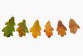
Seasons come, Seasons goby eojedaaComment: I'm no fan of high-key in general, and i can't see a point of it here for sure. Taking the white to this point of absolutel computer white is pretty heavy going on the eye, especially where your subject seems battered by it. Little sense of texture here, little sense of three-dimensionality to the leaves. |
 Photographer found comment helpful. Photographer found comment helpful. |
| 11/26/2004 04:38:20 AM |
Rings of timeby Dim7Comment: I'm not sure it's necessary to show the entirety of the tree to get your point across here; by doing that you've inevitably included a large amount of background, and that background isn't so strong - the clutter of leaves, trees, sky, grass just feels messy here, and doesn't add to your real point, surely? Also the rings are only really visible in one part of the tree - right beside those interestingly shaped cracks. I wonder that you haven't concentrated on just that area, filling the frame with tree would make it much more effective (much simpler, really). There's little sense of light here also - very blank and ordinary seeming. |
| Photographer found comment helpful. |
| 11/26/2004 04:34:27 AM |
phoneboothby HokaheyComment: The centring of your subject makes me feel that there should be another element to the image which really makes the point, but I don't find anything. The variety of light trails is good. It's very hard with this composition for the phone booths to hold my eye - I find myself constantly drifting to other areas of the image. |
| 11/26/2004 04:32:11 AM |
early morning hoursby t_onlineComment: Good exposure - a tricky blance to achieve between your lighting and tthe brightness of the flames. There's a cold sense to the image, for me - not quite sure from what, it might be the light on the melted wax. |
| Photographer found comment helpful. |
| 11/26/2004 04:29:53 AM |
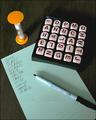
Write Faster!by alsatiaComment: Most have gone for a sense of the slow movement of time - I like that you've chosen the idea of time pressure instead. The composition is very nearly too busy - though I think you get away with it, just. The poor image quality (white balance, focus or processing making it fuzzy, sharpening halos, odd colour artefacts around the letter dice) really lets it down I feel - can't see an effective point of it. |
| 11/26/2004 04:26:51 AM |
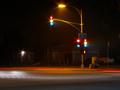
Stop or Go?by rkligmanComment: Missing amber? Seems odd to have chosen this set of lights, as that unusual feature, for me, detracts fro the strong sense of a deserted street - the idea of time continuing to pass at night is very strong.The light trails from the car(s) are almost unnoticeable, as they meet the line of the pavement so closely. I wonder if there's enough impact to catch the eye of the rapid voter? |
| 11/26/2004 04:23:43 AM |
Holes In Timeby Rando D300Comment: I think, for this challenge, I'd have wanted to emphasise the rings of the tree somewhat - they're hardly visible here. Compositionally effective. |
| Photographer found comment helpful. |
| 11/26/2004 04:22:14 AM |
5 O'Clock Shadowby K-RobComment: I like the fundamental composition - there's a non-glamourous sense of shine to the skin, the bright white lines image left. those and the balance of mouth and curve of jaw make for a engaging photo. |
| Photographer found comment helpful. |
| 11/26/2004 04:18:40 AM |
TIMEby graphicfunkComment: Interesting approach. The composition is very cluttered - so many different things, and they seem almost haphazardly organised. Light reasonably effective on the digicam, but becomes very weak and flat in the background areas - actually has a feel of the muted tones of an old photograph, which does have an effect. The clock feels forced into the composition (to emphasise meeting the challenge, perhaps?), where something along the lines of a calendar might have been more effective? Your biggest problem in terms of dpc score, however, is certainly the very busy composition, and fairly common idea. Good luck. |
| Photographer found comment helpful. |
Home -
Challenges -
Community -
League -
Photos -
Cameras -
Lenses -
Learn -
Help -
Terms of Use -
Privacy -
Top ^
DPChallenge, and website content and design, Copyright © 2001-2025 Challenging Technologies, LLC.
All digital photo copyrights belong to the photographers and may not be used without permission.
Current Server Time: 08/27/2025 03:25:57 AM EDT.