| Image |
Comment |
| 11/27/2004 10:13:00 AM |
Architecture Past And Presentby GolferDDSComment: Whilst I like the way you've fitted these into your frame, I eally do find the completely burrnt-out sky more of an annoyance than a useful contribution: the image becomes almost more about that white shape than about the architecture. |
 Photographer found comment helpful. Photographer found comment helpful. |
| 11/27/2004 10:09:56 AM |
"Just Passing Time"by tfarrell23Comment: Carefully done, indeed. Feels a touch over-posed for me: there's little realistic about tthe placing of the pencil, nor the hyper-sharpness of it. I get what you were heading for, I think, but for me it turns it into a simply posed image, rather than anything particularly communicative. |
| Photographer found comment helpful. |
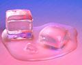
| 11/27/2004 10:08:06 AM |
Solid2Liquidby EddyGComment: Neat, careful, good use of colour. Taking the colour so very far away from black I think works to give the image that neon punch, though the obvious downside of it is to stifle any strong sense of depth. Not sure about it, in the end. |
| Photographer found comment helpful. |
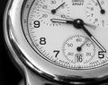
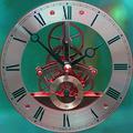
| 11/27/2004 10:06:05 AM |
Three Secondsby mickwestComment: Quite apart from the sharpening artefacts around the numbers and face markings, it is the scratches and disorganised reflections in the face surround that most let this image down for me: they remove from the clean lines, the stylishness of the image, but yet there doesn't seem to be an age factor, a history, a story of use that you're communicating here. The composition of the circle of the face in the frame is strong - not an easy thing to get right - and the positions of the hands and movements of them are clear. |
| Photographer found comment helpful. |
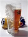
| 11/27/2004 10:01:44 AM |
An Evening With Friendsby cbonsallComment: Nicely executed trick - though I'm not certain about your light: seems quie heavy - the reflections so very bright, but the subjects seeming a touch indistinct. Pity you couldn't have got the glass more precisely half and half - I think these kinds of trick work really do need care in such areas. |
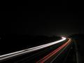
| 11/27/2004 09:58:52 AM |
Heading into the nightby orvaratliComment: Excellent composition, strong sense of dark, like the stars. A couple of things, which i think matter in such a simple composition: the break in the white trails, and the white spot extreme left: I would certainly have cloned them out myself. But an impressive go at a pretty common type of image, all the same. |
| Photographer found comment helpful. |
| 11/27/2004 09:55:59 AM |
Abstract Timeby MorganComment: I appreciate that this is as big a file as you could enter, but nevertheless I think the jpeg artefacts present - certainly around the smaller cogs and dials, and in the intense red and green colours - cause more sense of confucion than of anything else. Quite strange in all - just not, I'm afriad, in a way that particularly appeals here. |
| Photographer found comment helpful. |
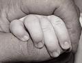
| 11/27/2004 09:52:43 AM |
Generationsby BudComment: I think this needs a softness of light, and of direction of light, that you haven't achieved: this way leaves all the skin seeming quite shiny and ugly. The composition also seems quite threatening - i'm not sure that's what you intend. The adult fist being closed over those small fingers speaks more of enclosure, of suffocation, than of gentleness. I don't know - maybe you intended a more sinister image - it would be unusual for a challenge entry for sure, and it's hard to be certain. |
| Photographer found comment helpful. |
| 11/27/2004 09:48:51 AM |
Eroding Sunsetby mirdonamyComment: A slightly too lengthy exposure? Only slightly - just enough for the water to seem not properly focussed: not enough to be blurred exactly, but certainly without the crispness of sharp focus. As the rock silhouette seems OK, it almost has to be motion blur. I'm also not sure about the way you've placed the horizon relative to the rocks. |
| Photographer found comment helpful. |
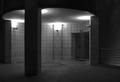
| 11/27/2004 04:53:11 AM |
Architecture At Nightby gpgeminiComment: Not the kind of thing that appeals here - on dpc I mean - so that will have hurt your score more than anything. I like it though - the strict organisation of both the architecture and your POV and crop which suit it admirably. I don't know if I would have used simply the blue channel - a single channel always tends to be very noisy. Don't get me wrong, I'm a fan of some noise (viz. my own entries), but I think here it rather dominates too much. But it's fun work, and I think a top photograph, certainly in potential, possibly let down just be that (for me) excessive noise. I can see that it helps the feel - but I think a more reserved use of it would not remove that element, and keep a tidier feel suiting the highly organised image.
E |
Home -
Challenges -
Community -
League -
Photos -
Cameras -
Lenses -
Learn -
Help -
Terms of Use -
Privacy -
Top ^
DPChallenge, and website content and design, Copyright © 2001-2025 Challenging Technologies, LLC.
All digital photo copyrights belong to the photographers and may not be used without permission.
Current Server Time: 08/27/2025 12:04:54 AM EDT.