| Image |
Comment |
| 11/27/2004 09:52:43 AM |
Generationsby BudComment: I think this needs a softness of light, and of direction of light, that you haven't achieved: this way leaves all the skin seeming quite shiny and ugly. The composition also seems quite threatening - i'm not sure that's what you intend. The adult fist being closed over those small fingers speaks more of enclosure, of suffocation, than of gentleness. I don't know - maybe you intended a more sinister image - it would be unusual for a challenge entry for sure, and it's hard to be certain. |
 Photographer found comment helpful. Photographer found comment helpful. |
| 11/27/2004 09:48:51 AM |
Eroding Sunsetby mirdonamyComment: A slightly too lengthy exposure? Only slightly - just enough for the water to seem not properly focussed: not enough to be blurred exactly, but certainly without the crispness of sharp focus. As the rock silhouette seems OK, it almost has to be motion blur. I'm also not sure about the way you've placed the horizon relative to the rocks. |
| Photographer found comment helpful. |
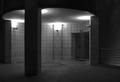
| 11/27/2004 04:53:11 AM |
Architecture At Nightby gpgeminiComment: Not the kind of thing that appeals here - on dpc I mean - so that will have hurt your score more than anything. I like it though - the strict organisation of both the architecture and your POV and crop which suit it admirably. I don't know if I would have used simply the blue channel - a single channel always tends to be very noisy. Don't get me wrong, I'm a fan of some noise (viz. my own entries), but I think here it rather dominates too much. But it's fun work, and I think a top photograph, certainly in potential, possibly let down just be that (for me) excessive noise. I can see that it helps the feel - but I think a more reserved use of it would not remove that element, and keep a tidier feel suiting the highly organised image.
E |
| 11/27/2004 04:31:43 AM |
Hourglassby PerezDesignGroupComment: Technically excellent study - like the background progression of light: really adds that little interest to the negative space, and pulls the eye to the subject. (I've used background light like this myself, and usually been knocked in comments for it - intrigued to know if you're getting something similar). Strong sense of texture on the wood. Just the slightest sense (and it's more significant in such a contrlled an simple image) of too much sharpening in some edges of the wood - top right especially. |
| Photographer found comment helpful. |
| 11/27/2004 04:27:08 AM |
Oreo Eulogyby wkoffelComment: Very clever; can't say it does much for me photographically. I wonder if you haven't sacrificed a sense of depth and power of light in the process of the trick. |
| Photographer found comment helpful. |
| 11/27/2004 04:25:27 AM |
Winter Migrationby GeneralEComment: A clear technical meeting of the challenge - no, that doesn't read like I mean it (it's a compliment). I mean that the element of passing time is a camera-relevant one, rather than subject-based. I love that you haven't gone to black for your background. I love the intent of this too. Great shot, I hope it does wildly better than I expect it to ;-) |
| Photographer found comment helpful. |
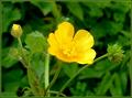
| 11/27/2004 04:21:38 AM |
Bud-flower-seed.....seed- bud- flowerby trainComment: This strong composition is just a touch let down by that semi-focussed stalk image left - adds a touch of confusion to the visual progression through your three subjects. Good colour - perhaps the yellows on the flower are just a fraction over-done? I feel that some areas have lost detail. Neat approach to the challenge though. |
| 11/27/2004 04:18:45 AM |
What's Next?by fotodudeComment: Good high-key work - thank god you haven't gone for the 'perfectly' white background which is so annoying to the eye. I can't say I like the composition of subject very much - though it does have a strong element of recession to it, I think it has become too complicated; my temptation would be to have lined them up more, use a stronger diagonal composition ... but I'm not certain that would work any better :-) A pretty common subject approach too. |
| Photographer found comment helpful. |
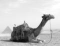
| 11/27/2004 04:14:08 AM |
Pyramids of Egyptby ramiComment: Like the approach tremendously - your processing has achieved that sense of an aged shot very well - has the feel of a early 20th century traveller's shot. Really like the composition too. Subtle, graceful. |
| Photographer found comment helpful. |
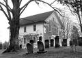
| 11/27/2004 04:12:02 AM |
Time On Earthby JMSComment: I like this - especially the dark tones of the stones, coupled with the weathering of the boarding of the building. I find your choice of point of view a bit odd - mainly where the ttree overlaps the building - rather that it just leaves that small edge of it still showing: it doesn't quite work compositionally, though quite what I'd recommend instead I don't know. Strong image, nevertheless. |
Home -
Challenges -
Community -
League -
Photos -
Cameras -
Lenses -
Learn -
Help -
Terms of Use -
Privacy -
Top ^
DPChallenge, and website content and design, Copyright © 2001-2025 Challenging Technologies, LLC.
All digital photo copyrights belong to the photographers and may not be used without permission.
Current Server Time: 08/26/2025 04:10:51 PM EDT.