| Image |
Comment |
| 11/27/2004 04:20:41 PM |
weatheredby parrotheadComment: There are a number of things I like about this: that sense of soft-focus, which chimes with a common perception of 'old' photography; a strong sense of the textures and details produced by ageing; strong compositional principles, and a strong balance of interest. Wha it communicates to me - and what, I'm afraid, i don't like about it - is that there's some kind of glory in that previous age, that its decay and left-overs, that so blight our present (and to be fair, that our present is currently bequeathing to our future), is really rather pretty and lovely, rather than sinister and regrettable, which to my mind is the more apt reaction. Great shot, with that reservation. |
 Photographer found comment helpful. Photographer found comment helpful. |
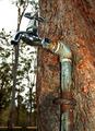
| 11/27/2004 04:13:15 PM |
Engulf the pipeby NodeComment: Good subject. The presentation of it is reminiscent of some of the modern 'suburban' school of photography (my term) - those guys who are using the colour scemes and 'simplistic' methodology of the 1970's snp-shot: on-board flash, heavy saturation, disdain for some rules. I like the metallicism of the tap, the reds and browns in the tree ... but its not a school of photography that particularly appeals to me, I'm afraid. |
| Photographer found comment helpful. |
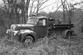
| 11/27/2004 04:09:07 PM |
Forgotten Veteranby Resusit8uComment: Good subject, without doubt. Your photograph - well, it's almost hyper-documentary in style - it is, to me, more about a simple capture of the entirety of the truck and its location, including as much detail as possible, than it is about communicating anything of your own feeling about it. That may well be your choice - inwhich case you've absolutely achieved it - but perhaps it is not the way to score well here. All the technical detail is there, but I would have preferred more of an attitude to be taken to it, rather than this simple representation. |
| Photographer found comment helpful. |
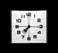
| 11/27/2004 04:04:59 PM |
The 8th Hourby DefyTimeComment: Almost non-pnotographic in its quality. The overlap of the hour hand is intriguing. I like it, I like the bordering and presentation generally. Neat, and controlled. |
| Photographer found comment helpful. |
| 11/27/2004 10:52:33 AM |
Overpassby spydrComment: The light trails, compositionally are strong; I'm not sure about the other lights around - they seem to clutter what might be stronger for being a very simple image. |
| Photographer found comment helpful. |
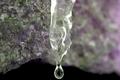
| 11/27/2004 10:50:36 AM |
one day at a timeby mrsamsaComment: It feels that you've placed your focal plane too far into the image: surely the focus should be more strongly on the ice and drop, whereas it seems to be behind it to my eye. |
| Photographer found comment helpful. |
| 11/27/2004 10:41:09 AM |
|
| Photographer found comment helpful. |
| 11/27/2004 10:39:23 AM |
Patience is a Virtueby SkipComment: What a wondefully strange, marvellous image. I really wish the side of that bag wasn't so far over-exposed. Great sense of the ordinary, beautifully communicated in the absolutely 'normal' colour palette you've used. Everso expressive - very strong work. I hope others understand it, or at least give it the time. |
| Photographer found comment helpful. |
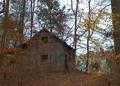
| 11/27/2004 10:36:18 AM |
Years Gone Byby rayg544Comment: The old building seems almost incidental to this shot; try it: as you focus on it, your eye is constantly pulled toward the bright areas of sky toward the top of the image. There's little real detail either:I really want to be able to see the signs of ageing in the wood, but because of the flat light it's in all that texture just isn't visible. I'm not sure what one would do to fix it - a different light would be the obvious thing, but is that possible? Perhaps if there were a time of day when the light slanted in through that break in the trees to illuminate the old shed more than the surrounding trees? Either that, or consider tthe approach of a close-up on the broken down areas of the wood. The encroachment of the trees toward the shed is obviously a good point to make re the challenge, but I think you've sacrificed a properly communicative image just to get that element. |
| Photographer found comment helpful. |
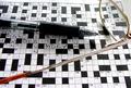
| 11/27/2004 10:25:58 AM |
16 downby biggood53Comment: Aside from meeting the challenge by the straightforward expdient of putting the words in the shot - and the more genuine sense of the challenge by it being a shot of a crossword - I find this a slightly uncomfortable image. The differentiation between whites and greys seems overly definite, rather than progressive, and your composition places odd things in the strong areas of frame - the 'passing time' is releggated from visual interest by being so far toward the edge. I think many voters will simply see a crossword shot. |
| Photographer found comment helpful. |
Home -
Challenges -
Community -
League -
Photos -
Cameras -
Lenses -
Learn -
Help -
Terms of Use -
Privacy -
Top ^
DPChallenge, and website content and design, Copyright © 2001-2025 Challenging Technologies, LLC.
All digital photo copyrights belong to the photographers and may not be used without permission.
Current Server Time: 08/26/2025 01:46:52 PM EDT.