| Image |
Comment |
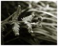
| 04/02/2005 06:42:24 PM |
Preludeby sherComment: I kind of know the shot you're after ... I just wish you had more grace in that unfolding of the fern. In purely design terms, it's a favourite image of mine is this - the tonality and the depth of field are expertly done, and the composition, but that sense of the spring of the new isn't really here for me. |
 Photographer found comment helpful. Photographer found comment helpful. |
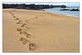
| 04/02/2005 06:38:30 PM |
...and as the sea washes the shore, it turns every day into a new beginning.by andriComment: I would wish for a less blatant composition, perhaps: a wider-angle lens and a less forced concentration on the sand: there's just enough horizon to feel forced to appreciate the natural setting, but it's placed so as to be entirely subsidiary to the image: there's a hint of sunrise in your title, and not so much in your image. |
| Photographer found comment helpful. |
| 03/31/2005 08:20:43 AM |
A Teen-age Daughter by e301Comment: Another fourth? A real surprise given the score - thanks for all the votes and opinions. |
| 03/23/2005 04:30:55 AM |
Father and Sonby e301Comment: Originally posted by Mephisto:
really cool message.did you shoot this spontanious in daylife |
Kinda - I was actually shooting an open day at a theatre. Daylife ... good. |
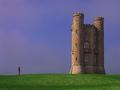
| 03/22/2005 05:38:37 PM |
Light Before the Stormby ArtanComment: I think you'll win, out of what i've seen so far. Minor gripes about verticality of tower, placing of figure, and 'storm' in your title - it looks like a pleasant summer's evening, colour-wise. The figure is a masterful necessity to a sense of scale in the image. Where is this? What is this? It looks like it should be a Landmark Trust property (qv if you don't know them) - but not one that is familiar. More than anything, I think you'll win because it's just nearly impossible to vote this down for anything. |
| Photographer found comment helpful. |
| 03/22/2005 05:35:07 PM |
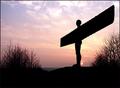
Twilight of the Godsby fredandaudComment: I really want something to give a sense of scale to this: nothing here says anything about how damn big the angel is. Other than that, i can imagine this selling, though. |
| 03/22/2005 05:33:56 PM |
Tuxedo with Boutonnièreby sparklyComment: More tuxedo? I can imagine a composition with this button-hold placed strongly top right of frame, and showing much more of the structure of tux and waistcoat - this seems simply to be of the 'Bouttoniere' |
| 03/22/2005 05:31:44 PM |
|
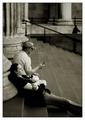
| 03/22/2005 05:31:20 PM |
Symbol for the Timesby secondglantzComment: Nearly ideal - though i could wish for more detail brought out of the shadow side of his(?) face. Photographically, as presented, I also think you could privilege him in fame more strongly - it looks like the body angle would sit well in a composition that moved him to the right solidly - and would give the buyers somewhere for their text, also. |
| Photographer found comment helpful. |
| 03/22/2005 05:28:26 PM |
Nature vs Machineby dwterryComment: I think you'll get hit by the quality police for this one - sharpening artefacts, and blocky sense of compression. It's a strong image though, which might allow some poorness of quality. I think you could successfully have allowed a bit more space around the main subjects however - never forget how easily the eye is lead out of your frame ... |
| Photographer found comment helpful. |
Home -
Challenges -
Community -
League -
Photos -
Cameras -
Lenses -
Learn -
Help -
Terms of Use -
Privacy -
Top ^
DPChallenge, and website content and design, Copyright © 2001-2025 Challenging Technologies, LLC.
All digital photo copyrights belong to the photographers and may not be used without permission.
Current Server Time: 08/24/2025 08:23:28 AM EDT.