| Image |
Comment |
| 04/22/2005 07:08:44 PM |
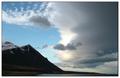
Fighting the cloudsby lastefComment: This could be a stunner - but this kind of scene really needs to be as big as possible, surely, and could be 20% bigger than this at least. I think also that you could add some light and then contrast to the mountain. Has real potential, but unfortunately unrealised. |
| 04/22/2005 07:06:35 PM |
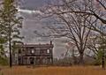
A House in the Countryby dahkotaComment: I think i'd have tried some selective sharpening on that house - it could usefully just pop out of the image a little more? I'm no fan of the extreme nature of your darkening of the sky - have you tried using a threshold mask to achieve this effect - it allows the joins to be so much less noticeable? marvellous composition though, and with that little extra punch to match the processing I think it might have been a contender: I think you could use more contrast and lightness in the grass, and there's that overall sense of blurriness also. Close, but doesn't quite do it for me. |
 Photographer found comment helpful. Photographer found comment helpful. |
| 04/22/2005 07:00:59 PM |
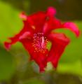
Stand Upby maxjComment: Great depth of field effect - though perhaps, given your title, you might have wanted to deepen it a touch to include those bits that actually are up? I think they pull the attention from the fabulous detail of the pollen bits. Excellent combination of the abstract in the bokeh and the perfect in the detail. |
| Photographer found comment helpful. |
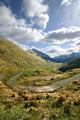
| 04/22/2005 06:58:40 PM |
Change of Weatherby JeanComment: Lacking some of that real ping of sharpness - camera? processing? can't tell - and perhaps some real sweep of tonality - seems pretty washed out, overall: those visible tops of the mountains could have more impact, to emphasise the mist, and the water could be toned down some, and it's a shame that all detail has gone from the sky. It's a good still scene, with real potential - but, certainly for this kind of orthodox beauty, it really needs to have that technical perfection to complete the impact. |
| Photographer found comment helpful. |
| 04/22/2005 05:29:56 PM |
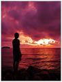
Never Take Eye Offby 123takeComment: Good shot - and I like the overall tonality in this too. The thing that bugs me more than anything is the sharpening halo around the figure and the island in the distance ... if this is from USM, then I might point out that it took me ages to realise that you can use values below 1 for the radius - like 0.6 - and this makes so much difference it's untrue. A shame the bright bit of sky is so blown, but really hard to deal with, that stuff. |
| Photographer found comment helpful. |
| 04/22/2005 05:24:48 PM |
Chickby PixelstateComment: Beautifully detailed, and controlled tones too. Fine work. Background just a little dominant? Could have been muted more? And I wonder if, for a dpc audience, it wouldn't want for a little contrast - just to give a fraction more punch to the colours and the fine textures. I like it muted though - but the background, personally, I would have dealt with - just a touch, unnoticeably (hopefully). |
| Photographer found comment helpful. |
| 04/22/2005 05:21:38 PM |
Journey Aheadby PaulMdxComment: Lens? I need to know what lens you've used for this :-) It looks slightly wider than my 18-55, and I quite like the effect foreground. Excellent composition in this shot, although i would have worked over the exposure more than this: I think you could keep that bright sense of the landscape without having to have the clouds' edges getting overblown so much - if not in raw conversion, then simply with large-feathered selection and the usual brightness tools. Though i like the intensity of the light: it's by no means a classical way to shoot such a scene, but it's effective, and a little different. |
| Photographer found comment helpful. |
| 04/22/2005 05:15:36 PM |
The Fishermanby utroComment: How to suggest that one might brighten this to give it some punch, without losing the intensity of those colours? I don't know: maybe I'm wrong, maybe it isn't too dark and the silhouette doesn't need to a little more definition - but that was my immediate thought. |
| Photographer found comment helpful. |
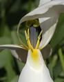
| 04/22/2005 04:57:28 PM |
Inner Tulipby CantiqueComment: Intersting and different. You might, in my view, happily try calming down the exposure a bit - well, more than a bit, really, and then bringing the whites back to where you want them: that would give you a lot more punch in the yellows of the stamens (or whatever they're called), and lose some of the impact of the background. |
| Photographer found comment helpful. |
| 04/22/2005 04:55:05 PM |
Tangible lightby bpickardComment: Reminds me of something this - not sure what. Something of the Frederick Evans about it, perhaps. The feel is gloriously suited to the mood and scene, though I might personally have tried to select and calm down some of the light a touch - it just goes a bit far for me on this monitor (but then the variety of viewing options is something we have to take into account). There could be debates about keeping the white wall image left, and about the height of your point of view - choices, I suppose, but not sure I could say anything else would be better. |
| Photographer found comment helpful. |
Home -
Challenges -
Community -
League -
Photos -
Cameras -
Lenses -
Learn -
Help -
Terms of Use -
Privacy -
Top ^
DPChallenge, and website content and design, Copyright © 2001-2025 Challenging Technologies, LLC.
All digital photo copyrights belong to the photographers and may not be used without permission.
Current Server Time: 08/23/2025 09:21:37 PM EDT.