| Image |
Comment |
| 02/24/2006 04:28:02 AM |
State of Graceby pawdrixComment: I like this: it has, thanks to your chosen toning, an almost underwater quality to it. The excessive distortion of the extreme wide-angle only adds to that effect. I'm not absolutely sure about the processing for this composition - I feel that I'd like to see it more grounded, to make more of the street level stuff. Obviously, the basic rules probably forbid that ;-) |
 Photographer found comment helpful. Photographer found comment helpful. |
| 02/23/2006 01:29:35 PM |
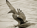
Ascendby JPRComment: Marvellous drama - just too much detail missing? that heavy selenium tone works well for it though. |
| Photographer found comment helpful. |
| 02/23/2006 01:27:25 PM |
I`m barely waiting.by andrewreinerComment: A couple of things i don't understand here - firstly that the comsposition seems to be makling those grain silos the more significant thing, and secondly whether it's really as pretentious as I first thought. Might have to come back to it - though the chance of that in this challenge is small I'm afraid. |
| 02/23/2006 01:23:58 PM |
The Landingby Kevin WaiteComment: Decent work - in fact, decent all round: tone, detail, focus. It perhaps lacks a sense of drama, that thing that would really make it stand out in this enormous crowd. |
| Photographer found comment helpful. |
| 02/23/2006 01:19:50 PM |
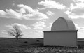
WAITING FOR NIGHTby dolikemagooComment: So difficult, even without the restrictions of basic editing, to control both the sky and the ground exposure. I don't think you quite succeed here: too much lost control in the clouds, and not enough graduation of tone in the observatory. The shadow/highlights filter can be hugely effective here, though the results are often a touch unrealistic. Obviously, the most effective approach would be an ND grad filter when shooting. There's a certain sense of quietness and mood to the shot though, which I appreciate. |
| Photographer found comment helpful. |
| 02/23/2006 01:17:00 PM |
|
| Photographer found comment helpful. |
| 02/23/2006 01:16:03 PM |
Mother and Childby balancedfoxComment: It's unusual, I think, to see this very often done composition without visible fingernails on the child's hand. The reason, I think, is that the fragility of the smallness is more emphasised by the nails, which seem even more impossibly small than the fingers themselves. But this is a decent attempt - I think the composition could be more orthodox, and stronger - it is, after all, a very orthodox image - perhaps by having the adult hand enter frame from a less straight up and down direction. Your toning is good though, but I feel you'll suffer for having presented a well known idea without quite enough pop to it. |
| Photographer found comment helpful. |
| 02/23/2006 01:12:44 PM |
Eye see Uby deme314Comment: To me this seems too close to a possible real colour-space to be properly considered a duotone - surely that wall and that forehead aren't shades of the same colour? And indeed, whether or no they are, the point is perhaps that they don't appear to be. A fairly interesting image though - perhaps a touch more visible an eye might really have pinged the impact? - certainly good enough to have been properly toned. |
| Photographer found comment helpful. |
| 02/23/2006 01:10:14 PM |
Cloudsby EquilibristComment: More dynamic range required! You've comspressed everything into a very narrow range. Anyhow, the shapes of this composition don't seem particularly well framed to me - there is nothing to help or guide the viewer's eye through the image. |
| 02/23/2006 01:08:38 PM |
I love you, you're perfect, no changeby litsaComment: I find this very poor. Nothing has been done to control the range of exposure, all the tones are compressed into a very narrow range indeed, with the result that it feels hopelessly amateur. The sepia toning is also very heavy, and hasn't helped. I'd have a damn good go at it with the levels tool, at the very least. However, I suspect that the composition of the shot isn't interesting enough for even that to put it into contention. |
| Photographer found comment helpful. |
Home -
Challenges -
Community -
League -
Photos -
Cameras -
Lenses -
Learn -
Help -
Terms of Use -
Privacy -
Top ^
DPChallenge, and website content and design, Copyright © 2001-2025 Challenging Technologies, LLC.
All digital photo copyrights belong to the photographers and may not be used without permission.
Current Server Time: 08/18/2025 07:41:51 AM EDT.