| Image |
Comment |
| 06/11/2003 11:48:09 PM |
|
 Photographer found comment helpful. Photographer found comment helpful. |
| 06/11/2003 11:43:46 PM |
|
| 06/11/2003 11:42:24 PM |
|
| Photographer found comment helpful. |
| 06/11/2003 11:41:23 PM |
Ranger Rickby vtruanComment: The background is rather distracting. I can see this being a mag cover. |
| Photographer found comment helpful. |
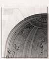
| 06/11/2003 11:31:11 PM |
BASEBALL DIGESTby purpletrollComment: Perhaps a more symetrical view would be more useable for a 'cover'. It might have helped with the (very) slight but (a little) distracting flaring in the top left. |
| Photographer found comment helpful. |
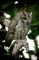
| 06/11/2003 11:28:54 PM |
Rubber Loverby ish36Comment: I like the softness of the edges, and the slight reflection. Gives a good 3d feel. |
| Photographer found comment helpful. |
| 06/11/2003 11:25:52 PM |
Sing Out! ( http://www.singout.org/ )by eloiseComment: Seems a bit dark (even for my monitor). I am quite distracted by everything around the 'singing' subject. Perhaps a closer shot, at a different angle to remove the background guitarist would have been better and more usable as a cover. |
| Photographer found comment helpful. |
| 05/12/2003 11:46:01 PM |
Glassby AmieeComment: A bit too messy for me.... and there seems to be a strange purple arc accooss the dish. |
| 05/12/2003 11:43:42 PM |
Nature's Fire (Abstract)by LeahStephenComment: A softer more ambiant light should have been used to show the detail of the bowl without so much flare. If the shaddow and light refraction is the main subject.... perhaps the bowl could have been almost removed from the shot? (ie: shoot over it making sure it had no focus?) |
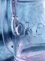
| 05/12/2003 11:39:41 PM |
Coca-Cola "Glassic" (get it? Coca-Cola Classic)by jdavisComment: Pity the glass wasn't clean...... I think a balance of how much rimm and base would have made a great improvement (we see a nice bit of curve of the rim, but the base is cut and very incomplete)
(no need to clutter a good title with the "nudge""nudge") |
| Photographer found comment helpful. |
Home -
Challenges -
Community -
League -
Photos -
Cameras -
Lenses -
Learn -
Help -
Terms of Use -
Privacy -
Top ^
DPChallenge, and website content and design, Copyright © 2001-2025 Challenging Technologies, LLC.
All digital photo copyrights belong to the photographers and may not be used without permission.
Current Server Time: 08/04/2025 09:09:30 AM EDT.