|
|
|
Showing 371 - 380 of ~1062 |
| Image |
Comment |
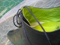
| 08/16/2009 09:21:20 PM | There you areby depugheComment: ** Hello from the Critique Club**
Composition
This photo has a very interesting perspective which definitely draws attention to it. One important element of composition is context. What is the context of the subject? If you look at the top ten photos, either the shoe was taken out of context, or specifically placed within a fitting context. For example, the 8th and 10th place (Baby's first walking shoes, and Chucks) are focused on the footwear itself, out of the environmental context. The 3rd place photo (Camouflage) puts the shoe into an environmental context that matches the shoe itself.
Your photo has a nice angle on the shoe, but the context becomes confusing and leads the viewer to ask questions such "what is the wire for", "is the green grass or a court of some type"?
You stated that you wanted the shoe to stand out from the background, so, remove the background, or make it simpler. The more complex a background is, the less you will be able to concentrate on the subject.
Technical
The focus is on, the lighting is nice a soft, two very important qualities. You mentioned you used the "remove color cast tool". Unfortunately, this tool didn't remove the color cast enough. Try using unsharp mask with a high radius. In photoshop, I use (24 7 0) as the colorcast removal options, and adjust accordingly. There are MANY ways to remove color cast and the forums are full of suggestions.
|
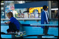
| 08/05/2009 08:41:23 PM | Iconic skateboardby boothefamComment: ** Hello from the Critique Club **
I normally break my comments down into composition and technical components. For this photo, I want to concentrate this critique around the composition.
Composition
The main problem with this photo is that it appears random, without any prior thought to how the photo will be composed. Often, this is related to as a snapshot. In reading your description, my thoughts seem correct. Let me describe what I mean by snapshot a little more. In your description, you mention specifically "neighborhood kids" and "break from skate transport". When looking at the photo, I don't get the sense of a neighborhood or even that they were skating. Essentially, this photo is taken out of a larger context, perhaps you saw these kids skating and saw them take a rest. The photo, out of context, is a snapshot, a simple capture of time without the relative space around it. If not for the skateboard, which is a minor element, I would not know what these kids were interested in.
Generally, I speak about composition in terms of lines, shapes, contour, color, etc. In this case, I'll discuss space. The photo is divided in the middle. The right photo shows a kid ordering what my guess is an ice cream or similar. On the left, you have another kid, doing something. There is nothing in the middle. This empty space divides the photo leaving the viewer unsure of where they should look.
In terms of the challenge, street photography, there is little to portray a street, except for a reflection of a parked car.
The idea of the photo is just, and there are many ways that a shot like this can be improved. For example, make the skateboard and kids more of a major element. Focus on them together more, with the skate board. The boys could be resting against a tree or a mailbox on a sidewalk with their ice cream, drink, or even nothing at all. A low angle shot with the skateboard in front of them, possibly a little blur on the kids would bring a story to the photo.
Let the photo tell the story, not a description.
If you would like to discuss this more, please let me know. |  Photographer found comment helpful. Photographer found comment helpful. |
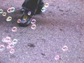
| 08/04/2009 10:34:25 PM | Bubble-coloured streetby oanacotuComment: ** Hello from the Critique Club **
I noticed that this is your first entry. My comments are broken down into compositional and technical elements.
Composition
The bubbles around the person walking is a very interesting idea. The Rule of Thirds is a key compositional element as the eye tends to be drawn to specific points and lines in an image. Essentially, take an image and break it into thirds from left to right, top to bottom. You are left with 9 segments. Often, the right third is preferable for main subjects. In this photo, placing the feet on the lower right point and right third line and surround the image with the bubbles would have added a strong compositional element.
The other problem is the angle: the shot straight down is not as interesting as other angles. Imagine that you are walking down the street and you look down. The view is ordinary, and common. Shooting low to the ground would add an interesting perspective. Experiment with this. Take an array of photos in a similar scene standing up, then on your knees, then on your stomach, and finally, on your back. You will find new vantage points and more interesting compositions.
Technical
If anything, this photo is extremely out of focus and suffers some chromatic aberrations, a fault of the camera lens itself. The lighting seems a bit strong, was this taken mid day? Try taking the photo when light is at a shallow angle. | | Photographer found comment helpful. |
| 08/04/2009 10:23:30 PM | Geology Rocks !by RasaiComment: ** Hello from the Critique Club **
Very interesting image, I like your progression of geology from the rock to the pure elements.
Composition
The main problem with this photo is in the composition: it is too flat. I do like the progression from the larger rock background to the smaller rock, to the smaller elements. This progression is a benefit to this photo. However, every object is essentially in the same plane. A tighter angle with more texture on the rock holding the elements would have led to a more dynamic photo.
Technical
The lighting, while soft, is flat, leading to the compositional comment above. A second source of light would help to bring out the texture in the rock and add depth to the photo. The lighting then effectively places everything in the same plane.
Overall, it is interesting from the placement of the objects. It would be good to experiment with additional light sources and get in tighter with the shot, perhaps dropping the background out altogether to help isolate the stone itself. It definitely has promise and would be a good one to enter in a Free Study. |
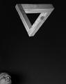
| 08/04/2009 10:06:41 PM | Nothing is Impossible!by Ecce_SignumComment: ** Hello from your fellow Critique Club members **
Composition
I definitely like the placement of the triangle with the point oriented downward. Not only are there distinct lines in the triangle, but the point leads to another line, one that ends at the bottom of the photo. The person in the lower left is interesting. I'm not sure if it makes or breaks the composition. The face doesn't go with the triangle, but at the same time nothing would result in too much negative space.
Technical
This photo is well lit, exposing the texture of the wood. Perhaps though a little more lighting for shadows would bring out the three dimensionality of the triangle a little more. The only issue I find is that too much of the background is visible and would be better if it was nearly black.
Very nice shot! | | Photographer found comment helpful. |
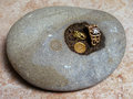
| 08/03/2009 10:13:46 PM | Snailfanby codfish709Comment: ** Hello from the Critique Club **
Cute fellow. You must have had a lot of patience waiting for him to get in the right spot.
Composition
Although I will discuss the technical aspects of this photo in a minute, the compositional aspect is the one which weighs heavily. This is a very busy photo; there is a lot for the viewer to look at, and it is not clear where the intended focus is. Let me explain that a little. It is clear by the title that the snail is your main subject. However, the eye is easily drawn away from the subject by the coral, the castle, and the large negative yellow space. If you look at the other animal subjects in the challenge, you will find that what surrounds the subject is simple and uniform. Take SandyP by Lutchenko for example. The subject is surrounded by blank space, which forces the eye to concentrate on the Sandy Pea.
For fun, take the snail and place him on a mirror (as in SandyP). Illuminate it with nice soft light and you will have one interesting shot! Try it out and submit in the Free Study!
Technical
There is not too much I have to say about the technical aspects as the composition drives most of it. Were you using the ambient light from the tank? At an ISO of 800 and 1/40 of a second (f7.1) I can imagine that you didn't have too much light. Try supplementing with a bounce flash, or a light bounced of the ceiling. Especially if you take the suggestion for composition above.
So, finally, this is a nice close up shot of the snail. There is a lot you can do with him...experiment. | | Photographer found comment helpful. |
| 07/31/2009 12:45:09 AM | Duck.jpgby jomariComment: Very nice! I love the ripple in the water. The colors a brilliant too! | | Photographer found comment helpful. |
| 07/29/2009 10:18:45 PM | Jumpby pallComment: ** Hello from the Critique Club **
This is certainly an interesting take on a portrait. One goal of any portrait is to portray the character of the person. I infer then that you must be quite jovial. In fact, I'm guessing you went more for effect and fun rather than targeting a high score. Which makes critiquing equally as fun. :)
Composition
At first glance, I wasn't sure how I liked the tilt of the photo. Generally, I find that tilt is overused. However, after viewing this photo in different ways I have to say that the tilt works. In fact, it adds an element of suspense. In addition, the angle shot, from ground up, also adds a critical perspective to the photo. The sky is a key element of the background which helps to pull the subject away from the ground, definitely a benefit here.
The posture is also important. The right leg and left arm make a distinct line from the ground to the sky, again adding to the effect.
Technical
The exposure on the sky is appropriate; it is not too dark, nor too light. However, a bit more illumination is needed on the subject. It appears as though processing has pushed the fact and skin tones to the right giving a slightly noisy effect and unnatural colors given the rest of the scene. There also appears to be a slight halo around the subject. It is also clear that the subject is stopped in air by the flash. It would be interesting to see this same photo with a 2nd curtain sync as that may give a little more action to the photo. Either way, this is a fine shot. | | Photographer found comment helpful. |
| 07/28/2009 09:23:03 PM | Trouble And Strifeby kingskingdomComment: ** Hello from the Critique Club **
Portraiture is always difficult due to the number of technical aspects that need special attention. This photo is nicely done.
Composition
The posture is very distinct in this one. The subject is looking up, which makes me believe that she is a very confident person or a person who is always looking toward the future. At least, that is how this posture, to me, defines the subject. Which is interesting because it does not match the title.
The only issue I have is that too much of her chest is showing and tends to make her face blend due to the similar skin tones. Thus, focus is drawn slightly away from her face. I also see a little of an arm and a leg (white pants?) that also seems to draw away from the face. It is clear that this is a tough pose. If you performed a tighter crop, just below the necklace the focus to her face would be restored, however, a new problem would crop up: only one shoulder. Thus, a slight angle change to show her right shoulder and tighter crop would have really pushed this posture nicely. As I said, this was difficult, but still, nicely done.
You also chose the right amount of added color to the face. The red lipstick shade is subtle and not overbearing which helps to contrast her lips against her blond hair. The eye shadow also helps to add additional contrast to the red and blond and helps to draw focus to her eyes. More importantly, you chose a shade close to her eye color which also helps to bring them forward.
Technical
Very nice job on the lighting. You have exposed one side slightly more than the other to give enough shadow to add depth to the photo, but not too little on the other side to bring her face deep into darkness. With that said, the left side could use slightly less exposure as details in her skin texture are slightly diminished. The DOF is very good. The blouse is outside of the facial plane, which is good as it helps to isolate the face and direct attention, but not too out of focus to be a feature.
Again, an excellent photo. |
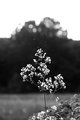
| 07/26/2009 09:19:46 PM | Flyingby posthumousComment: ** Hello from the Critique Club **
Composition
When this image first loaded on my screen I saw primarily the top white portion of the photo. Then, as I scrolled down and saw more of the flower, the compositional feel changed dramatically. This was a result of a square crop which really helped the photo out the most. The nicest part of this composition, and what really sets this from many others is that the image is not static; its not just a photo of a flower. Rather, there is distinct motion as petals (or pollen?) are floating around the flower. This really adds a sense of tranquility to the photo. The flower is nicely isolated from the background. I think a horizontal crop may have worked better with more open space to the left.
Technical
The focus is sharp; the 4.0 aperture was definitely a good choice. There is the right amount of DOF to isolate the flower, but still have enough of the foreground elements in focus. The black and white conversion really works with this photo as this photo has elements in almost all zones. The main problem, and what probably brought the score down, was the white negative space on the top. It really doesn't add to the photo and distracts from the central composition. | | Photographer found comment helpful. |
|
Showing 371 - 380 of ~1062 |
Home -
Challenges -
Community -
League -
Photos -
Cameras -
Lenses -
Learn -
Help -
Terms of Use -
Privacy -
Top ^
DPChallenge, and website content and design, Copyright © 2001-2025 Challenging Technologies, LLC.
All digital photo copyrights belong to the photographers and may not be used without permission.
Current Server Time: 08/07/2025 02:44:43 AM EDT.
|