| Image |
Comment |
| 04/20/2007 06:15:08 PM |
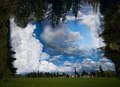
Trees and Skyby nheilweilComment: Just comes across as a jumble--idea is interesting, but execution needs work. |
 Photographer found comment helpful. Photographer found comment helpful. |
| 04/20/2007 06:15:03 PM |
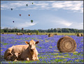
Field of Dreamsby scarbrdComment: This is actually a great idea and, viewed purely from a compositional standpoint, the image is very strong. However, the collage elements don't blend together well and the whole comes across very artificial. (If it's not a collage, then I amend my comment to say: the pp creates a very artificial collage effect). |
| Photographer found comment helpful. |
| 04/20/2007 06:11:46 PM |
Tranquilityby ho0jokerComment: This reminds me of some other work that I have seen elsewhere. Is this an homage to some famous work? Anyway... the idea is interesting, but it dosen't come across well for me. I know that the composition is not supposed to look "natural", but the sky you've placed behind the buildings just doesn't fit. I think that its the differing light angles implied by the shadows in the foreground buildings (implying a light source above and to the front left of the photo) and the obvious light source in the background (above and to the back left). |
| Photographer found comment helpful. |
| 04/20/2007 06:07:19 PM |
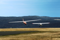
Uplifting Viewby gzuprukComment: Interesting idea. Unfortunately, the subject comes across as the planes, not the landscape. Take the planes away and the surrounding scene isn't very interesting. Also, if the planes were going to be an element, it would have been more interesting to see them from the front, rather than the back, and to have them larger in the frame. |
| Photographer found comment helpful. |
| 04/20/2007 06:07:03 PM |
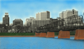
Colors of the Capitolby MegaweaponComment: The pp on this gives an effect of this being an assemblage of clip art, rather than a real photograph. The dodging and burning in the sky and on the edges of the buildings is very distracting as well. |
| 04/20/2007 06:05:20 PM |
Progress?by Ice-Tea-1983Comment: This doesn't really work asthetically, or as an environmental statement, which I assume is what you were going for. There is nothing really compositionally to hold onto as the viewer. The idea could be good, but execution just kind of falls flat. |
| Photographer found comment helpful. |
| 04/20/2007 06:03:23 PM |
Mumbai cityby chetandesaiComment: This actually doesn't work for me, but I think it has the potential to be a great shot. The power lines in the foreground are very distracting and detract from the main image of the city skyline. I like the grain/noise you have going, and perhaps my whole impression of the shot would change if I could see it larger in the vertical. (I know you maxed out the dimension horizontally. Might have been better to crop off the right quarter in order to get more horizontal space.) It is hard to tell if the hazy/gritty impression comes just from the grain or whether there is a lot of haze in the shot. Either way a lot of detail is just washed out. If you have the chance to reshoot I also might suggest waiting until dusk/early evening when you might get the lights from the city to come out. |
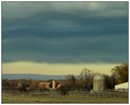
| 04/19/2007 09:43:11 AM |
There's a Storm Blowin' Inby HipychikComment: Everything looks out of focus (or perhaps too much neat image?). Perhaps that is intentional, but it doesn't work for me. Colors are nice, and I like the layering effect of the clouds. |
| Photographer found comment helpful. |
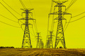
| 04/18/2007 10:55:34 PM |
Towersby bmartuchComment: Very cool. How did you get the yellow color in the sky? |
| Photographer found comment helpful. |
| 04/18/2007 03:34:32 PM |
To no man's landby SSSSComment: I would rather that the border was thinner and the picture bigger, but very moody and cool nonetheless. |
Home -
Challenges -
Community -
League -
Photos -
Cameras -
Lenses -
Learn -
Help -
Terms of Use -
Privacy -
Top ^
DPChallenge, and website content and design, Copyright © 2001-2025 Challenging Technologies, LLC.
All digital photo copyrights belong to the photographers and may not be used without permission.
Current Server Time: 08/08/2025 01:05:18 PM EDT.