| Image |
Comment |
| 02/06/2007 06:56:36 PM |
Unwilling by scalvertComment: very well done. one of three 10s for this challenge. if there is any justice this will take the blue. |
 Photographer found comment helpful. Photographer found comment helpful. |
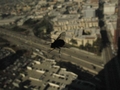
| 02/06/2007 05:53:39 PM |
High Rise Flyby jenlund70Comment: this is shallow dof, but not an attractive or well shot picture. the subject and compositional elements are pretty unattractive, but you might have had something if the fly had been lit better and the landscape far beyond had been futher out of focus. sorry - 4 |
| Photographer found comment helpful. |
| 02/06/2007 05:53:36 PM |
Not the China!by kgdeasonComment: too small - 4. this might have scored much higher, but can't see the picture well enough at this size to really evaluate its merits. |
| 02/06/2007 05:53:33 PM |
Modern Timesby thejasComment: Meets challenge, but this has some technical and compositional problems. Idea is not bad though, and a different setup on this theme could be good. I think it would have been better to have the watch in focus with the digital time out of focus, but still readable. The watch is a more attractive feature. Also, I would have either been farther out so that the entire watch face is in the frame, or closer. The crop as is doesn't looks accidental. Lastly, not sure what the tilt adds. Sorry - 4. |
| Photographer found comment helpful. |
| 02/06/2007 05:49:53 PM |
naiadby patryComment: this just looks oof, not a deliberate use of dof. composition needs some work as well (perhaps fuller in the frame and at a steeper and/or opposing tilt?). sorry - 3. |
| 02/06/2007 05:47:15 PM |
engagementby spleenlessComment: as a portrait of the guy, this is okay. but it seems that an engagement photo should have both parties in focus, or focus on the woman. composition and lighting seem a little flat as well. 4. |
| 02/06/2007 05:45:15 PM |
|
| 02/06/2007 05:44:35 PM |
Long Pencilby mdintrainingComment: focus point on the eraser would have been more interesting, where it is doesn't really make sense to me. light/exposure is flat. 4. |
| Photographer found comment helpful. |
| 02/06/2007 05:43:34 PM |
Where Angels Danceby pixelpigComment: the dof may be very shallow here, but the lack of foreground or background makes it difficult to judge, and therefore means that the use of shallow dof doesn't seem to add anything to the image. like the lighting. 4. |
| Photographer found comment helpful. |
| 02/06/2007 05:41:58 PM |
Kid's First Snackby msdoubletroubleComment: dof is shallow, but focus point seems off. appear to be on the nose, but would have been better (imho) if it had been on the eye, of if the dof had been a little less shallow so that the whole face had been in focus. 4 |
| Photographer found comment helpful. |
Home -
Challenges -
Community -
League -
Photos -
Cameras -
Lenses -
Learn -
Help -
Terms of Use -
Privacy -
Top ^
DPChallenge, and website content and design, Copyright © 2001-2025 Challenging Technologies, LLC.
All digital photo copyrights belong to the photographers and may not be used without permission.
Current Server Time: 08/02/2025 04:09:43 AM EDT.