| Image |
Comment |
| 03/02/2003 12:04:53 PM |
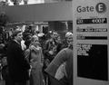
honeymoon hellby tomzinhoComment: I like the idea of "airportness" causing despair, and your use of B & W gives this image a journalistic feel to it, which is nice for a candid shot about despair. The image's effectiveness may be enhanced by simply catching more despairing expressessions: these folks look uncomfortable at most. Also try angles and perspectives to see if that helps. The sign on the right is not doing anything much for me. The "Delay" is there, but it is very quiet. |
| 03/02/2003 12:00:01 PM |
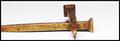
His Despair Our Gainby VisionComment: Okay, this is the 10th time I've visited this image and I finally got it. ANd I like the idea, too. If you had used nails or spikes other than railroad spikes, it might be clearer. And a bit higher perspective would accentuate the image of the cross, though I do like a lowish angle. Keep tweeking and it will come. |
 Photographer found comment helpful. Photographer found comment helpful. |
| 03/02/2003 11:57:09 AM |
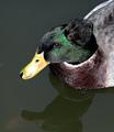
Cancerby vtruanComment: The title says despair to me, and I can certainly see some kind of growth on the head of the duck, but other elements in this image do not support these. The duck does not seem disturbed, in fact he has a smile on his face. THe colors and lighting do not help your communication either. Try fiddling with mood and angles to really make your point. |
| Photographer found comment helpful. |
| 03/02/2003 11:54:33 AM |
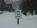
Ironyby TurcoComment: I like the tones here, and how you've used the snow in the foreground to make your point. The blatant centering of the sign and the use of a standard perspective echo the sign's sentiments. Still, you might try different angles and light to see if your point and mood couldn't be made clearer. Snow and "No thru traffic" doesn't really equal despair to me. I would think that having the image more in focus and having a greater depth of field would aid you. |
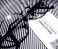
| 03/02/2003 11:50:26 AM |
Glasses and cardby GrenComment: I like the tones and contrasts here, and the placement of the objects is engaging. I can see the card saying "Funeral Home," but the mood and other communication in the photo do not support "despair." I'm not sure what glasses have to do with despair, for example, or the vertical lines. It is also unclear to me how the image being out of focus helps you as a choice. |
| Photographer found comment helpful. |
| 03/02/2003 11:47:05 AM |
MY FIRST AND LAST ATTEMPT TO CLIMB OUT OF HELLby RubenComment: You've captured "cold" well, and "icy," but the despair is not as apparent to me. You may be assuming that we know what you do. The image has a nice mood to it, that could be despair if the subject were clearer. INteresting textures, too. |
| 03/02/2003 11:45:04 AM |
Poor TYby nitro102Comment: We have a cat just like this and she always looks sad, too. For this image, for which you have a good eye in finding a subject, the face is centered. Try fiddling with cropping to close in on what is really important: the blankets do nothing for you here in terms of framing or focus. The rule of thirds may help you here, too. |
| Photographer found comment helpful. |
| 03/02/2003 11:42:24 AM |
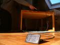
Low energyby calypsoComment: You've used light and some interesting angles effectively to draw attention to your subject. Perhaps you're assuming too much in thinking that we know what is being presented in terms of both objects and theme communication. I see a guy pressing a button of some kind on a machine and is that a solar collector of some kind? All this does not add up to "despair" to me, even with the title. If despair is to be found in having no energy, it may be worthwhile to experiment more with mood and result. |
| Photographer found comment helpful. |
| 03/02/2003 11:38:32 AM |
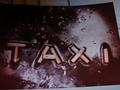
Fare-- Fair?by Straight8Comment: I like the tones and composition of this photo in terms of placement of the word TAXI. The stark contrasts really draw my attention. I must admit to being a bit baffled as to the relevance of the word TAXI in this way to the theme of despair. The image may also be more effective in its communication with a bit more sharpness overall. The title does not clear up my perplexity. |
| 03/02/2003 11:35:24 AM |
Web Newsby KingLokComment: A clever idea. You might try fiddling with your lighting to give the image some mood, and perhaps some interesting perspective or angles would add to the photo's effectiveness as well. Your horizontal lines indicate a detatchment, which is enhanced by the despair being on the computer in the first place. Since the image has almost no color, you might try actually making it black and white to show a kind of journalism of sorts. Good luck. |
Home -
Challenges -
Community -
League -
Photos -
Cameras -
Lenses -
Learn -
Help -
Terms of Use -
Privacy -
Top ^
DPChallenge, and website content and design, Copyright © 2001-2025 Challenging Technologies, LLC.
All digital photo copyrights belong to the photographers and may not be used without permission.
Current Server Time: 08/05/2025 07:53:46 AM EDT.