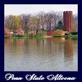
DPChallenge: A Digital Photography Contest You are not logged in. (log in or register
 
Browse Settings
Currently viewing:
Memberdsidwell

Show comments:

Per page:

Order:

Comments:


Comments Made by dsidwell
Pages:   ... [406] [407] [408] [409] [410] [411] [412] ... [532]
Showing 4081 - 4090 of ~5319
Image Comment
Penn State Altoona
05/15/2003 12:37:47 AM
Penn State Altoona
by OneSweetSin

Comment:
Greetings from the Critique Club!

I concur with all of the compliments below!

In this image, the light and textures of the water and trees lead my eye directly to the that interesting tower. The tower is seen in its environment, or perhaps it would be more accurate to say the the environment contains a tower. As a post card shot, It succeeds because it shows us not only the tower itself, but also its surroundings, which are no less interesting and engaging. In fact, you suggest in this photo that the tower BELONGS there in this space. Through your capture of color, you show that it is just some kind of unusual tree or other landscape feature, enhancing, I'm sure, what the architect wanted! In other words: Great composition!

I really enjoy how you've used the water here as both a strong base for the photo as well as an interesting feature in and of itself. I love how the light gradually fades darker as it approaches the center of the photo, and then is light again in the sky above the trees. The "horizon line" is well placed, and the line created by the shore, once again, lead my eye right to that tower.

This is well done, and you should be pleased with the outcome.

As a postcard, some suggested that it was not really a postcard shape, and this could be true, but artists are constantly breaking the boundaries of what a postcard is these days. I've even seen triangular ones! Still, format is something to think about is this were, for example, for a client.

To improve the shot, you might try exploring a little with light. You obviously can't control the light here, but perhaps a different time of day with longer shadows and interesting sunlight would enhance the shot even more. It looks right now to be about an hour or two before sunset (or after sunrise). You might want to revisit this site and see what interesting light can be found just before sunset or just barely after sunrise.

Once again, great shot! I really look forward to seeing your future work! Good Luck!

David
Photographer found comment helpful.
Blending
05/12/2003 10:44:20 PM
Blending
by severin

Comment:
Tricky and effective. Effective use of "double exposure" technique. Tones match and are perfect together--no small feat I'm sure.
Photographer found comment helpful.
Stop! Moon Dead Ahead!
05/12/2003 10:43:25 PM
Stop! Moon Dead Ahead!
by Anachronite

Comment:
hah! Great catch. Clever idea. Super composition.
Photographer found comment helpful.
Beach Huts
05/12/2003 10:42:50 PM
Beach Huts
by hughletheren

Comment:
Washed tones are perfect for this shot. Nice composition and point of view. A very nice shot.
Photographer found comment helpful.
"Cahoots"
05/12/2003 10:42:07 PM
"Cahoots"
by casualguy

Comment:
I bet you had to clean this mess up, didn' t you? Wonderful tones and lighting, though the glare can be distracting at times. I wish the blue had as much strength as the other colors.
Petals
05/12/2003 10:40:00 PM
Petals2nd Place
by agwright

Comment:
Stunning clarity and focus and composition. A nice shot!
Photographer found comment helpful.
Primary Pegs
05/12/2003 10:39:28 PM
Primary Pegs
by sher

Comment:
Vibrant colors and good clarity and clean appearance. I like the negative space, though there might be just a tad too much. Nice work!
Photographer found comment helpful.
Rain, Rain, Go Away!
05/12/2003 10:38:07 PM
Rain, Rain, Go Away!
by DougPaz

Comment:
She's a cutie! Yellow is vibrant; I wish the blue and red had similar strength in the photo. Very nice portrait!
Photographer found comment helpful.
Finger Fun
05/12/2003 10:36:51 PM
Finger Fun
by scab-lab

Comment:
Clean, clear and effective. I'm buying some tomorrow!
Photographer found comment helpful.
Playground Abstract
05/12/2003 04:27:42 PM
Playground Abstract
by mariomel

Comment:
This would be even more of an abstract (which is done well by the way) if the screws were absent. Perhaps when the voting is over, you can create a version without the screws. Very nice composition and point of vew. Colors are cheerful and the abstract works because of the lines you've captured.
Photographer found comment helpful.
Pages:   ... [406] [407] [408] [409] [410] [411] [412] ... [532]
Showing 4081 - 4090 of ~5319


Home - Challenges - Community - League - Photos - Cameras - Lenses - Learn - Help - Terms of Use - Privacy - Top ^
DPChallenge, and website content and design, Copyright © 2001-2025 Challenging Technologies, LLC.
All digital photo copyrights belong to the photographers and may not be used without permission.
Current Server Time: 08/25/2025 11:28:59 AM EDT.