| Image |
Comment |
| 06/15/2003 10:41:46 PM |
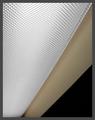
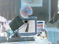
Flouresceby greenem2Comment: Interesting lines and patterns. Perhaps a closer point of view would provide a sense of mystery or drama to the shot. |
 Photographer found comment helpful. Photographer found comment helpful. |
| 06/15/2003 10:40:32 PM |
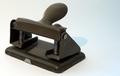
A Staplerby russiComment: Your choice to put the stapler in the lower left third is interesting, and creates a feeling that the stapler can barely be contained. More dramatic or moody lighting would heighten this feeling even further. |
| Photographer found comment helpful. |
| 06/15/2003 10:39:21 PM |
Copy of a staplerby AlexysComment: Intriguing light. It's fun to see a unique light source being used! The composition works for me, too. The stapler doesn't seem very sharply focused, though, and this detracts a tad from this lovely and inventive idea. |
| 06/15/2003 10:37:58 PM |
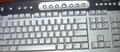
My keyboardby Crafty SueComment: The slight tilt of the keyboard reallly helps add interest to this image. It seems slightly out of focus, though, and I think some more interesting lighting would add more drama and mood to the image, which would lead my thoughts beyond the photo, as it were, to think about deeper or broader things. |
| Photographer found comment helpful. |
| 06/15/2003 10:35:47 PM |
Complaint Departmentby draney4Comment: Interesting use of "negativity" in this photo. I'm not sure it adds much to your overall effect, which is surreal and dream like. Is this the effect you were going for? |
| 06/15/2003 10:34:27 PM |
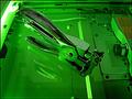
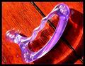
Tool of the tradeby kosmikkreeperComment: I like the colors here and the harsh lighting seems almost appropriate. I have no idea what I'm looking at, though. |
| 06/15/2003 10:33:28 PM |
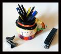
Pilgrim and Friendsby ChiquiComment: Nice still life arrangement; triangles work for me. The whole image seems inappropriately out of focus, just slightly. My attention certainly falls to the colorful pencils and pens in the mug. |
| 06/15/2003 10:32:18 PM |
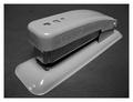
Old Stand Byby jerrftComment: Nice composition adds depth to the subject. Black and white gives attention to its form, which seems appropriate here. I find your lighting less interesting than your other elements, but this is a straightforward "stock" photo of a stapler. |
| Photographer found comment helpful. |
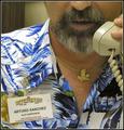
| 06/15/2003 10:30:48 PM |
"Office".... Artby tfarrell23Comment: Clever and interesting. Your cropping is really well done here with only the lower part of his face in focus (and the badge, of course). I find the lighting and focus less interesting than your composition, but this is an engaging shot. |
| Photographer found comment helpful. |
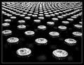
| 06/15/2003 10:28:18 PM |
Like Soldiers Marching Into Battleby mariomelComment: Nice work. I love the patterns here. I kind of wish the foremost bottles were in focus, though rather th an the third row, but you may have tried that already and found it dissatisfactory. I'm sure folks have mentione that this does not appear very office-like. |
| Photographer found comment helpful. |
Home -
Challenges -
Community -
League -
Photos -
Cameras -
Lenses -
Learn -
Help -
Terms of Use -
Privacy -
Top ^
DPChallenge, and website content and design, Copyright © 2001-2025 Challenging Technologies, LLC.
All digital photo copyrights belong to the photographers and may not be used without permission.
Current Server Time: 08/26/2025 06:00:51 PM EDT.