|
|
|
Showing 311 - 320 of ~375 |
| Image |
Comment |
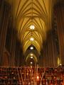
| 02/26/2003 11:21:16 AM | St. Patrick's Cathedralby lionelmComment: CRITIQUE CLUB
This photo is absolutely breathtaking, making it very hard to critique!
CHALLENGE: For rhythm, this photo may be a bit busy. There are so many examples of rhythm here that you might want to focus on just one thing, like the pattern in that amazing ceiling.
TECHNICAL: I think your camera was set perfectly. There is a light at the bottom of the photo, and I can't decide if that's your flash reflection or someone elses? This is probably something you'll want to edit later.
POST CHALLENGE SUGGESTIONS: I would stongly considered cropping out the bottom of this piece. The eyes are automatically drawn to that amazing ceiling and everything else adds an element of clutter. Don't get me wrong, this is an absolutely GORGEOUS print that deserved a high score! |
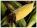
| 02/26/2003 11:08:46 AM | Kernalsby GraciousComment: CRITIQUE CLUB
Lighting: Absolutely perfect. I find nothing wrong with your lighting at all. There is just a tiny bit too much lighting near the bottom right hand corner which draws the eye down a bit.
Technical: Obviously, your camera was set to do this perfectly. I see no graininess, noise, or technical issues here at all.
Challenge: Very yellow! Fits the challenge beautifully.
Overall: A WONDERFUL shot! I really like this and can see it in an advertisement easily. |
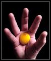
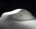
| 02/26/2003 11:05:10 AM | Rising Sunby jmsetzlerComment: CRITIQUE CLUB
Well, this is just my luck... I have to do my first critique on one of the best photographers here! Well, here goes... =)
CHALLENGE: Obviously met. The lighting draws my eyes to your thumb and the corner of the yolk though. Although it's a great shot, you may have wanted to put more emphasis on the actual yolk, just to meet the challenge. The most interesting thing about this print is how the yolk seems to defy gravity. It's an awesome effect.
TECHNICAL: I don't see anything wrong with the settings you used. It's a very sharp, clear photo.
LIGHTING: The lighting is gorgeous depending on what you're after. Like I said before, maybe a little more emphasis on the egg. The shadows on the fingers are fantastic.
POST-CHALLENGE EDITING: I would recommend getting rid of the thumb hangnail as well as the scars on the middle fingertip. Near the bottom of your hand, you have an overshadow, which makes your hand look a bit dirty or bruised, so you might want to touch that up as well. Maybe lighten the hands a bit to get rid of some of the redness.
I have browsed through your galleries and you obviously know your stuff. Your unique approach to this challenge is refreshing, and I think it's a very interesting shot. |
| 02/26/2003 10:54:21 AM | Alone in the Light by indigo997Comment: CRITIQUE CLUB
Gorgeous, gorgeous, gorgeous.
LIGHTING: Superb, absolutely PERFECT. I am sure people would love to know how this lighting was set up. Maybe a tutorial?
CHALLENGE: Very yellow, and all the attention is on the yellow as well. Gorgeous.
TECHNICAL: Obviously perfect
CHANGES: I can't think of a single one to be honest. This honestly looks like a print you would buy. You did a fabulous job and your ribbon was well-deserved. - I strongly think you should do a lighting tutorial. Lighting like this is NOT easy! |  Photographer found comment helpful. Photographer found comment helpful. |
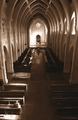
| 02/26/2003 10:51:09 AM | Rowsby greenem2Comment: CRITIQUE CLUB
WOW! Okay, I have been staring at this for quite some time, and frankly, I LOVE this photo. It's absolutely gorgeous.
LIGHTING: Beautiful. The only nit-picky critique I have is that the focus falls on the windows at the end which seem like they should have more to them, because they are so bright. Obviously, this couldn't be corrected with the sunlight, but I would like to see more lighting on the books.
CHALLENGE: Definitely met. Wonderful rhythmic look. Maybe a bit "choppy" - I actually think this would have been perfect for "leading lines"
TECHNICAL: I see no problems at all with your settings
OVERALL: I absolutely love this, so please don't think of this as a short critique. It's hard to critique something that is near perfect. Adjust the lighting on the windows (now that you can edit) and you have yourself a treasure! | | Photographer found comment helpful. |
| 02/26/2003 10:47:21 AM | Sweet Heartsby AnachroniteComment: CRITIQUE CLUB
Lighting: This seems a bit "washed" to me, with most of the light falling on the upper left hand corner. With the light there, it almost seems like there should be a center of focus there too - maybe an individual heart with a cute saying??
Subject: This fits the challenge VERY well. The only downfall to this shot is that it is a photo of something we are all used to seeing on Valentines Day. There may have been a lack of interest during the voting.
Sharpness: A bit too sharp, and the colors are a bit too bright. I think this would have made a great "soft" print.
Overall: I think it's a good shot, and I love how you filled the entire frame. I might go for a more "unique" subject next time and soften your lighting, simply to avoid a snapshot look. Of course, with the time limit, it made it difficult to go "all out"! Take care, and great job! | | Photographer found comment helpful. |
| 02/25/2003 08:47:21 PM | | | Photographer found comment helpful. |
| 02/25/2003 08:44:54 PM | | | Photographer found comment helpful. |
| 02/25/2003 08:41:53 PM | | | Photographer found comment helpful. |
| 02/25/2003 08:38:27 PM | | | Photographer found comment helpful. |
|
Showing 311 - 320 of ~375 |
Home -
Challenges -
Community -
League -
Photos -
Cameras -
Lenses -
Learn -
Help -
Terms of Use -
Privacy -
Top ^
DPChallenge, and website content and design, Copyright © 2001-2025 Challenging Technologies, LLC.
All digital photo copyrights belong to the photographers and may not be used without permission.
Current Server Time: 08/17/2025 03:14:27 PM EDT.
|