| Image |
Comment |
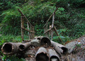
| 11/22/2006 11:21:21 AM |
Acrossby abhraComment: Nice composition, but the background is very distracting. Maybe a shallower dof to isolate 1 particular aspect or taken from the oposite direction would have been more interesting to me. |
 Photographer found comment helpful. Photographer found comment helpful. |
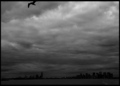
| 11/22/2006 11:18:30 AM |
Seagull over NYC.by petrakkaComment: Too bad the seagull was cut off. There is so much space between the gull and NYC that I can't easily tie them together with my eyes. |
| Photographer found comment helpful. |
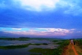
| 11/22/2006 11:16:56 AM |
A panoramic view of a paddy field in Kerala, India.by manukarunComment: It looks over saturated to me and too much sky. I'm thinking it would have been more interesting with a low perspective so there is more road leading the eyes and no people (or make the people the subject facing the camera). Also it appears blotchy on my monitor, is that jpeg artifacts from too much compression? |
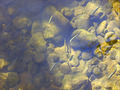
| 11/22/2006 11:13:59 AM |
Trout Belowby justineComment: I've tried photos like this before and although you have done a much better job than me I still think it is too busy and no central subject so uninteresting. |
| Photographer found comment helpful. |
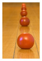
| 11/22/2006 11:11:31 AM |
Converging tomatoesby TallisManComment: Great composition and use of perspective. The two glare (especially one being blue) spots distract a little from an otherwise great photo. Thank you for placing the tomatoes within the lines of the table, it helps control my wondering eye. |
| Photographer found comment helpful. |
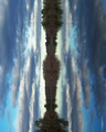
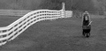
| 11/22/2006 11:09:16 AM |
Vertical Horizonby mfimanComment: That is definately dramatic, but it just kills me to look at it. My mind just will not accept it unless I treat it as an ink blot. Please forgive my lack of vision. |
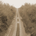
| 11/22/2006 11:05:25 AM |
Lonely Trackby tomcatComment: I can't explain why this photo doesn't just grab me and make me look and look...Maybe it is that the track is dead center, but then that is the POINT. I'm sorry I can't vote higher than a 6 for this because it is nice... |
| Photographer found comment helpful. |
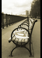
| 11/22/2006 11:02:57 AM |
Pagan Sundayby pineappleComment: Very nice! Why only verticle borders? My eyes follows the bench and leaves the photo...maybe a top border would have prevented that? Anyway, I'm sure you had a good reason that is above me and the photo really works so who am I to say? Ps. If someone says there is too much boring sky at the top left don't believe them - the sky is a perfect compliment to the subject. |
| Photographer found comment helpful. |
| 11/22/2006 10:59:02 AM |
The Farmerby elipsComment: Very nice black and white. Good balance and "perspective". Simple compositions like this really appeal to me. I do wish the horizon was a little straighter but that is a nitpicky thing to say :) |
| Photographer found comment helpful. |
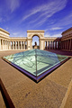
| 11/22/2006 10:56:40 AM |
Points of Viewby sfaliceComment: Very nice perspective shot. The lighting was very harsh but you did a good job balancing it out. Very clean and not too busy for me. I think the angleing sidewalk at the bottom of the picture matching the purple point of whatever it is makes this composition very interesting. Good job |
| Photographer found comment helpful. |
Home -
Challenges -
Community -
League -
Photos -
Cameras -
Lenses -
Learn -
Help -
Terms of Use -
Privacy -
Top ^
DPChallenge, and website content and design, Copyright © 2001-2025 Challenging Technologies, LLC.
All digital photo copyrights belong to the photographers and may not be used without permission.
Current Server Time: 09/04/2025 02:45:26 AM EDT.