| Image |
Comment |
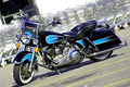
| 12/03/2006 11:37:22 AM |
Motorcycleby ladpupmoeComment: A tad overexposed, focus is soft & not the most flattering of locale, either.
Perspective is a little lacking in creativity. I think it would have been better if you had gotten up close & more toward the front of the bike, taking advantage of the reflections all that chrome has to offer and getting less of the parking lot, shopping carts & pavement stains.
I'm pretty much a newbie here, though, so take my comments with a grain of salt - just 'cause I'm being critical doesn't mean I think MY stuff is doing any better! You'll likely lap my submission, lol... Good luck! |
 Photographer found comment helpful. Photographer found comment helpful. |
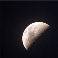
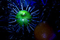
| 12/03/2006 11:31:35 AM |
E.T.'s Viewby dhumann1Comment: Soft & little noisy compared to the other moon entries. I like your composition more, though... |
| Photographer found comment helpful. |
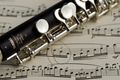
| 12/03/2006 11:30:12 AM |
Etudeby AnnComment: A little boring in set-up & composition. Doesn't evoke a whole lot from me - could have been helped greatly by more dramatic lighting, IMHO. Nice focus & exposure, though! I'm pretty much a newbie here so take my comments with a grain of salt - just 'cause I'm being critical doesn't mean I think MY stuff is doing any better! You'll likely lap my submission... Good luck! |
| Photographer found comment helpful. |
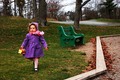
| 12/03/2006 11:28:06 AM |
Snacks at the Parkby pcphotosComment: Cutie pie - but 'diagonal' connection weak here. Dutch angle would have carried it further as far as the challenge goes... I'm pretty much a newbie here, though, so take my comments with a grain of salt - just 'cause I'm being critical doesn't mean I think MY stuff is doing any better! You'll likely lap my submission... Good luck! |
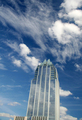
| 12/03/2006 11:27:42 AM |
Frost Towerby Zot1Comment: Small submissions make it hard to really give images a fighting chance!
I also consider this pretty much a DNMC - the ever so slightly slanted perspective seems more accidental than anything - it's missing a strong diagonal connection.
Composition could have been much better overall. The viewer is left wondering what they are supposed to look at - what's the subject? Is it the building? Is it the clouds? |
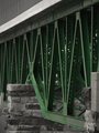
| 12/03/2006 11:20:51 AM |
Saltireby jasonlpriceComment: Kinda dark - makes me search for the texture & interest. A little PP playing (what's legal for this challenge anyway - contrast, color, sharpening, etc.) would have gotten you more mileage, I think. 'Diagonal' connection is strong, but not compelling enough on its own without help from what it is composed of, IMHO. I'm pretty much a newbie here, though, so take my comments with a grain of salt - just 'cause I'm being critical doesn't mean I think MY stuff is doing any better! You'll likely lap my submission... Good luck! |
| Photographer found comment helpful. |
| 12/03/2006 11:20:23 AM |
Going Green!by colorcarnivalComment: Selective color has gotten pretty cliché - plus I feel this would have been more interesting if the challenge instructions had been followed more spiritedly. A dutch angle here would have brought a lot more to the party. But I'm pretty much a newbie here, though, so take my comments with a grain of salt - just 'cause I'm being critical doesn't mean I think MY stuff is doing any better!
Good luck! |
| Photographer found comment helpful. |
| 12/03/2006 11:19:06 AM |
Apples 'n Orangesby tapeworm_jimmyComment: Seems a bit pointless.... (ha ha, get it?) I'm pretty much a newbie here, though, so take my comments with a grain of salt - just 'cause I'm being critical doesn't mean I think MY stuff is doing any better! Good luck! |
| Photographer found comment helpful. |
| 12/03/2006 11:18:40 AM |
Frozen.by Dan_CottleComment: Egads, I love this one but I'm missing the challenge connection so I have to vote it down a bit. Makes me wonder if it was s'posed to be 'Light on White'. Really lovely, though. I'm a bit bothered by the lower left flower & for these rules I would have framed it out during composition (blurred it more in Advanced Editing). Otherwise I love the delicacy of the center bloom & soft background. |
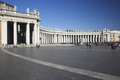
| 12/03/2006 11:17:47 AM |
Roma -- Piazza San Pietroby Rino63Comment: Ambiguous diagonal connection with this one - unless it s'posed to be the slightly skewed horizon impression. If so, perhaps taken it a bit further would have been in order here. Seems more like a tourist snapshot than a thoughtfully composed work of creativity. I'm pretty much a newbie here, though, so take my comments with a grain of salt - just 'cause I'm being critical doesn't mean I think MY stuff is doing any better! You'll likely lap my submission... Good luck! |
| Photographer found comment helpful. |
Home -
Challenges -
Community -
League -
Photos -
Cameras -
Lenses -
Learn -
Help -
Terms of Use -
Privacy -
Top ^
DPChallenge, and website content and design, Copyright © 2001-2025 Challenging Technologies, LLC.
All digital photo copyrights belong to the photographers and may not be used without permission.
Current Server Time: 08/21/2025 02:55:20 AM EDT.