| Image |
Comment |
| 05/02/2007 09:00:33 AM |
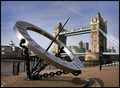
Tower Bridge in the morningby kevip6Comment: I've seen a similar shot in a UK photography magazine taken in the exact same position but it was taken at dusk with lights reflecting off the sculpture which added that something different. I wonder if you've tried to emulate that same image or if it is just pure coincedance? Either way, the fact I have already seen what CAN be done with this shot has done nothing for the way I see this image. Sorry! |
 Photographer found comment helpful. Photographer found comment helpful. |
| 05/02/2007 08:56:06 AM |
|
| Photographer found comment helpful. |
| 05/02/2007 08:55:47 AM |
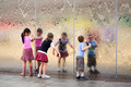
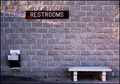
Urban Oasisby taterbugComment: I like the texture on the wall but this is just not interesting enough for me |
| Photographer found comment helpful. |
| 05/02/2007 08:55:13 AM |
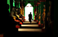
The Caretakerby librodoComment: i like the silhouette effect on the man but i find the fact that you can see detail on the right hand side and not the left a bit distracting, it should be either one or the other IMHO. |
| Photographer found comment helpful. |
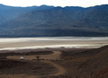
| 05/02/2007 08:53:52 AM |
Alone In Death Valleyby TommyMoe21Comment: It looks like the dark ground and hills have tricked the camera into overexposing the sky which is a real shame as it has real potential. A good technique to avoid this is to take a spot meter reading on a brighter part of the image (ie the sky) and then lock these settings for use in the actual shot. Most DSLR's as far as i know have the capability to lock the exposure and shutter readings so perhaps read up on the manual?? |
| Photographer found comment helpful. |
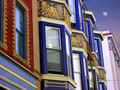
| 05/02/2007 08:40:26 AM |
Perfect Blue Buildingsby CrazyStripesssComment: great colours but i'm not sure what is going on with the sky and moon? The houses look really sharp and clear but the sky looks really blurred and looks like it does not belong there, looks like a bit of a PS bodge to be honest. |
| Photographer found comment helpful. |
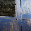
| 05/02/2007 08:38:49 AM |
study of a broken homeby GnarfComment: I can kinda see where you are coming from with this one but it's just not quite interesting enough for me |
| Photographer found comment helpful. |
| 05/02/2007 08:36:45 AM |
Waldo's Houseby bbrightComment: wow, this is very nice.
I like everything about it apart from the artifact to the right of the house low down, I can't work out what it is and it's bugging me! Looks too dark to be sky? |
| Photographer found comment helpful. |
| 05/02/2007 08:34:24 AM |
Look to the Skiesby meneleComment: great silhouette, nice colours for the sky although it looks rather unnatural, especially as the bottom right corner is really orange compared to the rest.
Nice compositon and good placement of the dish. |
| Photographer found comment helpful. |
| 05/02/2007 08:31:52 AM |
"B Movie"by smccComment: hmmmm this is a pretty unusual perspective and I can't decided whether I like it or not.
One thing I noticed straight away was the amount of "noise" normally caused by using a high ISO setting but as this image is very artistic and unusual i'm not sure if it was intentional or not.
The ground looks too blown out IMO especially on the right hand side at the front but again i'm not sure if this is intentional or not?
The crop is kinda strange too and you've definitely got me wanting to see more, and I guess that can only be a good thing.... |
| Photographer found comment helpful. |
Home -
Challenges -
Community -
League -
Photos -
Cameras -
Lenses -
Learn -
Help -
Terms of Use -
Privacy -
Top ^
DPChallenge, and website content and design, Copyright © 2001-2025 Challenging Technologies, LLC.
All digital photo copyrights belong to the photographers and may not be used without permission.
Current Server Time: 08/21/2025 05:27:39 AM EDT.