| Image |
Comment |
| 04/21/2005 12:41:57 AM |
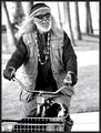
Sold Outby marvinComment: this is one of the funniest photos i've seen in a long time |
 Photographer found comment helpful. Photographer found comment helpful. |
| 01/03/2005 04:29:58 AM |
|
| Photographer found comment helpful. |
| 01/03/2005 04:27:02 AM |
|
| Photographer found comment helpful. |
| 11/21/2004 02:39:47 AM |
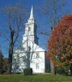
Novemberby OlyuziComment: This is a Critique Club comment
Olyuzi,
Wow, finally a comment that I can make to you without any politics involved :).
I'm not really seeing a ton of the "leaning" that a lot of commenters are talking about. I see a little but it isn't a big problem here. One thing I did notice right away is how hot the exposure is on the church. This could be a result of a few things. The shadow cast on the church could have tricked the camera into using a slower shutter than it should have, or maybe you decided to boost the contrast to bring out the shadow on the front some more. I'm not sure. I dont' think it's terribly important. One suggestion I have is to try maybe turning this into a tritone or quadtone image and using the shadows to your advantage in that area. Shadows are cooler in b&w. It's a calendar worthy subject, in need of some minor tweaking. Hope this helps a little. Take care rant buddy.
Josh |
| Photographer found comment helpful. |
| 11/21/2004 02:31:37 AM |
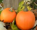
Novemberby dphillipsComment: From the Critique Club:
Donna,
From my personal experience on DPC, going purely on what scores well and what doesn't, I can definitely say you went a little far on the neat image. Now that's just from a voter's standpoint. You do have your artistic prerogative to do as you wish. I think the smoothness looks out of place given that the pumpkins are really the only objects with the extreme smoothness. One suggestion would be to download the new version of NeatImage. It has a new feature that automatically picks the best area to sample the grain for removal.
As for the rest of the image, I think it's decent overall. The leaves are a tad distracting. One other suggestion that I think would help a lot is a tighter crop on the left side to start the left side of the frame with the wooden post. It gives a reference point and wouldn't just be floating out in the middle of the picture. Hope this was helpful. Have a nice day.
Josh |
| Photographer found comment helpful. |
| 11/01/2004 12:17:15 AM |
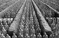
Battle Lines by CamComment: how often are you in my neck of the woods :)? awesome shot. i'll be going to xi'an in a couple months |
| Photographer found comment helpful. |
| 04/01/2004 12:02:41 AM |
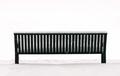
Snowy Benchby kellenhellerComment: this one definitely stands out to me right away. i like it a alot. i would like it even more with some more negative space though. still a nice shot. |
| Photographer found comment helpful. |
| 03/15/2004 11:14:04 AM |
Anastasiaby nbortonComment: how is this not going to ribbon? another defeat for dpc voters |
| Photographer found comment helpful. |
| 03/15/2004 11:13:25 AM |
Hypnotic Stare by librodoComment: focus is a little soft, but still i think this is the best photo in the challenge. lots of emotion in this one |
| Photographer found comment helpful. |
| 01/30/2004 07:58:50 AM |
|
Home -
Challenges -
Community -
League -
Photos -
Cameras -
Lenses -
Learn -
Help -
Terms of Use -
Privacy -
Top ^
DPChallenge, and website content and design, Copyright © 2001-2025 Challenging Technologies, LLC.
All digital photo copyrights belong to the photographers and may not be used without permission.
Current Server Time: 08/26/2025 11:41:17 PM EDT.