| Image |
Comment |
| 02/16/2007 01:12:09 PM |
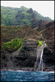
Waterfall on the Nepali Coastby staabComment: I really like how the waterfall just runs right into the ocean. Those rock formations are fantastic and the blue water and green plants really set off nicely against the dark rocks. |
 Photographer found comment helpful. Photographer found comment helpful. |
| 02/16/2007 01:10:24 PM |
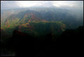
Waimeaby staabComment: Chris- Awesome colors and textures. I assume this was taken from a helicopter? |
| Photographer found comment helpful. |
| 02/15/2007 07:34:36 PM |
Green Sand Beachby staabComment: Awesome location - That is a must see - I think we will need to upgrade our vehicle to go for the 4x4. |
| Photographer found comment helpful. |
| 02/15/2007 12:53:52 PM |
\"Natures Rebirth\"by bennettjamieComment: Jamie - Unfortunately - many of us do not understand the biology of plants and were struggling to understand how the dead leaves/ petals were a good thing. From a technical perspective - the image is a little on the dark side and it seems almost too closely cropped and suffers from very shallow focus on a dark object. The little blue sign in the back of the pot is also a distraction.
Overall, your concept is good, but the focus and lighting need a little help to help the rest of us understand your message. To be honest, a more dramatic image, such as a plant growing after a forest fire or shoots of a plant coming up around another dying plant, has a great deal more impact than leaves dropping off a tulip. |
| Photographer found comment helpful. |
| 02/15/2007 12:24:48 PM |
|
| Photographer found comment helpful. |
| 02/15/2007 10:57:31 AM |
Leaf Lifeby macrothingComment: I love the textures that this photo shows - very nice use of lighting to show the detail of the leaf - and nice use of bokeh for the background. 8 |
| Photographer found comment helpful. |
| 02/15/2007 09:38:56 AM |
desk bellby undieyatchComment: This bell seems completely out of focus. It has a lot of cool detail to it, but we can't see it. |
| 02/15/2007 09:38:11 AM |
Warning to Young Music Loversby elizadebComment: Pretty nice set up for a shot (and very funny sign) - but the saturation really seems off - the mortar on the brickwork looks purple to me and the rest of the image has a strong orangish tone on my monitor. |
| Photographer found comment helpful. |
| 02/15/2007 09:36:12 AM |
Beatnik Understudyby MuppetComment: The set up of the photo is pretty good - especially the drum and hat. But, this image seems a little fuzzy and the lighting with the sharp shadows is not very flattering to the cool drum. I woudl love to see more detail on the drum - sharpening and improved light might help out. |
| Photographer found comment helpful. |
| 02/15/2007 09:34:29 AM |
554 - Synchronization Completeby emaynerComment: A nice effort. The illumination from the iPOD seems a bit blown out compared to the CDs around the photo. A little better lighting on the CDS so that the exposure could be adjusted would probably help this. |
| Photographer found comment helpful. |
Home -
Challenges -
Community -
League -
Photos -
Cameras -
Lenses -
Learn -
Help -
Terms of Use -
Privacy -
Top ^
DPChallenge, and website content and design, Copyright © 2001-2025 Challenging Technologies, LLC.
All digital photo copyrights belong to the photographers and may not be used without permission.
Current Server Time: 08/23/2025 05:33:02 AM EDT.