| Image |
Comment |
| 08/22/2003 06:08:11 PM |
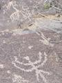
Petroglyphsby ArtifactsComment: Composition: Nice attempt with foreground/background.
Technical: Unfortunately the colour similarity leaves it a little flat, which is a shame, given the interesting subject.
Meets challenge: Yes
Overall impression: Very interesting subject.
[ If this style of comment is useful, please leave a few yourself! www.calcaria.net/dpc.html ] |
 Photographer found comment helpful. Photographer found comment helpful. |
| 08/22/2003 06:05:09 PM |
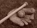
Yesterday's Gameby jimmythefishComment: Composition: Nice inclusion of subjects. I think I'd try to get an object more on a third, however.
Technical: Nice focus. Background matches the foreground colour a little too much.
Meets challenge: Yes.
Overall impression: Nicely done.
[ If this style of comment is useful, please leave a few yourself! www.calcaria.net/dpc.html ] |
| Photographer found comment helpful. |
| 08/03/2003 04:48:18 AM |
Real Refreshmentby joannadivaComment: Composition: I'm not too keen on the point of view. If it was possible to get a show without reflections I think it would be better square-on to the cans.
Technical: Focus seems slightly off.
Meets challenge: Yes
Overall impression: Composition greatly affects the image, which I'm not too keen on personally.
[ If this style of comment is useful, please leave a few yourself! www.calcaria.net/dpc.html ] |
| Photographer found comment helpful. |
| 08/03/2003 04:46:37 AM |
A Bee's Eye Veiwby marinajoeComment: Composition: I would have preferred the flower centre to be on the top-right third intersection.
Technical: Unfortunately the eye is instantly drawn to the flower centre, which is slightly out of focus.
Meets challenge: Some people may mark you do for being able to see a background.
Overall impression: Nice subject, but somewhat lacking technically.
[ If this style of comment is useful, please leave a few yourself! www.calcaria.net/dpc.html ] |
| 08/03/2003 04:44:07 AM |
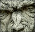
Gargoyleby MikeOComment: Composition: Nice composition and cropping.
Technical: I like the focus and colourisation. Did you try a b&w? I think the border is a little thick and darkens the photo unnecessarily. Don't forget DPC adds a 1px black border, making yours slightly thicker.
Meets challenge: Yes
Overall impression: Nice amount of detail and interesting subject.
[ If this style of comment is useful, please leave a few yourself! www.calcaria.net/dpc.html ] |
| Photographer found comment helpful. |
| 08/03/2003 04:30:42 AM |
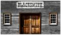
Blacksmithby JPRComment: Composition: Interesting composition. There isn't one main focal point, which some viewers may not like. For me it adds to the interest of the photo as a whole.
Technical: Nice colour and contrast. The b&w wall looks surprisingly good against the wooden door/windows.
Meets challenge: Yes
Overall impression: Very nice photo. Well done.
[ If this style of comment is useful, please leave a few yourself! www.calcaria.net/dpc.html ] |
| Photographer found comment helpful. |
| 08/03/2003 04:27:32 AM |
100% Pure Felineby geminiwbComment: Composition: Nice use of ROTs. My eye was drawn to the black part at the bottom though - I would have tried to crop this out, if possible.
Technical: The focal point for me is the cat's eyes/nose, which aren't the most in focus. I think this would improve the image quite a lot. (I realise it's a pain to work with animals!)
Meets challenge: Yes
Overall impression: Nice idea, but lacking a little technically.
[ If this style of comment is useful, please leave a few yourself! www.calcaria.net/dpc.html ] |
| Photographer found comment helpful. |
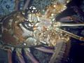
| 08/03/2003 04:25:21 AM |
"Lobsterface . . ."by PirateDiversLtdComment: Composition: Because of the relatively similar colours it's hard to pick out focal point. Would have been good to use the rule of thirds to draw the viewer's eye where you want.
Technical: I guess lighting was impossible to change. Did you use a flash? The shadows are a little harsh. Personally I try and avoid using a flash unless really necessary as it does tend to make photos look a little poor.
Meets challenge: Mostly. I would have expected to see no background really.
Overall impression: Good effort and reasonable result.
[ If this style of comment is useful, please leave a few yourself! www.calcaria.net/dpc.html ] |
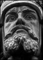
| 08/03/2003 04:21:55 AM |
Hermann the Germanby kebmod54Comment: Composition: Nice position. Seems very slightly off-centre though.
Technical: Good choice of b&w. Looks very slightly oversharpened?
Meets challenge: Yes
Overall impression: I guess this was difficult to take. Good, but getting it dead straight would help.
[ If this style of comment is useful, please leave a few yourself! www.calcaria.net/dpc.html ] |
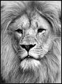
| 08/03/2003 04:17:45 AM |
I am watchin' youby AnastasiaComment: Composition: Nice use of thirds.
Technical: Looks like quite a shallow DOF, making the corners look out of focus? :-/ Really like the monochrome and contrast.
Meets challenge: Yes
Overall impression: Well done.
[ If this style of comment is useful, please leave a few yourself! www.calcaria.net/dpc.html ] |
| Photographer found comment helpful. |
Home -
Challenges -
Community -
League -
Photos -
Cameras -
Lenses -
Learn -
Help -
Terms of Use -
Privacy -
Top ^
DPChallenge, and website content and design, Copyright © 2001-2025 Challenging Technologies, LLC.
All digital photo copyrights belong to the photographers and may not be used without permission.
Current Server Time: 08/27/2025 05:09:41 AM EDT.