| Image |
Comment |
| 11/26/2003 03:30:06 AM |
|
 Photographer found comment helpful. Photographer found comment helpful. |
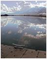
| 11/16/2003 05:49:47 AM |
God in the Dock by C.S. Lewis by dsidwellComment: What a stunning image. Very little to critique here really.. Shame there's a branch on the right, but otherwise pretty spot on. Fits the title well too. Good luck on a ribbon. |
| Photographer found comment helpful. |
| 11/16/2003 05:47:16 AM |
Midnight Hour Encores by Bruce Brooksby BobsterLobsterComment: I like the feeling of movement. Not quite sure about the colourisation - I think I'd maybe have gone a little lighter? Also, I'm not keen on the border. A simple single pixel of colour and then 10px of black would have worked better I think. |
| Photographer found comment helpful. |
| 11/16/2003 05:45:41 AM |
|
| Photographer found comment helpful. |
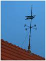
| 11/16/2003 05:40:49 AM |
Gone With the Windby GPComment: Nice idea. I think I'd have tried to get the vane vertical. Also, it may have been worth running the image through NeatImage (www.neatimage.com), which would probably have made the sky nice and smooth. |
| Photographer found comment helpful. |
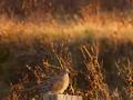
| 11/16/2003 05:38:10 AM |
Lonesome Doveby scrum8Comment: I like the colourisation and contrast. Not sure if composition has the dove a little low in the frame? It's not too noticable, but the image looks a little oversharpened? (Very sharp edge on the dove's breast, and speckles in the background.) |
| Photographer found comment helpful. |
| 11/16/2003 05:30:40 AM |
|
| Photographer found comment helpful. |
| 11/16/2003 05:29:40 AM |
The Sun Also Risesby Glen KingComment: This is a nice shot, but the image is very obviously ruined by jpegging at too low a quality. If you look at the sky is looks blocky and pixilated. I notice the image is only 13kb. DPC allows you 150kb to play with, so it may be worth creating a larger image to improve quality. |
| Photographer found comment helpful. |
| 11/16/2003 05:27:58 AM |
|
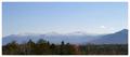
| 11/16/2003 05:26:53 AM |
My Side of the Mountainby adineComment: Fantastic landscape. Pretty much spot on, but why did you choose that border? Had you cropped it to a sharp line, I don't think it would have made a lot of difference visually, but DPC's 'vote down fancy borders' police wouldn't be knocking off marks. |
| Photographer found comment helpful. |
Home -
Challenges -
Community -
League -
Photos -
Cameras -
Lenses -
Learn -
Help -
Terms of Use -
Privacy -
Top ^
DPChallenge, and website content and design, Copyright © 2001-2025 Challenging Technologies, LLC.
All digital photo copyrights belong to the photographers and may not be used without permission.
Current Server Time: 08/26/2025 06:24:31 PM EDT.