| Image |
Comment |
| 04/14/2009 11:53:49 AM |
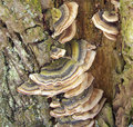
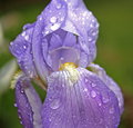
Living Texturesby ReinerComment: It looks a little oof and could use a little curves but the subject choice and composition look good. |
 Photographer found comment helpful. Photographer found comment helpful. |
| 04/14/2009 11:52:42 AM |
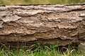
Erosion Resistant Rockby Dano6Comment: This might look better in b/w. I don't mean that it doesn't look good in color just that b/w "might" look better. |
| Photographer found comment helpful. |
| 04/14/2009 11:50:47 AM |
woodby roksibancComment: Not sure how to comment on this one. It isn't a bad shot technically and it certainly meets the challenge but it isn't very interesting to me. Some of the shots I like in the challenge have somewhere interesting to rest my eye while the major portion of the shot is about texture. I suppose that would be a way to add interest here. Maybe take that rock that's off to the right and put it more into the shot? Or a flower? |
| Photographer found comment helpful. |
| 04/14/2009 11:45:46 AM |
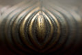
Alchemyby digimComment: Very interesting. I like the lines and shapes in this shot. |
| Photographer found comment helpful. |
| 04/14/2009 11:44:31 AM |
Goosebumpsby mqnaufalComment: Beautiful. Only drawback is the bright spots in the top right. I realize it's basic editing but maybe if you had moved yourself just a little to the right when shooting it you could have avoided them. I think cropping them out wouldn't work because you would lose the nice texture on the bottom right. |
| Photographer found comment helpful. |
| 04/14/2009 11:41:45 AM |
|
| 04/14/2009 11:41:13 AM |
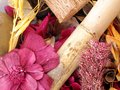
Potpourriby WishingdoveComment: I like that it's a different choice of subject than anyone else in the challenge but some things for thought would be that piece in the top left is distracting so maybe removing that and putting in another piece that is darker or change the angle and quality of your lighting. Also it seems just a little flat so some curves could help. |
| Photographer found comment helpful. |
| 04/14/2009 11:37:35 AM |
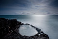
Silke seaby biggisComment: Overall this is a nice photo. I'm not fond of the dark corner on the bottom left though so maybe just a little crop off that side or brightening it up a little somehow without compromising the nice look you have going on in the rest of the shot. |
| 04/14/2009 11:34:57 AM |
Spring Thawby gopherphotoComment: The center composition of the cone isn't helping this image and the upper left corner is overexposed. The texture of the dead grass is good so maybe making that the subject by moving in a little closer there but having the cone still in the shot but not centered would have made this a stronger image. |
| 04/14/2009 11:31:40 AM |
i have no ideaby smardazComment: It almost looks obscene. lol. I think this would benefit from a greater dof though. |
| Photographer found comment helpful. |
Home -
Challenges -
Community -
League -
Photos -
Cameras -
Lenses -
Learn -
Help -
Terms of Use -
Privacy -
Top ^
DPChallenge, and website content and design, Copyright © 2001-2025 Challenging Technologies, LLC.
All digital photo copyrights belong to the photographers and may not be used without permission.
Current Server Time: 08/11/2025 03:11:08 PM EDT.