| Image |
Comment |
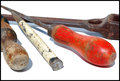
| 04/14/2009 06:17:44 PM |
Tools forgottenby DCrest01Comment: I do like the brightness in this image but I'm not fond of the shadows. Maybe a fill light from the top right would help minimize that. Also the tool on the left might have been better placed by turning it around so that the brush is in the foreground. You have the similar textures on the other 3 tools and the shape of that one is similar to the red one so turning it around would add not only interest but bring in another texture which is lost off the screen on the left. It also looks like that one has more rust on the other end of it too. Overall well done. |
 Photographer found comment helpful. Photographer found comment helpful. |
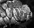
| 04/14/2009 06:12:22 PM |
Wattle Podby Gordon_1Comment: Never heard of that. They are interesting little creatures though aren't they? Good exposure and contrast. dof choice works well. |
| Photographer found comment helpful. |
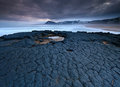
| 04/14/2009 06:10:45 PM |
Contrastby camerabugComment: Funny enough I don't think you have enough contrast in this image. There is an even gray tone with no bright brights and dark darks imo. The two textues are contrasting though if that's what you meant by the title. A little curves would make it a better photo though. |
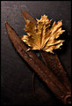
| 04/14/2009 06:08:39 PM |
What was left of Summerby TechoComment: I think the light falls off a little too much toward the bottom of the image. It isn't so much that it loses detail but maybe adding a diffused fill light from the bottom would bring out more of the tables texture too. the exposure on the leaf is very good and overall this is interesting to look at. Well done. |
| Photographer found comment helpful. |
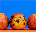
| 04/14/2009 06:05:36 PM |
How do you like them applesby GiorgioComment: The thumbnail doesn't do this one justice. I thought they were oranges. Technicals are very good! Love the complimentary color for the bg. Only thing I can think of is maybe having that middle one (just as it is) next to a ripe good one with a bite out of it. It would give a comparison texture and variety of texture including the smoothness of the ripe apple and the grainy texture of the inside as well as the wrinkled old look of the rotting one. Just a thought. I like this one like it is too though. |
| Photographer found comment helpful. |
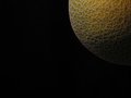
| 04/14/2009 04:36:00 PM |
Celestialby androgeusComment: It must have been a team concept to have all of you make a moon out of a cantaloupe. I think maybe this is a little underexposed though. |
| Photographer found comment helpful. |
| 04/14/2009 04:35:04 PM |
Agedby GemGemComment: Well done. Maybe a tad over-sharpened but not bad. |
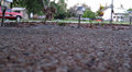
| 04/14/2009 04:34:32 PM |
Rough Pathby DigitalElphComment: The shallow dof here is not helping. With a greater dof we'd be able to see the texture better. |
| 04/14/2009 04:33:43 PM |
Hexagon by orvaratliComment: Great example of how to use a fisheye well to your advantage. Texture with an interesting photo. |
| Photographer found comment helpful. |
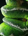
| 04/14/2009 04:32:36 PM |
scalesby rodgers_leComment: Looks like he's playing peek a boo. Well done. Great technicals, love the lighting, PP is done well and great texture. |
| Photographer found comment helpful. |
Home -
Challenges -
Community -
League -
Photos -
Cameras -
Lenses -
Learn -
Help -
Terms of Use -
Privacy -
Top ^
DPChallenge, and website content and design, Copyright © 2001-2025 Challenging Technologies, LLC.
All digital photo copyrights belong to the photographers and may not be used without permission.
Current Server Time: 08/07/2025 02:44:08 AM EDT.