| Image |
Comment |
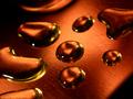
| 06/05/2003 01:56:20 AM |
Golden Tearsby tommy_tComment: I didn't notice the faces until I came back to the picture again. Cool! The reason I like this photo is the sharpness of it, plus the fact that if you were trying to explain the word "liquid" to someone who had never seen it before, this picture would help them to understand it pretty quickly, I think. Also, the diagonal dark areas in upper left and lower right add nice symmetry. I don't know exactly what I'm looking at, but I like it. Nice job! |
 Photographer found comment helpful. Photographer found comment helpful. |
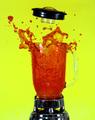
| 06/05/2003 01:53:20 AM |
Blow your topby dan_pendletonComment: I find the yellow a little bright (okay, a lot bright), but that's the only negative thing I have to say. It definitely SCREAMS out "liquid" and is interesting in a sort of "how'd they do THAT?" kind of way. I especially like that the liquid's spray is utilizing the space nicely, and doesn't feel uneven. |
| Photographer found comment helpful. |
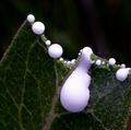
| 06/05/2003 01:51:24 AM |
Sapby vtruanComment: I love the drama of this image! The stark white goes so well against the green, and everything stands out so nicely! This is a really intriguing image, and very creative in execution. Is it really sap, or did you hand-place droplets of glue? Natural or not, it's beautiful! |
| Photographer found comment helpful. |
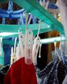
| 06/02/2003 05:32:44 PM |
my laundryby TiberiusComment: This image is one of the ones I came back to later. I like the mundane-ness of it, and how that can really convey the "home" feeling. The blurry whatever-it-is in the upper right is distracting, but I like the crispness of the red clothes against the greenish drying rack. Just upgraded ya a point. Nice work! |
| Photographer found comment helpful. |
| 06/02/2003 05:30:01 PM |
|
| 06/02/2003 05:28:21 PM |
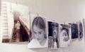
my home my wall my kids my photosby jbruno1397Comment: This one really strikes me -- I like the concept, the only thing that doesn't work for me is that the picture on the left isn't pure B&W like the others. I find that distracting. Other than that, very nice! |
| 06/02/2003 05:26:34 PM |
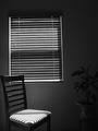
Minimalby briphotoComment: Another one of those images that I keep coming back to over and over during the week. It definitely has a mood of peace and quiet in it. The plant on the right is just a bit too much of a contrast to ignore, but not enough of a contrast to see very well. Would recommend either cropping it out entirely or playing with balance to see if you can get it more into view. |
| 06/02/2003 05:24:42 PM |
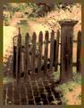
The Garden Gateby fleenkComment: I like the painterly effect on this photo. Only suggestion would be to move the post either up a little or down a little so it's not quite so centered vertically. |
| 06/02/2003 05:23:24 PM |
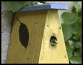
On The wall of my HSH, another HSHby rhipsterComment: I love the home-within-your-home idea, and especially that the bird inside looks so snug and possessive of the little house! Looks sharp and focused, composition is nice, might try boosting saturation a little and see what it looks like, just for kicks. |
| Photographer found comment helpful. |
| 06/02/2003 05:21:39 PM |
Home Is Where The Heart Isby wayne9232Comment: The centered magnifying glass with the vertical being juuuuuust off-perpendicular is a little distracting, would have preferred more of an angle on the glass' handle. I like the very literal interpretation, complete with "heart" drawn on. Very cute. It conveys the information you want to convey, just would have preferred a slightly less formal composition. |
Home -
Challenges -
Community -
League -
Photos -
Cameras -
Lenses -
Learn -
Help -
Terms of Use -
Privacy -
Top ^
DPChallenge, and website content and design, Copyright © 2001-2025 Challenging Technologies, LLC.
All digital photo copyrights belong to the photographers and may not be used without permission.
Current Server Time: 08/24/2025 06:48:55 PM EDT.