| Image |
Comment |
| 09/03/2003 01:21:55 PM |
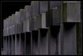
Death repeats itselfby heidaComment: Did you try reversing this so it runs from the upper left ? Do you prefer it this way or that way ? Just a thought... |
 Photographer found comment helpful. Photographer found comment helpful. |
| 09/03/2003 01:20:41 PM |
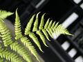
Natural Fractalsby tomlewis1980Comment: was the background deliberate ? Not sure it enhances the leaf at all. Also the out of focus leaf in the upper left seems accidentally included as well ? |
| Photographer found comment helpful. |
| 09/03/2003 01:19:36 PM |
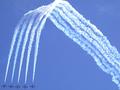
Smoke on! by Fibre OptixComment: cool composition - just a slight touch too tight at the top though ? |
| 09/03/2003 01:19:12 PM |
Striking a Poseby RiderGalComment: Think I'd prefer this with the first woman as the in focus point, with the rest receeding out of focus |
| Photographer found comment helpful. |
| 09/03/2003 01:18:35 PM |
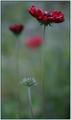
Mercy of the Seasonby jimmythefishComment: good DoF choice, colours are very drab though - maybe a touch under exposed /dark ?
Also, to pick nits, the rear out of focus red bloom is merging with the foreground stem , a slight change of location would help with that. |
| Photographer found comment helpful. |
| 09/01/2003 02:34:56 AM |
|
| Photographer found comment helpful. |
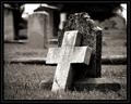
| 08/28/2003 10:25:42 AM |
Soul Harvestby jmsetzlerComment: Not sure I like this one so much - the out of focus regions just seem blurry to my eye - maybe gives me a ghostly impression or being dead, but doesn't quite work for me. The foreground cross is a strong tonal contrast to everything else, but it would maybe look better with a less over exposed look that kept some more of the texture ? The jumbled composition just feels haphazard and accidental - particularly the occluded 'murray' headstone on the right - I can't tell how much of this was intentional to make it look cluttered vs. accidentally arranged. |
| 08/28/2003 10:20:57 AM |
Peace In The Valleyby jmsetzlerComment: Very well exposed and composed - not sure that I like the extremely shallow focus slice in this though, you've lost a bit of the front of the cross and the sliver of out of focus grass in the foreground is a touch jarring - maybe a stop or do wider to get the real subject all in focus while keeping the rest blurred would work better ?
The two white 'hot spots' (sky?) pull me away from the subject a bit too - try covering them with your hands - does it change how you view the picture ? I can see a 'pulling me upwards towards' heaven reason for them perhaps - but I find it better with those areas removed/ darkened - worth a play to see how it changes the picture.
Probably suffered from narrow views of 'garden' but seems right on topic to me... Message edited by author 2003-08-28 10:21:36. |
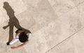
| 08/25/2003 12:09:23 AM |
Vertical Postureby GringoComment: I really enjoy how the shadow seems 'more real' than she does because of the angle. A well deserved ribbon |
| Photographer found comment helpful. |
| 08/24/2003 05:14:21 PM |
|
| Photographer found comment helpful. |
Home -
Challenges -
Community -
League -
Photos -
Cameras -
Lenses -
Learn -
Help -
Terms of Use -
Privacy -
Top ^
DPChallenge, and website content and design, Copyright © 2001-2025 Challenging Technologies, LLC.
All digital photo copyrights belong to the photographers and may not be used without permission.
Current Server Time: 07/28/2025 11:12:34 PM EDT.