| Image |
Comment |
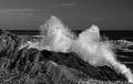
| 11/18/2004 11:30:01 PM |
Reflectionsby GallatinComment: Nice pic. IMO, more white space at the top would have worked nicely. |
 Photographer found comment helpful. Photographer found comment helpful. |
| 11/18/2004 11:24:21 PM |
|
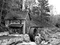
| 11/18/2004 05:24:35 PM |
The Barnby digitaldaveComment: Great capture of grays and textures. A bit more contrast may have been very effective! |
| Photographer found comment helpful. |
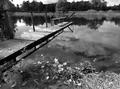
| 11/18/2004 05:23:46 PM |
Crossroadsby dfleisComment: Great use of "white" space... but the subject is .....boring or not of interest, IMO. Also what is the hint of something there on the right border? Still giving you a 5.
|
| 11/18/2004 05:21:48 PM |
i doby sacredspiritComment: A bit too dark. I think if it was not soo dark the shadows would be very effective. Also, the horizontal placement of subject is probably not the most interesting composition!! But, good idea. |
| Photographer found comment helpful. |
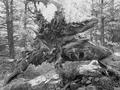
| 11/17/2004 08:47:27 AM |
Near the Ghost Mineby SammieComment: IMO, this photo would have been awesome with more white space - possibly a slightly different angle that allowed the space to the left to be used. Increasing the contrast also. |
| Photographer found comment helpful. |
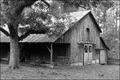
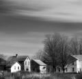
| 11/17/2004 08:45:42 AM |
Old Home Placeby DustyOComment: To have more white space would have enhanced this photo. A bit to bright as well. Great subject. |
| Photographer found comment helpful. |
| 11/17/2004 08:44:27 AM |
|
| Photographer found comment helpful. |
| 11/17/2004 08:43:43 AM |
|
| Photographer found comment helpful. |
| 11/17/2004 08:41:56 AM |
|
| Photographer found comment helpful. |
Home -
Challenges -
Community -
League -
Photos -
Cameras -
Lenses -
Learn -
Help -
Terms of Use -
Privacy -
Top ^
DPChallenge, and website content and design, Copyright © 2001-2025 Challenging Technologies, LLC.
All digital photo copyrights belong to the photographers and may not be used without permission.
Current Server Time: 08/08/2025 03:36:20 AM EDT.