| Image |
Comment |
| 05/03/2003 03:08:19 PM |
Bloodroot and Shadowby drdab99Comment: Greets from the Critique Club!
I really like this image, it's nice and simple. The exposure is great and the focus is superb. The only thing that I can really nitpick on is the composition. For some reason I feel like I want to see more on the right hand side of the frame. Maybe the whole of the shadow?
The colors are wonderful though the leaf at the bottom is just a tad distracting. Overall, this is a really good photo that deserved the high score it got. Congratulations!
-Matt |
| 05/03/2003 02:56:10 PM |
Still Aliveby mikemtiComment: Greets from the Critique Club!
Hi Mike,
This subject could have been much better presented, in my opinion. The lighting is great and really shows off the details in the flowers, however that gets lost in all the stuff going on around the flowers. The surrounding branches get lost in the table, the table pulls the viewer away from the flowers, and the green just adds confusion.
DrJones, who critiqued one of my worst shots, gave me some really good advice - the simpler the subject, the more tempting it is to overload it with surrounding details. Keep it simple. Rather than laying the flowers out on the table, lay them out on a piece of cloth. Get in real close to them so the viewer can see the detail.
Just one or two changes and this would have an outstanding picture, as it is now it's consigned to snapshot status.
Good luck in the next challenge!
-Matt |
| 05/01/2003 08:32:46 PM |
Blues and Twosby agwrightComment: Good pan. I really like that. Gives the feeling of motion and of transportation. Great take on the challenge idea. |
 Photographer found comment helpful. Photographer found comment helpful. |
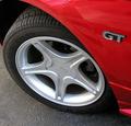
| 05/01/2003 06:51:08 PM |
GTby WILDBLUEComment: Ahh. I love Mustangs. The idea of this photo is nice but something feels missing from the execution. Everything is in focus and sharp, though there appears to be some oversharpening in the GT emblem. The composition is nice, but not perfect. I think more of the fender would have made this stronger - perhaps even back to the door frame. I think the main problem I have is that the colors duller than I'd like them to be. Still good clean photo. 6 |
| Photographer found comment helpful. |
| 05/01/2003 06:46:08 PM |
Little Big Boyby hoojComment: I like the angle you've chosen to shoot this subject at and I also like the negative space. Both serve to accenuate the curves nicely! However, the lighting is uneven - the front of the car feels a bit dark and the flares are too distracting to my eye. Good shot - 7 |
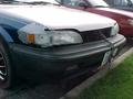
| 05/01/2003 03:06:09 PM |
ole'reliableby BeingCleverComment: While this is a good idea, the execution leaves a lot to be desired. Everything is crisp, clear, and in focus. What is lacking is composition. There is too much around to take the attention away from your subject. Cropping the bottom part of your photograph would help that. The lighting is also harsh - it looks like you used the flash - that gave you that nasty reflection on the front window. Diffusing the flash (with a piece of tissue or paper) would have helped that a little. |
| Photographer found comment helpful. |
| 04/30/2003 10:18:43 PM |
This is my Transportation....by tiffComment: This doesn't impress me very much. It looks like a 5 second snapshot of a car. It could be a really interesting subject. Look for contrasts and unique bits of the car -focusing on the intersection between the hood and the fender for example, down near the tape. There's probably some really neat textures there. A flashlight at night would help bring them out.
It seems like you have a low end camera - that just means you need to work harder creatively to make up for it! |
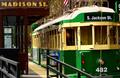
| 04/30/2003 10:14:38 PM |
Waterfront Streetcarby mzanoniComment: Good shot, if just a bit busy. The focus and colours are good but the horizon being tilted detracts some. Your use of thirds is good and draws the eye back into the picture. Perhaps cropping at the top of the street car would remove some of the clutter? |
| Photographer found comment helpful. |
| 04/30/2003 10:11:07 PM |
Traveling by boatby xertionComment: I really like this shot because of the feeling of calmness it gives. The colors are understated and the composition is very good. The only thing I would do is to crop the top of the picutre to near the top of the boat... this seems to give the picture a more balanced feel. |
| Photographer found comment helpful. |
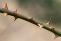
| 04/30/2003 10:03:19 PM |
Unfriendly Floraby magnusComment: Greets from the Critique club:
Hi Magnus!
For this me, this picture lacks wow factor. It's certainly different than most in this challenge and I like it for that. It's also a very simple composition - branch running diagonally and blurry background. That's also good in my book. What I don't like is that the this is soft or that the focus is lacking.. I want to see sharp pointy things, not suggestions of sharp pointy things! Also the shot seems strangely colorless. That may be due to the very plain background - probably not much you can do about that though! Too nitpick, I don't really like the positioning of that one thorn in the middle, I think it's just a bit too centered. Maybe a slightly different crop would have allieveated that?
Good job and good luck!
-Matt |
| Photographer found comment helpful. |
Home -
Challenges -
Community -
League -
Photos -
Cameras -
Lenses -
Learn -
Help -
Terms of Use -
Privacy -
Top ^
DPChallenge, and website content and design, Copyright © 2001-2025 Challenging Technologies, LLC.
All digital photo copyrights belong to the photographers and may not be used without permission.
Current Server Time: 08/04/2025 05:20:48 PM EDT.