| Image |
Comment |
| 06/10/2003 08:00:57 PM |
Sevenby Dim7Comment: Greets from the Critique Club:
Hi Neil,
My intial impression of this shot is one of visual confusion. To properly expose the house, you've overexposed the flowers and the grass in the foreground. The house feels cramped in the frame, and there's very little place for the eye to wander to expect the top left hand corner. What I like about the photo is the angle you captured your house from. Not many people would think to shoot from this angle. I also like the hints of the purples in the flower bed. If the front area was just a bit darker, I think this would have scored better.
Hope this helps! Good luck in future challenges!
-Matt |
| 06/10/2003 07:56:18 AM |
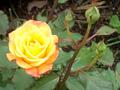
RioSamba rose.jpgby Crafty SueComment: Hi Sue
This is a very nice shot! I like the yellow of the rose contrasted with the green of the leaves. Also, the composition is very nice, having the diagonal of the plant stem to the right and the circle of the rose to the left creates loads of interest.
Good job!!
-Matt |
 Photographer found comment helpful. Photographer found comment helpful. |
| 06/04/2003 09:43:53 PM |
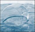
Crystal cleanby AnastasiaComment: Greets from the Critique Club!
Hi Anastasia ;)
First off.. I like this picture. But, there is something missing for me.
I think I want to see just a little more darkness in this shot. That's just personal opinion.
What I do like about this pic is everything else. I like the composition. the surface of the glass presented against the surface of the liquid (frozen water?). I even like tha back light. As for the mood, it makes me feel, well... light and airy, almost non-existant.
Just a tad more dark and it would have been striking, IMO. (Alternatively, cropping the light out of the picture might have worked as well...)
Good job, I think it should have placed higher! |
| Photographer found comment helpful. |
| 06/04/2003 07:39:20 AM |
House Invaderby mbardeenComment: THanks for the comments.
It's not a Black Widow, just turned black with levels and desaturation. The photo was majorly cropped and fliped - it was actually hanging upside down. The uncropped photo gave more of a feel for the home, but well, wasn't inspring at all.
|
| 06/01/2003 03:59:04 PM |
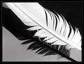
Birds of a feather by JeanComment: I love this photo. It's simple yet complex at the same time. The diagonals running through out and the tones you've captured are wonderful. I really love the juxtaposition of black, gray, and white. Great job! |
| Photographer found comment helpful. |
| 05/31/2003 07:07:29 PM |
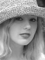
Whitneyby draney4Comment: At first I was disturbed by the focus on the rim of the hat, rather than the eyes.. however on further contemplation I do like the effect. It almost serves to draw attention to her face and hair. Good job! 9
|
| Photographer found comment helpful. |
| 05/31/2003 01:19:55 PM |
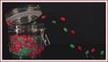
The Great Escapeby wayne9232Comment: Greets from the Critque Club!
Hi Wayne,
First off let me say that I think this photo shows great imagination and creativity. Well done in that regards! Now, to the meat and potatoes of the critique. The biggest thing that bugs me about this photo is that the colours feel very dull. The reds and greens don't pop out of the picture like I expect them to. The reflections are well controlled on the glass jar, but a bit overwhelming on the silver band. Other than those couple nitpicks, I think this a well executed shot.
Good job and good luck in future challenges!
-Matt |
| Photographer found comment helpful. |
| 05/29/2003 07:06:37 AM |
|
| Photographer found comment helpful. |
| 05/28/2003 02:29:47 PM |
Reflectionsby mbardeenComment: For those that wondered about the clear blue of the windows but clouds in the sky, it was a rather odd day. The clouds pretty much bisected the sky, clouds to one side, bright blue to the other. It was the strangest thing. |
| 05/22/2003 12:02:19 PM |
Powers in the Flowersby WarnercableComment: Greets from the Critique Club:
Hi Mark!
I love the colours in this picture, they're vivid and direct. The depth of field is just a bit too small for my tastes, I would prefer to see all of the flowers in focus. The only other thing I would do is to crop off about inch and a half of the left side. That would remove the stray petal and I think it improves the balance of colour in the composition.
All in all a good photo, just needs a little more to make it really good. Good luck in future challenges!
-Matt |
Home -
Challenges -
Community -
League -
Photos -
Cameras -
Lenses -
Learn -
Help -
Terms of Use -
Privacy -
Top ^
DPChallenge, and website content and design, Copyright © 2001-2025 Challenging Technologies, LLC.
All digital photo copyrights belong to the photographers and may not be used without permission.
Current Server Time: 08/03/2025 10:10:25 AM EDT.