| Image |
Comment |
| 06/04/2003 09:43:53 PM |
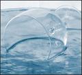
Crystal cleanby AnastasiaComment: Greets from the Critique Club!
Hi Anastasia ;)
First off.. I like this picture. But, there is something missing for me.
I think I want to see just a little more darkness in this shot. That's just personal opinion.
What I do like about this pic is everything else. I like the composition. the surface of the glass presented against the surface of the liquid (frozen water?). I even like tha back light. As for the mood, it makes me feel, well... light and airy, almost non-existant.
Just a tad more dark and it would have been striking, IMO. (Alternatively, cropping the light out of the picture might have worked as well...)
Good job, I think it should have placed higher! |
 Photographer found comment helpful. Photographer found comment helpful. |
| 06/04/2003 07:39:20 AM |
House Invaderby mbardeenComment: THanks for the comments.
It's not a Black Widow, just turned black with levels and desaturation. The photo was majorly cropped and fliped - it was actually hanging upside down. The uncropped photo gave more of a feel for the home, but well, wasn't inspring at all.
|
| 06/01/2003 03:59:04 PM |
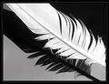
Birds of a feather by JeanComment: I love this photo. It's simple yet complex at the same time. The diagonals running through out and the tones you've captured are wonderful. I really love the juxtaposition of black, gray, and white. Great job! |
| Photographer found comment helpful. |
| 05/31/2003 07:07:29 PM |
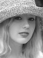
Whitneyby draney4Comment: At first I was disturbed by the focus on the rim of the hat, rather than the eyes.. however on further contemplation I do like the effect. It almost serves to draw attention to her face and hair. Good job! 9
|
| Photographer found comment helpful. |
| 05/31/2003 01:19:55 PM |
The Great Escapeby wayne9232Comment: Greets from the Critque Club!
Hi Wayne,
First off let me say that I think this photo shows great imagination and creativity. Well done in that regards! Now, to the meat and potatoes of the critique. The biggest thing that bugs me about this photo is that the colours feel very dull. The reds and greens don't pop out of the picture like I expect them to. The reflections are well controlled on the glass jar, but a bit overwhelming on the silver band. Other than those couple nitpicks, I think this a well executed shot.
Good job and good luck in future challenges!
-Matt |
| Photographer found comment helpful. |
| 05/29/2003 07:06:37 AM |
|
| Photographer found comment helpful. |
| 05/28/2003 02:29:47 PM |
Reflectionsby mbardeenComment: For those that wondered about the clear blue of the windows but clouds in the sky, it was a rather odd day. The clouds pretty much bisected the sky, clouds to one side, bright blue to the other. It was the strangest thing. |
| 05/22/2003 12:02:19 PM |
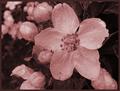
Powers in the Flowersby WarnercableComment: Greets from the Critique Club:
Hi Mark!
I love the colours in this picture, they're vivid and direct. The depth of field is just a bit too small for my tastes, I would prefer to see all of the flowers in focus. The only other thing I would do is to crop off about inch and a half of the left side. That would remove the stray petal and I think it improves the balance of colour in the composition.
All in all a good photo, just needs a little more to make it really good. Good luck in future challenges!
-Matt |
| 05/08/2003 06:32:04 AM |
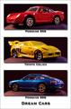
Dream Carsby orussellComment: Greets from the Critique Club!
Hi Owen,
I particularly enjoyed this shot because I felt it was a good execution of a good idea. The DOF is good on the Celica but I would have liked to see a little more on both the porches. On the top porsche that front headlight out focus is distracting too me and on the bottom it's the out of focus taillight that bothers me.
As for the composition - I like the colours you put together, red, yellow, and blue and I like the drop shadowing on the pictures and the text. It makes this pleasing to look at.
Overall a good job in my opinion! Good luck in the next challenge!
-Matt |
| Photographer found comment helpful. |
| 05/08/2003 06:23:21 AM |
Compromiseby draney4Comment: Greets from the Critique Club!
Hi Denise
I really like the concept behind the series of images you put together here, but I feel it misses the mark in a number of ways.
First I'd like to critique the pictures themselves: The best image of the lot is the third one. I like the lighting on the cat and the stone wall and think that makes a particularly interesting shot. The first and second images I'm not nearly as fond of... In the first the cat and birdbath are too isolated in center of the frame for it to effective. On the scond I'm not really fond of the blue bag against the green grass and I don't feel it goes well with the other two pictures.
Now for the composition: Olive green border == ick in my book. I think a black border would have suited this far better and really provided contrast to the white on the cat in each of the pictures. Also, these are all horribly small! You didn't use the full 640 pixel width available to you and the picture entire is only 60k. You can't fit much detail in that way, and that's really what you need to show these shots off. As of now the viewer can't get a good idea of how good or bad the photography is!
Good luck in the next challenge!
-Matt |
Home -
Challenges -
Community -
League -
Photos -
Cameras -
Lenses -
Learn -
Help -
Terms of Use -
Privacy -
Top ^
DPChallenge, and website content and design, Copyright © 2001-2025 Challenging Technologies, LLC.
All digital photo copyrights belong to the photographers and may not be used without permission.
Current Server Time: 08/03/2025 06:28:01 AM EDT.