| Image |
Comment |
| 10/07/2006 11:50:33 AM |
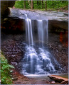
Waterfall in the Forestby docurrieComment: The soft effect on the waterfall is nice. The orange on the right side is somewhat distracting. I think that to include more of the water below by moving the falls to the left one-third of your photo would be more interesting than what is seen above the fall. |
| 10/07/2006 11:48:03 AM |
Force of Natureby jerseyjimComment: I like how the waves are breaking on the concrete forms. The green algae growing on some of them is somewhat distracting. Beautiful blue sky. |
| 10/07/2006 11:45:26 AM |
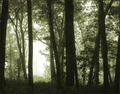
morning mistby dragonladyComment: I like the duotones. The composition is also good. I would increase the contrast a bit more to improve the textures in the trees. |
 Photographer found comment helpful. Photographer found comment helpful. |
| 10/07/2006 11:44:03 AM |
|
| Photographer found comment helpful. |
| 10/07/2006 11:42:39 AM |
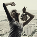
Time is upby EnnilComment: I like her pose, but find the clock to be unnecesary. I think that there needs to be more light on her face and left arm. |
| Photographer found comment helpful. |
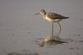
| 10/07/2006 11:41:01 AM |
Searchingby cpanaiotiComment: I like the muted colors here. I would increase the contrast a bit to make the ripples in the water stand out more. |
| Photographer found comment helpful. |
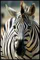
| 10/07/2006 11:40:16 AM |
Intensityby msdoubletroubleComment: I like the head-on viewpoint. I think this could be improved by blurring or burning the body to make the head stand out a bit more. |
| Photographer found comment helpful. |
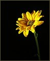
| 10/07/2006 11:38:53 AM |
Sittin prettyby Trumpeteer4Comment: The composition is good, but needs a sharper focus. I would also play with the saturation/hues to increase the textures of the petals. |
| Photographer found comment helpful. |
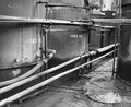
| 10/07/2006 11:37:36 AM |
Used Lubeby dustinwilsonComment: The black/white effect is good, but I think the contrast needs to be increased a bit more to play up the shadows and texture. |
| 10/07/2006 11:36:21 AM |
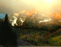
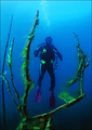
Poseidon's Tridentby ndsComment: I like the blues and greens. The lighting really creates a quiet, but haunting mood. Nice work. |
| Photographer found comment helpful. |
Home -
Challenges -
Community -
League -
Photos -
Cameras -
Lenses -
Learn -
Help -
Terms of Use -
Privacy -
Top ^
DPChallenge, and website content and design, Copyright © 2001-2025 Challenging Technologies, LLC.
All digital photo copyrights belong to the photographers and may not be used without permission.
Current Server Time: 07/21/2025 10:34:47 AM EDT.