| Image |
Comment |
| 04/10/2008 12:05:44 PM |
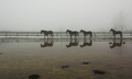
Overflowby bmartuchComment: I love how reflections seem to be capable of merging two worlds into one... this is a WONDERFUL shot. Excellent work! |
 Photographer found comment helpful. Photographer found comment helpful. |
| 04/10/2008 12:03:34 PM |
|
| Photographer found comment helpful. |
| 04/10/2008 12:03:14 PM |
|
| Photographer found comment helpful. |
| 04/09/2008 03:54:13 PM |
|
| Photographer found comment helpful. |
| 04/09/2008 03:47:23 PM |
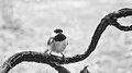
b&wby cynthiannComment: Really neat subject, but it took me a minute to figure out what this was - not a good thing. Probably a different angle, a more clear and simple composition would really increase the impact of the photo and the viewer would have a much better first-impression. |
| Photographer found comment helpful. |
| 04/09/2008 03:44:07 PM |
sadsammy.jpgby cynthiannComment: This one appears to actually need more contrast, but be careful. I think the problem here is that the image is over-exposed, making it appear washed-out. The best way of course, to fix this would be to just re-shoot the whole image, and make sure it's properly exposed. But you probably can't do that, of course. :) Ah well. Simply darkening and adding contrast at this point may not work... But on the other hand maybe it would. Who knows? ;) I agree with  Hot_Pixel Hot_Pixel below - the desaturation looks nice. Message edited by author 2008-04-09 15:44:37. |
| Photographer found comment helpful. |
| 04/09/2008 03:41:30 PM |
|
| Photographer found comment helpful. |
| 04/09/2008 03:40:56 PM |
bwflower.jpgby cynthiannComment: I'm going to venture to say that generally flowers don't do so well in black and white... but then for all I know this version looks a lot better than the originals color version. Also, the lighting is a bit to bright and harsh - there is a shadow from the flower's pollen things, and the light has created a rough texture on the flower petals. So fixing the light would probably be the single biggest thing to fix here. ;) I really love how smooth the center of the flower appears though. Neat! |
| Photographer found comment helpful. |
| 04/09/2008 03:37:29 PM |
Thirstyby cynthiannComment: Well... if it were in sharper focus, of course, that would be a bit help. Also, although I'm sure this is a rather difficult subject to get an interesting composition with, I'm not entirely sure I would crop it off like that. Also, it is slightly over-exposed and that shadow from the harsh lighting is not a good thing. I do like the bright colors with the white though - you had the right idea! ;) |
| Photographer found comment helpful. |
| 04/09/2008 03:33:33 PM |
flower.jpgby cynthiannComment: The blue is a bit too intense, too bright, too much here in my opinion. Otherwise, from what I can make of it - not bad! |
| Photographer found comment helpful. |
Home -
Challenges -
Community -
League -
Photos -
Cameras -
Lenses -
Learn -
Help -
Terms of Use -
Privacy -
Top ^
DPChallenge, and website content and design, Copyright © 2001-2025 Challenging Technologies, LLC.
All digital photo copyrights belong to the photographers and may not be used without permission.
Current Server Time: 08/17/2025 07:13:56 AM EDT.