| Image |
Comment |
| 04/20/2007 12:25:51 PM |
am i losing it?by cutoutComment: Cool... I'm not sure if I like the fact that two whole thirds of the photo is out of focus, I might have cropped a little more of the top. But I really like the point of view you used! The details on the face are really neat. Good shot! |
 Photographer found comment helpful. Photographer found comment helpful. |
| 04/20/2007 12:24:33 PM |
|
| 04/20/2007 12:23:56 PM |
|
| Photographer found comment helpful. |
| 04/20/2007 12:23:10 PM |
Ringletby PDXKimComment: Absolutely lovely! Beautiful... I love the colors - the coppery curls against the green. Your composition is wonderful, and the shallow DOF really adds to this picture. I love it! The only thing I might suggest is brightening it up a tad - there is nothing really white in this picture, which would help balance things a bit... so perhaps by adjusting the cuves in Photoshop you could get the highlights white. But I'm just being picky! A very sweet shot! |
| Photographer found comment helpful. |
| 04/20/2007 12:20:28 PM |
Just One (On a Brush)by freakin_hilariousComment: Cool idea! Not sure I like the red background very much, and it almost looks like the saturation is too high... but an interesting, unique shot! |
| Photographer found comment helpful. |
| 04/20/2007 12:19:42 PM |
Crib Coiffeby OmanOtterComment: haha! A hilarious expression! The lighitng is very nice here, but it looks a little grainy. Maybe lowering the ISO would help that a little bit. Cute shot! |
| Photographer found comment helpful. |
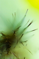
| 04/20/2007 12:18:34 PM |
macro hairby valioooComment: wow! VERY awesome! A really unique idea. Not sure I like the green/yellow colors all that much, nut everything else here is really neat. |
| 04/20/2007 12:17:47 PM |
happy hairby tnunComment: Well, it's a little bit to dark, and it looks like the saturation was too high. Maybe the biggest problem here though, is the grain. If you look in areas like her face for example, you'll see blotchy spots of color. I've had that same problem when my ISO was too high. Try lowering it a bit, and you'll end up with a smoother, less grainy image. Very good try though! I like how the subject's eyes aren't looking strait at the camera! |
| Photographer found comment helpful. |
| 04/20/2007 12:15:41 PM |
bad hair dayby messerschmittComment: A neat portrait! The only thing that I can think of that might improve the shot a little, is if there was some more light on the lower, darker half of the photo. I like the added detail of the photo on the wall! |
| Photographer found comment helpful. |
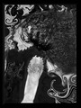
| 04/20/2007 12:14:09 PM |
Head Banger's Ballby libertyComment: A little bit too confusing for me - the composition is so busy I realy don't know what's going on. Interesting idea though! |
| Photographer found comment helpful. |
Home -
Challenges -
Community -
League -
Photos -
Cameras -
Lenses -
Learn -
Help -
Terms of Use -
Privacy -
Top ^
DPChallenge, and website content and design, Copyright © 2001-2025 Challenging Technologies, LLC.
All digital photo copyrights belong to the photographers and may not be used without permission.
Current Server Time: 08/14/2025 08:39:37 AM EDT.