|
|
|
Showing 631 - 640 of ~822 |
| Image |
Comment |
| 04/13/2007 08:37:10 PM | Tough Loveby UbersteinyComment: :) Fantastic shot. There had to be a good S&M one in here somewhere, with a theme like 'chains' it seems obvious... |  Photographer found comment helpful. Photographer found comment helpful. |
| 04/13/2007 08:36:08 PM | |
| 04/13/2007 09:06:00 AM | |
| 04/12/2007 07:21:37 PM | Tears of a Season (opening day - April 6th)by LonzComment: Greetings from the Critique Club.
Congratulations on your new personal best!
This is a well-executed creative idea. However, I think it has great appeal to a limited number of people who belong to the US baseball culture, and limited appeal to everyone else.
My first reaction was: meh, seen this before with nicer backgrounds. I've never heard of the Cleveland Indians, and had I not read the comments below, I wouldn't even know what sport it was. So while I find the shot technically very well done, I probably would have marked it down on the basis that I don't find it that aesthetically pleasing.
Now, having understood what it's about, my critique would be as follows:
I think the subject matter is very good, and the way in which it has been portrayed is extremely creative. It portrays the passion and emotion that sports fans put into their obsession, and does so in an original way.
TechnicallyL the photo is sharp and well lit (although the occasional bits are a bit too bright), the composition is interesting, and I think the water droplets going over the edge of the frame work well, as they make the image more 3-dimensional and interesting. I personally don't like the colours, but obviously, given the idea, there wasn't really a choice there.
The reflections of the droplets in the glass are a bit distracting in some of the droplets. I think they work well in the bottom left corner, where it gives a tearlike reflection, but on the top right it just seems a bit distracting. So maybe taking a photo from above rather than from the side might have improved it by getting rid of the reflections? Not sure about that one...
Anyway, that's all I can think of. God, men and sport, honestly... :p
PM me if you have any questions.
Jelena | | Photographer found comment helpful. |
| 04/11/2007 08:24:11 PM | | | Photographer found comment helpful. |
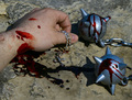
| 04/11/2007 03:01:34 PM | Double headed?by hajekaComment: Greetings from the Critique Club.
Wow, what a fantastic capture. I had to spend a while staring at it trying to figure out how it could possibly not be a montage. Perfect timing. I see the score is in your top 5 - well done.
I think the image itself is very interesting - brilliant capture, nice depth of field, and I love the symmetry of their faces. However, I think it could have been improved by adding an extra couple of post-processing steps.
The composition is good, but seems slightly unbalanced, probably because the faces are so symmetrical, but there's a large body on one side only. I would have been tempted to go for a slightly tighter crop on the sides, and see if that improves it. I also thought the image could benefit from being sharpened slightly more (although it's already pretty sharp as it is). Also, the colour of the background is pretty close to the colour of their fur, I think increasing the saturation a notch helps really bring out the leopards as the main focus of the picture.
Anyway, that's about all I can think of. Hope that helps.
Congratulations on a great capture!
Jelena | | Photographer found comment helpful. |
| 04/11/2007 05:45:49 AM | | | Photographer found comment helpful. |
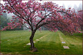
| 04/09/2007 06:35:13 PM | Still. Life.by cogeroxComment: Greetings from the Critique Club.
So, is it a graveyard? That didn't occur to me at all at first glance, it was only after I read through the comments that I started paying a bit more attention to the regular white tiles... (I really thought the tree was the focus of it, and the background was coincidental).
If it is a graveyard, then the subject matter is interesting, and the title works on several levels. And the tree seems to be dancing, there's a nice contrast between actual life which is moving and dancing (despite trees normally being still), and the symbols of absence of life in the background.
The composition is nice, although I would've liked to see the entire tree - it seems a shame that some of the branches are cut off. The colours are beautiful.
All in all - a very good shot, although I think it would have scored even more highly had the subject matter been more obvious.
Hope this helps. PM me if you have any questions.
Jelena | | Photographer found comment helpful. |
| 04/09/2007 06:13:03 PM | Still Dropby FirenzescaComment: Greetings from the Critique Club.
Great capture! Whether the subject fits the challenge or not is open to discussion, and depends on different people's interpretations of the challenge. I'd say it does, as the drops appear still, even if they are in fact in mid-motion.
I think the droplets are well captured, and look very good. However, in terms of the rest of the picture, I think there are a number of things that could have been improved.
Composition seems quite well balanced. However, an off-centre subject tends to look more dynamic than a centered one, so maybe positioning the drops more to the right would have helped? Also, I'm not sure if this is the best POV to take the picture from. Maybe a side view of the tap would have been better than one from the bottom? You can also use that in your composition, and maybe position the curve of the tap so it leads the viewer towards the main subject (like along a diagonal)
The lighting could have been better. The shadow behind the tap is really quite distracting, and it could have been disposed of by pointing a lamp towards the background. Also, the background seems very noisy, which you can get rid of in basic editing using Neat Image or similar software.
Anyway, hope this helps. Message me if you have any questions.
Jelena |
| 04/09/2007 05:47:28 PM | J E Tby hotpastaComment: Greetings from the Critique Club.
Ah, we meet again :)
As can be pieced together from the comments and score: good image, but a lot of people didn't feel it met the challenge. Yes, there is an engine spinning, but it's small and dark, and you can't really see the spin.
Technical stuff:
I think the image is very well composed. All the important lines seem to be just off the mystical thirds, and the right wing nicely leads your eye in towards the rest of the image. The gentle blue and orange nicely complement each other, and their relative quantity seems nicely balanced.
Interesting POV, I like the off-center subject, the fact that the plane is angled, and the trace of the tail at the bottom (rounds the image off nicely). I think the close-up works well.
As has been commented on, bits of the image seem oversharpened - it's something to watch out for. Also, there are bits of distracting glare shining off the airplane - I wonder if a polarizing filter might have helped?
Anyway. Good image - sorry it didn't score higher. I'm sure your score prediction would have been accurate for a different challenge theme.
PM me if you have any questions.
Jelena | | Photographer found comment helpful. |
|
Showing 631 - 640 of ~822 |
Home -
Challenges -
Community -
League -
Photos -
Cameras -
Lenses -
Learn -
Help -
Terms of Use -
Privacy -
Top ^
DPChallenge, and website content and design, Copyright © 2001-2025 Challenging Technologies, LLC.
All digital photo copyrights belong to the photographers and may not be used without permission.
Current Server Time: 08/05/2025 05:50:45 AM EDT.
|