|
|
|
Showing 541 - 550 of ~822 |
| Image |
Comment |
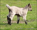
| 04/28/2007 10:56:27 AM | Exploringby GreetmirComment: That's very cute!
I would've been tempted to cut off some space on the left, and leave a lot more empty space on the right and at the top to really give the viewer a sense of movement and exploration.
The colours are nice, but the goat could do with some sharpening. |  Photographer found comment helpful. Photographer found comment helpful. |
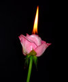
| 04/27/2007 12:04:24 PM | Burning roseby purpleflutterby13Comment:  skewsme skewsme, thanks for the pictures and comments. Those flowers are gorgeous!
Actually, I might try it again after all - I've recovered from the first rose-burning trauma, and I've got 2 more roses leftover to burn within the next couple of days...
A bit more background: the pink rose was a tester one - I wasn't sure if it would burn, how quickly, how well, etc. I've got 2 red roses left which I was going to use for the intended final shot. I might try a radical hue shift on this one - yeah, red would look better.
It's a nightmare getting the thing to burn. First I tried setting the flower on fire - didn't work. I soaked the flower in paraffin for a while and tried to light it - still didn't work. In the end, I had a paraffin-soaked piece of paper in the middle of the flower, and that's where the flame comes from. The reason for the POV was that the paper thing was done quite clumsily, so you can see it sticking out in all the shots I took from above.
Alcohol might work, but doesn't give off a very bright flame. The latest suggestion I heard was to cover the thing in lighter fluid, I might try that...
The things we do to entertain ourselves :) |
| 04/27/2007 09:36:38 AM | Burning roseby purpleflutterby13Comment: Originally posted by posthumous:
The only problem with this photo is that the rose is so purply pink (and veiny) it reminds me of something that I don't want to imagine burning. A color adjustment would improve this tremendously. |
lol you know, that's one association that never would have come to mind. However, now you've pointed it out, I can so see it.
However, you really want me to alter this marvel of radical feminism that randomly stumbled into my portfolio? Think of the layers of meaning this has created! Symbolising the male gender with a pink rose, then burning it - it's challenging sexual stereotypes and expressing the rebellion against male repression all at once! And you want me to change it?! Tsk, I bet it's because you're male! I''m being repressed!
lol :D |
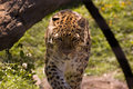
| 04/26/2007 07:21:26 PM | DSC_5719.jpgby griz210Comment: This is really cool. I love the fact the leopard is staring straight at the camera, it's a good capture. Lovely golden shades of fur, nice complementary background colour, good level of detail present, and the bokeh worked well too.
Downsides: the obviously cloned out bars (yeah, zoo shots are tough), and the fact that the leopard's face is in the shadow. The latter is fixable to an extent, and here's a tutorial that tells you how to do it. It's the most useful thing I've read in weeks, therefore I'm recommending it to everyone...
Anyway, good shot! | | Photographer found comment helpful. |
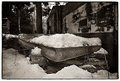
| 04/26/2007 07:15:10 PM | Princess & Peaby xianartComment: This is a really cool shot. Especially with the title, it actually makes a very good story.
There's a nice contrast here - while the title is a fairytale one, the picture is a very gritty, grainy, realist one. It makes you wonder whether the princess would still be so delicate if she was homeless and sleeping in the snow... So the picture could easily be used as an illustration of social inequality (though I assume it wasn't intended that way?).
Interesting subject matter, very good pp, works very well in B&W with all those nice shades and textures. Well done :)
| | Photographer found comment helpful. |
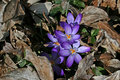
| 04/26/2007 04:33:55 PM | Spring!by ElaineComment: Wow, I love this! Beautiful colours, and I love the contrast between the vivid colours of the flowers and the gray/brown fallen leaves around them. Although it's a bit confusing conceptually - a strange struggle between autumn and spring.
It seems a shame that the lowest flower is in shadow, maybe moving the leaf would've helped? Otherwise a very good image. | | Photographer found comment helpful. |
| 04/26/2007 04:29:42 PM | Illegal Enigmaby WildcardComment: I prefer this version actually. Damn rules... :)
They're both very good though!
I think I prefer the crop of this one - your challenge one is almost too intimate. | | Photographer found comment helpful. |
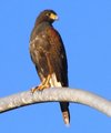
| 04/26/2007 04:09:20 PM | Urban Predatorby maxaz1Comment: Oh cool! Nice composition (the curvy branch thing is very cool), and I love the colour of the sky. However, it appears that the birdie had an unfortunate clash with a noise reduction program. Since in this case you're not limited by basic editing, you can solve it by using two different layers. The sky probably did need noise reduction to the extent you did it, but the bird and the branch didn't - just create a copy layer, apply noise reduction, then get rid of the bits that you didn't want Neat Imaged using a reduced opacity eraser.
Otherwise it's a good picture, there seems to be a decent amount of detail present, and I love that faraway look on the bird's face. Just fix the post-processing and it'll be perfect.
| | Photographer found comment helpful. |
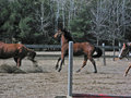
| 04/26/2007 04:00:07 PM | Cyrus2.jpgby snafflesComment:  There you go :) Sorry, it was a 5 minute job, and as a result Cyrus looks a bit, erm, diseased...
Feedbackwise: I'd say get even happier with PS and maybe get rid of the red thing at the front (although arguably it might be an interesting foreground).
Nice dynamic picture, I love the sense of action you get from it. Slightly tilted, but I think that works oddly well - it increases the sense of the horses moving forwards. The background is cool - the white tree outlines work really well in amongst the greenery.
Shame it's not sharper. But looking at the cameras you use, I can sympathise. My camera is very similar to your Canon, and it frequently ends up with a soft focus that DPC hates. Photoshop is the answer, the truth and the light? | | Photographer found comment helpful. |
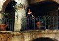
| 04/26/2007 03:35:08 PM | balconyby meyersComment: What a beautiful picture :)
She looks so happy. And the colours are just gorgeous - there's the nice blue/green and purples, there's also the nice golden/brown walls and flowerpots. Interesting and really aesthetically pleasing.
The composition is great - with the subject centered, but so many different things off centre that it still looks interesting. And the archways form a really nice frame.
So yeah, very pretty :) Must be a nice thing to keep as a memory. | | Photographer found comment helpful. |
|
Showing 541 - 550 of ~822 |
Home -
Challenges -
Community -
League -
Photos -
Cameras -
Lenses -
Learn -
Help -
Terms of Use -
Privacy -
Top ^
DPChallenge, and website content and design, Copyright © 2001-2025 Challenging Technologies, LLC.
All digital photo copyrights belong to the photographers and may not be used without permission.
Current Server Time: 08/06/2025 11:26:12 AM EDT.
|