| Image |
Comment |
| 05/09/2007 01:24:38 PM |
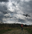
Wright Flyer Three-Viewby posthumousComment: Heh, I like the creations in the sky. For whatever reason, it makes me think of Oddysey 2001 and big black monolyths (no, I don't really understand why either...). The plane doesn't quite fit into the picture somehow, I agree with krnodil's comment.
Oh, and I beat you - my Free Study entry sucks more than yours :p
|
 Photographer found comment helpful. Photographer found comment helpful. |
| 05/02/2007 01:09:24 AM |
|
| Photographer found comment helpful. |
| 04/28/2007 09:43:34 PM |
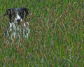
I see you!by bcobleComment: That's very cute. Good composition, and all the detail of the plants makes the picture really interesting. To improve it, maybe sharpen the picture slightly more, and increase the saturation to bring out the colours. |
| Photographer found comment helpful. |
| 04/28/2007 09:40:44 PM |
d_shot.jpgby theSajComment: Nice shot, I like her smile. Maybe try diffusing the light a bit more to make it more gentle? |
| Photographer found comment helpful. |
| 04/28/2007 09:38:09 PM |
IMG_0488.jpgby mngolferComment: Good angle and composition, but the lighting is bad and the colours are unspectacular. This shot could have been greatly improved with more editing - clone out the dark specks from the flowers, set the white balance and fiddle around with the colours until they really pop, maybe do some noise reduction too. There's potential there, but you need to work on it more. |
| Photographer found comment helpful. |
| 04/28/2007 09:34:53 PM |
forge.jpgby KronusComment: Cool shot. Wonderful, interesting subject matter. However, I'm not too keen on the lighting - I think the shot could have been greatly improved with clearer, more interesting light. |
| Photographer found comment helpful. |
| 04/28/2007 09:21:09 PM |
First-shoot-3.jpgby jackal9Comment: The composition and background are good. However, the lighting on the model's face seems a bit flat - maybe using a reflector or a fill-in flash would have helped? It's also to an extent possible to fix in post-processing.
Could do with being sharpened a touch as well.
Good picture, just not quite perfect yet. |
| Photographer found comment helpful. |
| 04/28/2007 09:17:57 PM |
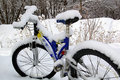
Not Today! 2by WriteHeartComment: Nice edit! Much better than the original entry. There seems to be a lot more detail in the snow this way, and it gives the right impression across.
Otherwise: good subject matter, and I like the diagonal the bycicle seems to create across the picture. |
| Photographer found comment helpful. |
| 04/28/2007 09:12:09 PM |
Chains Outtakeby krnodilComment: Your actual entry is infinitely better. This one would have probably ended up with a load of 4's and a bunch of comments telling you that the image is OOF.
I like the fact that you didn't use a real chain, just because sooo many other people did... |
| Photographer found comment helpful. |
| 04/28/2007 09:09:59 PM |
Juliana's Tattoo-Greenby Blue MoonComment: Cool! I think that looks a lot better than the original - maybe your friend should trust your Photoshop skills and add those green bits to the tattoo? :) |
| Photographer found comment helpful. |
Home -
Challenges -
Community -
League -
Photos -
Cameras -
Lenses -
Learn -
Help -
Terms of Use -
Privacy -
Top ^
DPChallenge, and website content and design, Copyright © 2001-2025 Challenging Technologies, LLC.
All digital photo copyrights belong to the photographers and may not be used without permission.
Current Server Time: 08/07/2025 02:58:35 AM EDT.