| Image |
Comment |
| 09/02/2007 04:28:00 PM |
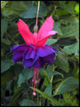
Tiny Dancerby ephlnComment: That's gorgeous! I love the bright colours. You've done a really good job of the editing - it really shifted the focus from distracting background elements to the subject itself. And like all best editing, you can't tell it's been done in the final version.
I only noticed the ballerina once I saw the title :) |
 Photographer found comment helpful. Photographer found comment helpful. |
| 09/02/2007 04:25:22 PM |
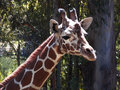
Giraffe by ephlnComment: Aww, giraffes are so cute!
Very cool picture, I think the composition is great, and I really like the high contrast between the subject and the background.
The only improvement I can suggest is to try and use a low opacity cloning stamp to fix up some of those blown highlights on the giraffe's face. |
| Photographer found comment helpful. |
| 09/02/2007 04:22:42 PM |
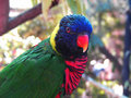
Lorikeetby ephlnComment: My god, the colours! Nice bokeh too :)
Actually, damn impressive bokeh with that camera, I really had trouble getting my P&S to do stuff like that.
On the other hand, I'd maybe go for a slightly different composition, maybe cropping off some of the right side or something. In terms of editing, I'd maybe run it through Neat Image again, there seems to be quite a bit of noise in the background. And you can make the bird stand out more by darkening the background with a black brush in a low opacity soft light layer.
|
| Photographer found comment helpful. |
| 09/01/2007 01:44:38 PM |
|
| Photographer found comment helpful. |
| 08/31/2007 05:40:13 AM |
Starbucks, Kuwaitby MelethiaComment: lol Fantastic. It's comforting to know that wherever you are in the world, there will be a Starbucks just a camel ride away :D |
| Photographer found comment helpful. |
| 08/30/2007 06:31:53 PM |
|
| 08/30/2007 06:18:49 PM |
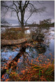
Bleak Novemberby Bear_MusicComment: Wow, such gorgeous colours :)
I knew your name would have to be in the top 20 for this challenge. |
| Photographer found comment helpful. |
| 08/30/2007 09:23:07 AM |
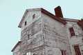
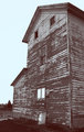
Duotones Outtakeby posthumousComment: The colour of the sky seems a tad blinding. And the house is even more personified in this picture than in the other one. I swear it's looking into the distance! |
| Photographer found comment helpful. |
| 08/30/2007 09:19:10 AM |
Duotones Outtakeby posthumousComment: I prefer the other outtake. This one has more texture, but I don't particularly like the composition. |
| Photographer found comment helpful. |
| 08/30/2007 09:17:58 AM |
Duotones Outtakeby posthumousComment: The paint is interesting, and I swear those top 3 windows look like a face. However, there doesn't really seem to be a big enough variation of light and shadow to really make the duotone interesting. |
| Photographer found comment helpful. |
Home -
Challenges -
Community -
League -
Photos -
Cameras -
Lenses -
Learn -
Help -
Terms of Use -
Privacy -
Top ^
DPChallenge, and website content and design, Copyright © 2001-2025 Challenging Technologies, LLC.
All digital photo copyrights belong to the photographers and may not be used without permission.
Current Server Time: 08/07/2025 11:06:18 PM EDT.