| Image |
Comment |
| 06/28/2015 04:00:54 PM |
returningby NiallOTuamaComment: Not pastel. But is compositionally interesting, and the graininess works with this image. |
 Photographer found comment helpful. Photographer found comment helpful. |
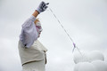
| 06/28/2015 03:59:42 PM |
paradeby boo8merComment: Wish focus were a little sharper and you had cloned out the splotch in the sky a bit to the right of and slightly lower than the model's finger. That said, I like the color palette and the composition of this image. |
| 06/28/2015 03:58:46 PM |
Fallenby ambakerComment: Not quite in sharp focus, and too contrasty. |
| Photographer found comment helpful. |
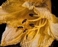
| 06/28/2015 03:57:55 PM |
_D7K6400_webby LionsitalyComment: A different crop--one eliminating the blurred blue bit in the lower right corner-- might've strengthened this image. Good choice of a pastel subject. The flowers are cute. Title needs work :-). |
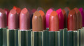
| 06/28/2015 03:56:20 PM |
Its a women thing.by MrJearComment: Good concept, good composition, good use of DOF. Lighting is harsh, and saturation could've been backed off a bit. FWIW, I don't think many of those lipsticks are a pastel shade... (and yes, I'm a woman). |
| Photographer found comment helpful. |
| 06/28/2015 03:54:05 PM |
The Pierby Ecce_SignumComment: Very cool. Love how the title helps tell the story, but it's an interesting abstract on its own. Only comment is that the upper left corner (the sun, I assume) is still a tiny bit too bright given the balance of tonality in the rest of the image. And there's a tiny dark speck in the purplish band on one of the pier supports. |
| Photographer found comment helpful. |
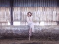
| 06/28/2015 03:51:04 PM |
The Farmer's Daughterby PaulComment: An interesting portrait. I like the textures and the horizontal repetition. The pinkness of the image seems artificially introduced to shoehorn the shot into the challenge. But it's still a good photo. |
| Photographer found comment helpful. |
| 06/28/2015 03:49:25 PM |
Pick a card, any card.by awpollardComment: I'm surprised at your choice of color cards, only one or two of which contain color swatches that fit my idea of pastel. Nevertheless, the idea is good. Your processing left splotchy areas along the right edge. |
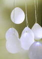
| 06/28/2015 03:47:06 PM |
Balloons at a Weddingby GeneralEComment: The balloons could have potentially been a good choice of subject. The composition isn't particularly interesting, nor is the background. End the dark edge in the upper right corner could've been cropped out. |
| Photographer found comment helpful. |
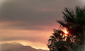
| 06/28/2015 03:43:20 PM |
Sun setting agaist a smokey sky.by rodfulkComment: Lots of smokey skies in my area right now too. Hope you're not in immediate danger from the fire(s).
The composition of this one is so-so. There's not really a clear subject, and the lens flare behind the palm (palmetto?) fronds, coupled with your sharpening (I'm guessing) makes for some odd splotchiness.
Perhaps if you'd moved to the right to fill more of the frame with the leaves, it wouldn't feel so much like a naked expanse on the left? |
Home -
Challenges -
Community -
League -
Photos -
Cameras -
Lenses -
Learn -
Help -
Terms of Use -
Privacy -
Top ^
DPChallenge, and website content and design, Copyright © 2001-2025 Challenging Technologies, LLC.
All digital photo copyrights belong to the photographers and may not be used without permission.
Current Server Time: 08/06/2025 01:23:50 AM EDT.