| Image |
Comment |
| 06/10/2003 12:10:35 PM |
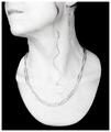
Paperclipsby sagestudioComment: Very orginal idea, I like it just the focus appears to have gotten soft near the bottome of the paperclip necklace. |
 Photographer found comment helpful. Photographer found comment helpful. |
| 06/10/2003 12:09:08 PM |
Patrioticby jpb56nyComment: *Critique Club*
The image itself is not bad at all however it really doesn't say Home Sweet Home it says Home of the Brave.
The large flag appears to be the main focus of the image, however even the focus on it is a bit soft. Possibly an unsharpening mask may have helped.
Overall it is a nice photo of NYC just doesn't say home sweet home.
Anna |
| 06/10/2003 12:01:03 PM |
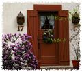
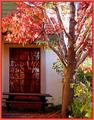
17by nathaliedooComment: *Critique Club*
Very pretty says welcome home and in that definately says Home Sweet Home. The boarder you used added to the image and gave it more of a feeling. The colors for the most part are good and the focus is really good. The texture is very nice in this photo and its like you can actually feel the roughness.
As someone mentioned the two branches in front of the door look like you could get hit by them but at the same time they also take away from the door and almost give it an appearance of being cut in 3 pieces. It also needs a little stronger lighting at the top of the door it is just to shadowy.
Over all this is a really homey feeling photo and it really well done. Keep up the good work.
Anna |
| 06/10/2003 11:11:15 AM |
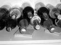
The House Specialby juliapersonComment: *Critique Club*
This shot has a lot of potential if all the little minor things are corrected. Cropping in tighter will get rid of the reflections on the wall from the bottles, take a little more time and make sure your focus is sharp and clear, it seems a bit soft but might even be correctable using an unsharpening mask in post editing also I am thinking you may have taken this in low light and a tripod can also help with the focusing. Also when taking something like this make sure you get all specks of dirt off the surface there are two black spots in the image that probably can be wiped away.
As for meeting the challege it doesn't really say Home Sweet Home it says wine cellar to me. Take your time and work on focusing, also if you need help correcting minor things in post editing just ask, cause most of the problems in your image are easily corrected with Photoshop or PaintShopPro.
Keep practicing and don't be afraid to experiment, welcome to DPChallenge also =o) wish my first entry would have scored as well as yours did.
Anna |
| Photographer found comment helpful. |
| 06/10/2003 10:54:13 AM |
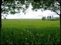
My own meadowby KINGComment: *Critique Club*
Very nice image, has a nice relaxing feeling to it, the lazy days of summer. I'm not sure what your main focus was on but most everything seems to be in realatively good focus. I can even make out the buttercups at the bottom of the photo.
You may have wanted to try to add more blue to the sky for feeling cause as it is now, its cloudy but there are traces of depth in the clouds just seems to need a tinge more blue to it.
It is a very nice image all you need are some animals or a child in close view to add more interest to the composition. It does meet the challenge cause it makes you think of living in the country, nice interuptation on the challenge.
Anna |
| Photographer found comment helpful. |
| 06/10/2003 10:39:28 AM |
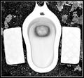
Where some find peaceby zerocusaComment: *Critique Club*
Definately an orginal idea here for the Home Sweet Home challenge, it does meet the challenge considering how much time the average person spends in the bathroom.
Your focus is very good, the composition is good and interesting. Very nicely done the black and white works well here.
There really isn't much I would do differently, the only thing I see is there is a small black mark at the top of the waterline. It actually reminds me of a blade of grass in water. It might have been something very easy to get rid of
Over all this is very interesting simply cause the style of the commode is not what we see everyday. Definately a conversation photo.
Anna |
| 06/10/2003 10:13:15 AM |
Protect your sweet home !by bosniakComment: *Critique Club*
Very interesting image at first glance it makes you think what is it. The focus appear to be on the lock itself, the angle at which this was taken makes it interesting and not just a lock.
The spots on the wall in the right hand corner are distracting and pull you away from the main subject. The focus is a bit soft at the bottom and as I said appears to be on the lock but the lighting on the lock doesn't allow for any of the detail to be visable.
It does meet the challenge and has a lot of potential for making the viewer think what is it. =o)
Anna
|
| 06/10/2003 01:39:36 AM |
Home sweet home with a green front yardby pedroviegasComment: *Critique Club*
Wow what an attention getter. Really neat houseboat, I'm guessing it's homecrafted. The focus on the boat is very good and dof field centers on the main subject. Well done there.
The saturation is a bit heavy on the golds and greens and would improve the image if not so harsh.
It is nicely done and would love to see more of the unusualness of Vietnam lifestyles.
Anna |
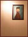
| 06/10/2003 01:32:06 AM |
Home Wallby tyrkinnComment: *Critique Club*
The color and contrast of the painting and wall are good. Your focus appears to be pretty good too.
You have two problems with the entire image. First being the lighting glare, it left a big white spot that distracts from the painting itself. Secondly the big emptiness of the image There is nothing in the bottom half to look at. A floral arrangement on a table or a chair added to the left side of the image would have added something to it and balanced it out somewhat so you would be looking at something on the bottom instead of emptiness.
It does say Home to me so with that in mind it meets the challenge.
Anna |
| Photographer found comment helpful. |
| 06/10/2003 12:56:17 AM |
The Gardenby GinaRothfelsComment: *Critique Club*
Very bright and vibrant colors. Your focus and dof are both very good. The texture of the leaves and roof are really well defined.
The only two things I find distracting in the photo first is the shadows on the house just appear overly processed cause of the graininess of them. Secondly the light coming through the middle of the tree is excessive. Possibly a different time of day or an overcast day would prevent that.
Overall it is a very appealling image. Keep up the good work.
Anna |
| Photographer found comment helpful. |
Home -
Challenges -
Community -
League -
Photos -
Cameras -
Lenses -
Learn -
Help -
Terms of Use -
Privacy -
Top ^
DPChallenge, and website content and design, Copyright © 2001-2025 Challenging Technologies, LLC.
All digital photo copyrights belong to the photographers and may not be used without permission.
Current Server Time: 08/05/2025 04:47:59 AM EDT.