| Image |
Comment |
| 05/27/2004 11:46:46 PM |
Boy in playgroundby LesyaComment: Critique Club
Very cute photo, that expression is well captured. Definately meets the challenge. Only thing I really notice is the yellow has left the baby looking a bit sallow, and thus a little less appealing than if it had been done with another could near the baby.
Overall it is very darling and still a keeper. |
 Photographer found comment helpful. Photographer found comment helpful. |
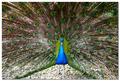
| 05/27/2004 11:44:22 PM |
Show Off!by osramComment: Critique Club
Very nice capture of the peacock. I really don't see much you could do to improve this photo, it stands well on it's own.
Nice work. |
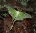
| 05/27/2004 11:43:10 PM |
Middle of the Nightby torrenzanoComment: Critique Club
Wonderful composition, very good detail and overall an excellent capture.
I really like this shot a lot, not much I would do differently, only thing I might do is clone out the vein on that one leaf that is creating such a strong line on the left side of the photo. It is distracting.
Again exellent work.
Anna |
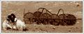
| 05/27/2004 07:09:35 PM |
The Crossby jonpinkComment: Critique Club
Very nice composition. The lighting gives this a warm charm. Very well done only thing I would do different is crop in closer allowing to show more detail. |
| 05/26/2004 07:21:48 AM |
|
| Photographer found comment helpful. |
| 05/05/2004 07:57:50 AM |
|
| Photographer found comment helpful. |
| 05/03/2004 12:06:42 AM |
|
| Photographer found comment helpful. |
| 04/04/2004 10:33:15 AM |
Architectureby dinnComment: Critique Club
Excellent work. Lines are very strong and the shadows and lighting add the drama to this. There really isn't much you could do to improve this photo with the exception of editing out the light glare at the top of the arch. That really is the only distracting factor in the entire photo.
Anna |
| Photographer found comment helpful. |
| 03/27/2004 07:58:57 AM |
Monicaby AlexysComment: Critque Club
There are a few flaws that I see right from the start. First being the color its just got too much of a green tone to it, making a photo that is very nice a lot less appealling. Second problem I see with this is the nose gets lost. Part of the nose blends right in to the cheek and it appears there is a tip of the nose and a bridge but nothing inbetween.
Composition is your strong point here excellent composition. Would love to see this with different tones to it.
|
| 03/23/2004 01:17:55 PM |
SURPRISE!by channeledComment: Critique Club
What a cute little girl very charming photo. Definately fits the challenges. Makes you wonder what she is looking at.
There are two things that could be done to improve it. First left side of her face appears to get soft. The other thing is the throw in the background it appears to be a wolf face, is very distracting and takes away from her.
Again it is very nice work just has those two minor flaws to it.
Anna |
Home -
Challenges -
Community -
League -
Photos -
Cameras -
Lenses -
Learn -
Help -
Terms of Use -
Privacy -
Top ^
DPChallenge, and website content and design, Copyright © 2001-2025 Challenging Technologies, LLC.
All digital photo copyrights belong to the photographers and may not be used without permission.
Current Server Time: 08/08/2025 12:00:32 PM EDT.