| Image |
Comment |
| 11/03/2005 11:52:15 PM |
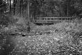
Forgotten Pathby hi131Comment: Greetings from the Critique Club
For starters you meet the challenge well there is a definate degree of graininess here. It's easily seen and you don't have to go looking for it.
As for improving this as others said its flat, and adjusting your contrast can help with that as well as a little change of lighting.
I do like the composition and placement of the bridge in your photo it makes it eye pleasing. Also adds some strong lines to your photo.
Anna |
 Photographer found comment helpful. Photographer found comment helpful. |
| 11/03/2005 11:47:23 PM |
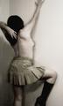
Against the Wallby lizzyc3Comment: Greetings from the Critique Club
Nice take on the challenge, but it has it flaws. I'm going to start by saying the PANELING...that line on the wall just distracts from your models beauty, it tends to pull the eye from her to it.
As for the pose and one boot just isn't eye pleasing. A different pose such as both hands on the wall feet apart as if being frisked by police or a different shoe might have solved the awkwardness here im seeing.
Your lighting seems to be good as does your focus. Its the silly things you overlook that hurt you during a challenge.
Anna |
| Photographer found comment helpful. |
| 11/03/2005 11:42:05 PM |
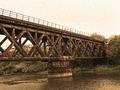
Echo of a Time Gone Byby trtfeasorComment: Greetings from the Critique Club
Very nice image strong lines, nice choice of tones. Excellent use of grain for effect.
I'm seeing one big issue here with the photo and it appears to be something very easy to correct. It looks like you have the Leaning Tower of Pisa here. The base of the bridge is on an angle and causes everything to appear leaning. You might want to try straightening that up and see what happens.
Overall though this is a very appealling bridge photo, nice take on the challenge.
Anna |
| 11/03/2005 11:27:52 PM |
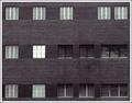
One Windowby JaimesonComment: Greetings from the Critique Club
You framed your subject well. Bricks all around
THere is one window as your title states that grabs for the attention but thats all the interest there is in this photo.
Your subject matter here just holds no interest to most, had you had a person in that window or some object it could have done a lot for this photo but not as it appears here.
I do see some graininess here so it obviously would fit the challenge.
Anna |
| Photographer found comment helpful. |
| 11/03/2005 11:18:33 PM |
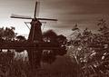
ANNO 1738by PhilosComment: Greetings from the Critique Club
Very nice and appealling image. Definately fits the challenge well. I like the reflection of the wind mill in the water it adds a lot of warmth to the photo.
Your lighting appears to be a little off with the leaves in the right foreground being a little bright and an area behind the wind mill also seems overly exposed.
I am seeing a few "scratch like" marks on the right side, not sure what you have going on there but you might want to touch them up now that the challenge is over.
Anna Message edited by author 2005-11-03 23:21:47. |
| Photographer found comment helpful. |
| 11/03/2005 11:16:53 PM |
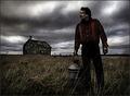
Desolation by Joey LawrenceComment: Greetings from the Critique Club
I'm going to start off by saying CONGRATS on a well deserved win. This photo of your Dad reminds me of Michael Landon and Little House on the Prairie.
I don't think there is any question you definately fit the challenge well. Your lighting, dof are all good.
Your sky is adding drama to the photo and truthfully there isn't anything I would change, unless I was to start nitpicking at silly things like the two blades of grass that cut your dad apart. I might clone those out or put a little bend into one of them.
Again congrats on the ribbon and keep up the wonderful work.
Anna |
| Photographer found comment helpful. |
| 11/03/2005 11:11:25 PM |
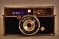
Long before digital...by GinaRothfelsComment: Greetings from the Critique Club
I'm going to start off by saying no doubt about it you met the challenge well.
I think the age of the camera warrented black and white and that red dot and blue background on the Hobby 16 logo just don't cut it.
I do agree that the camera is slightly tilted but in some ways that adds a little interest to very plain photo. Yes thats what my issue is with this photo...it actually reminds me of a stock photo for an old camera newspaper ad. Just not appealing in the age of digital.
Anna |
| Photographer found comment helpful. |
| 11/03/2005 11:06:08 PM |
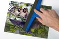
The *all new* Noise-B-Gone™ photo squeegee. Now with Levl-Rite™!by AndersOstbergComment: Greetings from the Critique Club
Nice image and since you said you were being silly I will tell you...You did fantastic at it.
The angle you did this at made it interesting. You definately met the challenge I see the graininess there. Although I'm sure others didn't get it cause I would have agreed with comments below that this should have ribboned if for no other reason than CREATIVITY and ORIGINALITY.
It's very hard to find any flaws in a photo when you like it and that is exactly my problem here trying to critique this...its just one of those images I personally wouldn't have changed a thing. I guess some of the voters wanted a green squeegee instead of blue. Oh my what a lame attempt I have at the silliness...
All I can say is beautiful creative work.
Anna |
| Photographer found comment helpful. |
| 11/03/2005 10:10:28 PM |
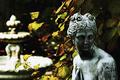
Morning Dip circa 205A.Dby lytaComment: Greetings from the Critique Club
Very eye appealing image here.
Strong colors in the background add to the grace and elegance of the statue. Although the fountain could be distracting at first glace but then it also appears to balance out the photo. I think the real problem is an area of overexposure to the fountain.
Lighting here is so so, there is some shadowing but not too much, the problem is an area of overexposure.
As for meeting the challenge there is definately grain here and I think the grain enhances this photo and actually makes it more appealing.
Nicely done.
Anna
DOF is used well here. |
| Photographer found comment helpful. |
| 11/03/2005 10:05:10 PM |
02:18 AM, Between Flightsby ergoComment: Greetings from the Critque Club
I am going to start out by saying NICE! I do like this photo for the grain challenge. The grain is there no question about it.
I personally like the color and effects here although I wonder if the yellow might have been just a little too much for some.
Your composition is very strong and you used the rule of thirds nicely here. Excellent perception as well you start out looking at your main subject and follow the lines to see even more. It just pulls you in very nicely.
Personally I wouldn't change a thing other than maybe processing the lines between each panel out to make a smooth image flowing from one side to the other.
Anna
|
Home -
Challenges -
Community -
League -
Photos -
Cameras -
Lenses -
Learn -
Help -
Terms of Use -
Privacy -
Top ^
DPChallenge, and website content and design, Copyright © 2001-2025 Challenging Technologies, LLC.
All digital photo copyrights belong to the photographers and may not be used without permission.
Current Server Time: 08/01/2025 01:43:22 AM EDT.