| Image |
Comment |
| 06/15/2003 03:56:49 PM |
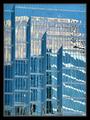
Vogueby danh669Comment: Very nice model, and I love this shot. I have to comment on the orientation of the photo, however, because if this were cropped to be a magazine cover it would look different. |
 Photographer found comment helpful. Photographer found comment helpful. |
| 06/15/2003 03:55:21 PM |
|
| 06/15/2003 03:54:08 PM |
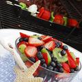
Family Circleby KarenBComment: This is one of the best I've seen so far, I think you should win a ribbon with this, or come very close. Maybe you should submit it to them? |
| Photographer found comment helpful. |
| 06/15/2003 03:52:54 PM |
Martha Stewart Livingby nbortonComment: Seems like a bit too much empty space at the bottom, maybe just my opinion? Everything else on this shot looks great! |
| Photographer found comment helpful. |
| 06/13/2003 04:19:03 AM |
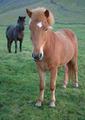
The Horseby birgirComment: this file is so small I can't tell much about it. |
| Photographer found comment helpful. |
| 06/13/2003 03:02:42 AM |
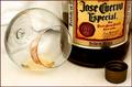
One Tequila... Two Tequila... Three Tequilla... FLOOR!by RiderGalComment: Greetings from the CC!
Photo meets challenge, there is liquid (tequila), and it isn't water (good job).
Lighting and focus seem perfect to me. One commented that photo was too dark, I disagree. I don't understand why your exposure time is 2.5 seconds, is this a typo?
Good colors in this photo. The lipstick was a great idea, my only suggestion would be to make it a brighter red. It would emphasize it even better.
I'm not sure if I like the composition. Not that it is bad, but it might be better if more of the bottle were shown?
Overall, your technique was good, and the idea humorous, but the photo is not all that aesthetically appealing. |
| 06/11/2003 01:50:01 PM |
|
| 06/11/2003 01:49:21 PM |
National Geographicby InnaNComment: Photos is a bit overexposed. There isn't room at the top for the magazine title. Otherwise the photo is very good. |
| Photographer found comment helpful. |
| 06/11/2003 01:48:07 PM |
|
| Photographer found comment helpful. |
| 06/11/2003 01:45:48 PM |
|
Home -
Challenges -
Community -
League -
Photos -
Cameras -
Lenses -
Learn -
Help -
Terms of Use -
Privacy -
Top ^
DPChallenge, and website content and design, Copyright © 2001-2025 Challenging Technologies, LLC.
All digital photo copyrights belong to the photographers and may not be used without permission.
Current Server Time: 08/14/2025 08:58:50 AM EDT.