| Image |
Comment |
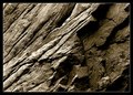
| 07/13/2006 09:51:27 AM |
Worn by Timeby justin_hewlettComment: I didn't comment on this image during the challenge because I thought it would score much higher and receive a lot of positive feedback. This is an image I would be very happy to call one of my own. You took a very stationary object and presented its character in a very dynamic manner. The lighting is perfect and provides a definite focal point imho. I gave this a 9. |
 Photographer found comment helpful. Photographer found comment helpful. |
| 07/13/2006 09:44:56 AM |
Arlington on the Beachby dfriedlandComment: I didn't comment on this image during the challenge because I thought it would score much higher and receive a lot of positive feedback. I really like the flow of this image. The only improvement would be to include a bit more of the cross front and center, as the blue flag tends to make this a focal point for this image. |
| Photographer found comment helpful. |
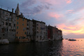
| 07/13/2006 09:41:09 AM |
Rovinjby gregaRComment: The sky in this image is very lovely to look at. However, the buildings have a little too much detail and compete with the sky for the viewer's attention. If you decrease the detail in the building using levels or curves, the lines of the building silhouette will naturally lead the viewer's eyes to the wonderful sunset and the boats in the water. |
| Photographer found comment helpful. |
| 07/13/2006 09:39:55 AM |
My perspectiveby SnaethorComment: The interaction between the sky, the towers and the power lines is very effective and well done. The person on the left really doesn't add to the composition and actually causes a distraction, drawing the viewer's eyes away from the strongest element in the composition. |
| Photographer found comment helpful. |
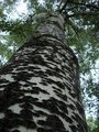
| 07/13/2006 09:29:27 AM |
solidby quackquackComment: I like the texture of the bark on this tree a lot and it could have served you well as the focal point of this image. However, the size of the trunk (how close you shot the tree) overwhelms the texture and causes the viewer's eyes to wander away from this wonderful feature. |
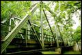
| 07/13/2006 09:24:57 AM |
over the river and through the woodsby fordmanf1Comment: I like the perspective you took of this bridge but the overall green hue is a bit overwhelming. You might want to consider changing this to a b&w image and play with the contrast a little bit. This image has so much potential. |
| Photographer found comment helpful. |
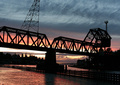
| 07/13/2006 09:22:15 AM |
Light and Shadowsby pinbokeshattaComment: The colors in this image are wonderful and the silhouette is nicely done. However, the wire and towers above the bridge really hurt this image and the angle of the left tower looks a little odd. If you clone these items out after the challenge, this could be a very powerful image. |
| Photographer found comment helpful. |
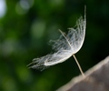
| 07/13/2006 09:18:51 AM |
A Perspective on Life: Bloom Where You are Plantedby karmatComment: I really like the positioning of the seed in this image. The triangle in the lower right corner helps the composition tremendously. I would have liked to have seen the seed completely in focus. Having three out of focus areas (foreground, background, and part of the main subject) makes the viewer work to find the focal point of the image. You may want to consider cropping out the whiteish-blue area in the top right corner. It has a tendency to draw the viewers attention away from the main subject of the image (You could also clone it out after the challenge). |
| Photographer found comment helpful. |
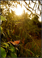
| 07/13/2006 09:13:22 AM |
Under the Texan Sunby elsapoComment: From yout title I know that the sun is an important part of this composition to you; however, cropping it out may allow you to balance the saturation and contrast better to help make the colors of the butterfly pop. You may also want to consider cropping this into a horizontal image, as the negative space to the right of the butterfly is add more to the image than the space above the butterfly. |
| Photographer found comment helpful. |
| 07/13/2006 09:09:26 AM |
Inflatable Joyby LERtasticComment: An interesting perspective on a playscape; however, the bright light in the background and the activity of the children in the background competes with the main subject for the viewer's attention and unfortunately, wins. |
| Photographer found comment helpful. |
Home -
Challenges -
Community -
League -
Photos -
Cameras -
Lenses -
Learn -
Help -
Terms of Use -
Privacy -
Top ^
DPChallenge, and website content and design, Copyright © 2001-2025 Challenging Technologies, LLC.
All digital photo copyrights belong to the photographers and may not be used without permission.
Current Server Time: 08/22/2025 05:34:18 AM EDT.